An example of a logo that utilizes ambiguity of positive and negative space to convey a meaning is the classic Girl Scouts logo. At first glance, one could see three side profiles of girls’ faces. Then, one may notice that the three faces are layered in a design that resembles a clover, a symbol that is commonly associated with luck and nature. The logo was created by a graphic designer named Saul Bass in 1978.
Terry Heckler is very famous for creating the logo for the very popular coffee chain called “Starbucks”. This logo looks simple although it is complex. It has positive space such as the face, crown and more. However, it has negative space as well which is the green background which makes the white logo stand out. The green symbolizes nature, healing, protection as well as wealth, and money. The logo is supposed to represent an old 16th-century “Norse” which is supposedly a two-tailed mermaid. It is also described as “the siren”. Even though, the symbol looks like a regular human the two little things on the sides are supposed to represent two mermaid tails making her a nautical character. The green symbolizes nature, healing, protection as well as wealth, and money. The space in this logo works really well because it is also outlining the image of the lady.
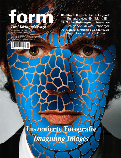
These magazine pages made by Form caught my attention with how they altered the normal use of these materials to create their own creative images. The first image has piano keys coming out of a pair of lips. Even with that to catch your attention there are more random objects and colors behind it to draw your eye over to it as well. The color use in this page is very well done and how some of the patterns and colors overlap shows depth to it. The second image is a mans coat and body and where his head is supposed to be is just clouds of smoke instead. These ideas take any object and alter it to however they want it to which is just beautiful itself. The third image, is a mans face and over his skin are these blue scales that range from light to dark blues. These three magazine pages are extremely creative and very well done. The text is simple since the background is so busy the text is centered in white to draw attention to it against the darker background.
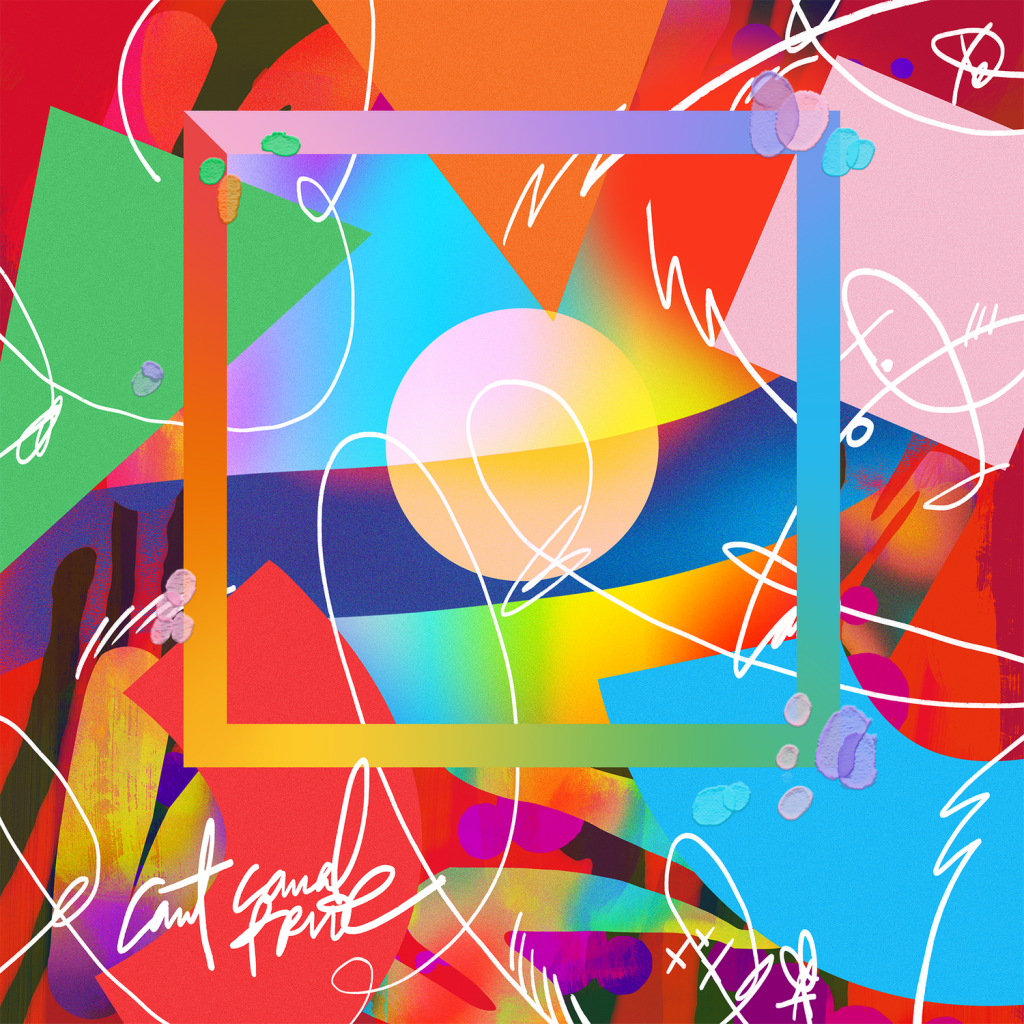
Aries Moross is an English graphic designer, artist, illustrator and art director based in London. They are known for typographic illustration as you can see in the image above. Personally, even though Aries is a current graphic designer I think their work still relates to the topic “History of Graphic Design” because their work is powerful and most of the work is supporting of LGBTQ which is a topic that has been around for a long time and is very significant today. After looking at Aries work, I became inspired with how they have so many different forms of their art. They use color but focus on typographic illustrations and shapes but they create a beautiful abstract piece with it. Aries has done multiple projects such as the Love & Mickey Mouse Collection. They wrote a book called “Make Your Own Luck” which features chapters on how to thrive in art school, develop your own style, self promote and more. Even though Aries was a designer for Nike, Topshop, and Google it has not always been easy for them. This book was written so that Aries could help and offer support to other graphic designers starting their careers. I have included some of Aries works below.The Knot Collective, 2017Netflix Transgender Awareness WeekNew Balance 247, 2017Can’t Cancel Pride
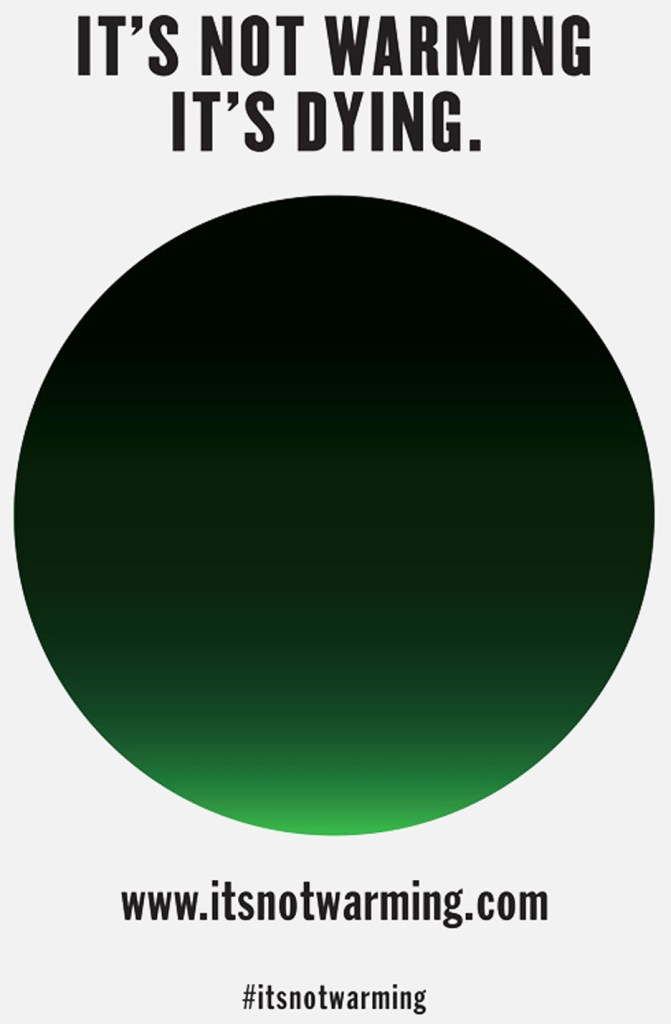
Milton Glaser is a Graphic Designer from Bronx, New York. He attended Cooper’s School of Art and graduated in 1951. After that, Milton founded Pushpin Studios with several of his classmates before he went on his own. He has completed projects in a wide range of design disciplines, including graphic, environmental, and interior design. Some of his works include an AIDS poster for the World Health Organization, a poster to promote the 1984 XIV Olympic Winter Games, Give Earth A Chance poster and the one above “It’s Not Warming, It’s Dying campaign” is a poster to raise awareness for climate change. He is most well known for the famous NY logo that is still used everyday. However, he is still very well known for his countless campaigns to raise awareness for many different humanitarian issues. He has countless posters and designs he created to advocate for numerous topics.
Climate change is an issue we face everyday and this campaign was created to raise awareness and support to the issue. This campaign aims to create a greater sense of urgency to the issue of climate change and to show how serious it really is. His design looks like a simple green and black circle however, the black part that is majority of the circle is symbolizing the smoke and pollution on Earth and the small bright green part at the bottom is symbolizing the little life remaining on Earth. There were buttons created of the green and black circle that are available to buy on the campaign website for $5 for five of them. https://www.dezeen.com/2014/08/04/milton-glaser-its-not-warming-its-dying-climate-change-campaign/
Apple’s page design is undoubtedly beautifully designed. It’s webpage showcases all of the devices that they are currently selling in a stunning display. A white background makes the text easy to read, and by scrolling down, each of the products shift effortlessly in a mesmerizing way while delivering promotional information about their products. The home page features backgrounds that are mostly white, but their most special products may have a colored background, making them stand out to the viewer. Even if a user has no intentions to actually buy a product, they would still likely enjoy the experience of scrolling through these beautiful designs.
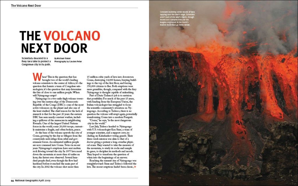
Many readers will look at a photo first as it can be eye catching to the reader like this first spread from national geographic. For many National Geographic readers, they are interested in the natural beauty that is our world. The spread above as you can see shows lava overflowing and spilling over the edge. What is amazing about photos like this one, it is considered a dangerous task as you travel to these locations to capture the best photo to share with others who do not have that experience of seeing it in person. Although the photo is fascinating, a text must include facts about this location and what it took to travel there. The writers did a good job with the title of the spread, along with the location, and dates included in the text. They also changed the boldness, color, and font of certain words or letters within the text.
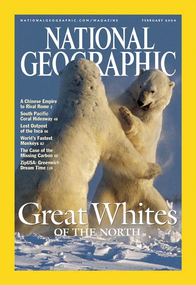
National Geographic has been a company that is well known for their journeys to places that are hard to reach for the normal photographer or human. Their journeys take days, weeks, or years to prepare and accomplish. NAT GEO is known for their front cover which includes their yellow outline around the page as it is a color that stands out when looking through magazines. Next they have their name in the cover with an incredible image of either nature, people, or certain locations.
I really enjoy looking at natural magazines like National Geographic as I have an interest in traveling to a few national parks after I graduate. They do an amazing job at keeping the reader interested and engaged in their spreads as they are images that are taken in real locations, with a camera, and at times in terrible conditions.
The very first graphic design agency dates back to 1903, and it was called the Wiener Werksätte (Vienna Workshop). This workshop consisted of architects, artists, and designers who put their heads together to create designs to grab the attention of its viewers. Koloman Moser, a painter, Josef Hoffman, an architect, and patron Fritz Waerndorfer established this workshop and created a promotional banner for this new agency.
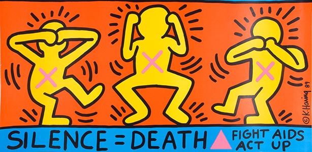
Throughout history, many artists have used their visual communication skills to convey topics that they felt needed dire attention or to be protested against. This is usually achieved by showing something to provoke shock value to the viewer or to make them think harder about something that they otherwise would not. Keith Haring, a famous artist from the 1980s, was no different. He is known for depicting his figures in joyous scenes, such as his easily distinctable but unnamed print of five dancing men in front of a yellow background. In a particular print of his titled Silence = Death, his usually peppy figures are drawn to be distressed by the silence against AIDS. Seeing brightly colored figures expressing negative emotions with X’s marked on their chests feels out of character for Harring’s designs, but this further emphasizes the importance of how necessary it is to fight against AIDS. Art historian, critic, and writer Ruth Millingon posted an article describing Harring’s picture amongst others made by different artists that also promote change or activism.
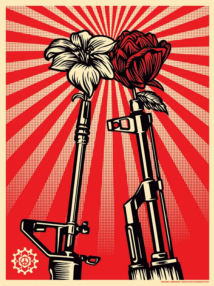
Shepard Fairey is an American contemporary artist and activist who is very open about his social and political opinion with his work. He is often seen creating and donating artwork to promote and create awareness of social issues such as women’s rights, gun regulation, human rights, and many more.
Fairey’s work combines elements of graffiti, pop art, business art, and Marxist theory. His work has been internationally shown in many galleries and museums


