This site is called Squarespace. It is a website design builder that offers an option to create an online portfolio with the aid of various templates. There is a fee after a trial expiration.
This site is called Squarespace. It is a website design builder that offers an option to create an online portfolio with the aid of various templates. There is a fee after a trial expiration.
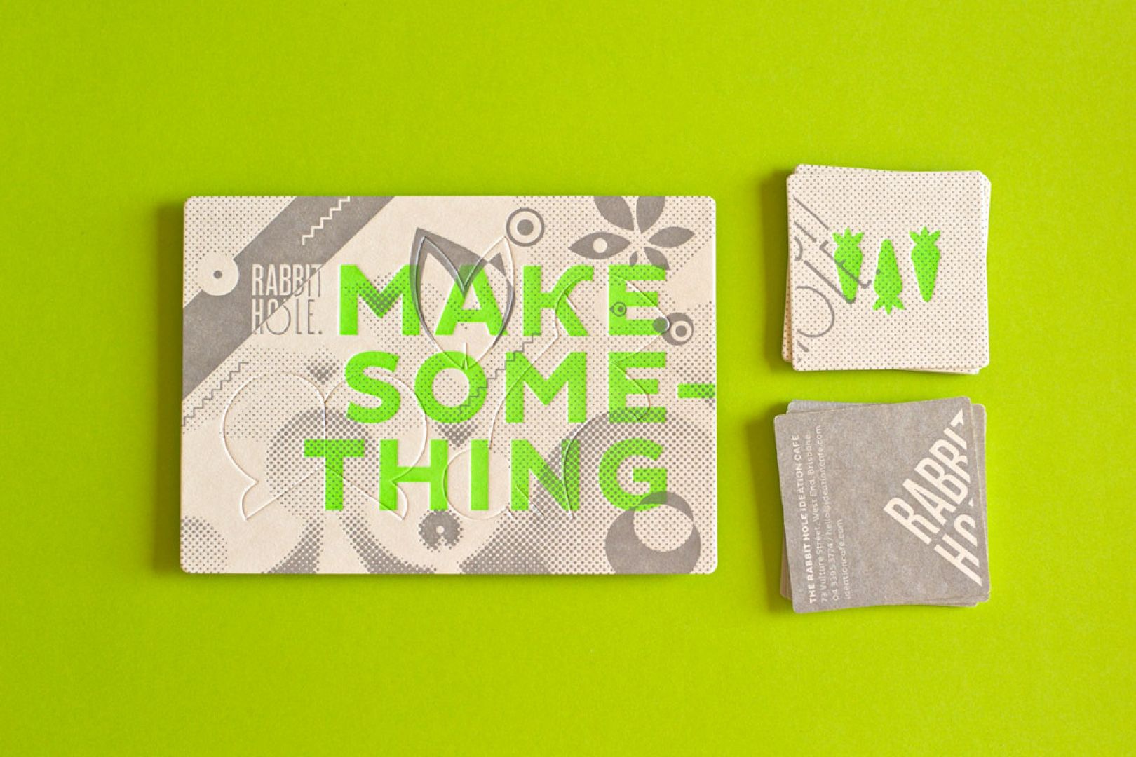
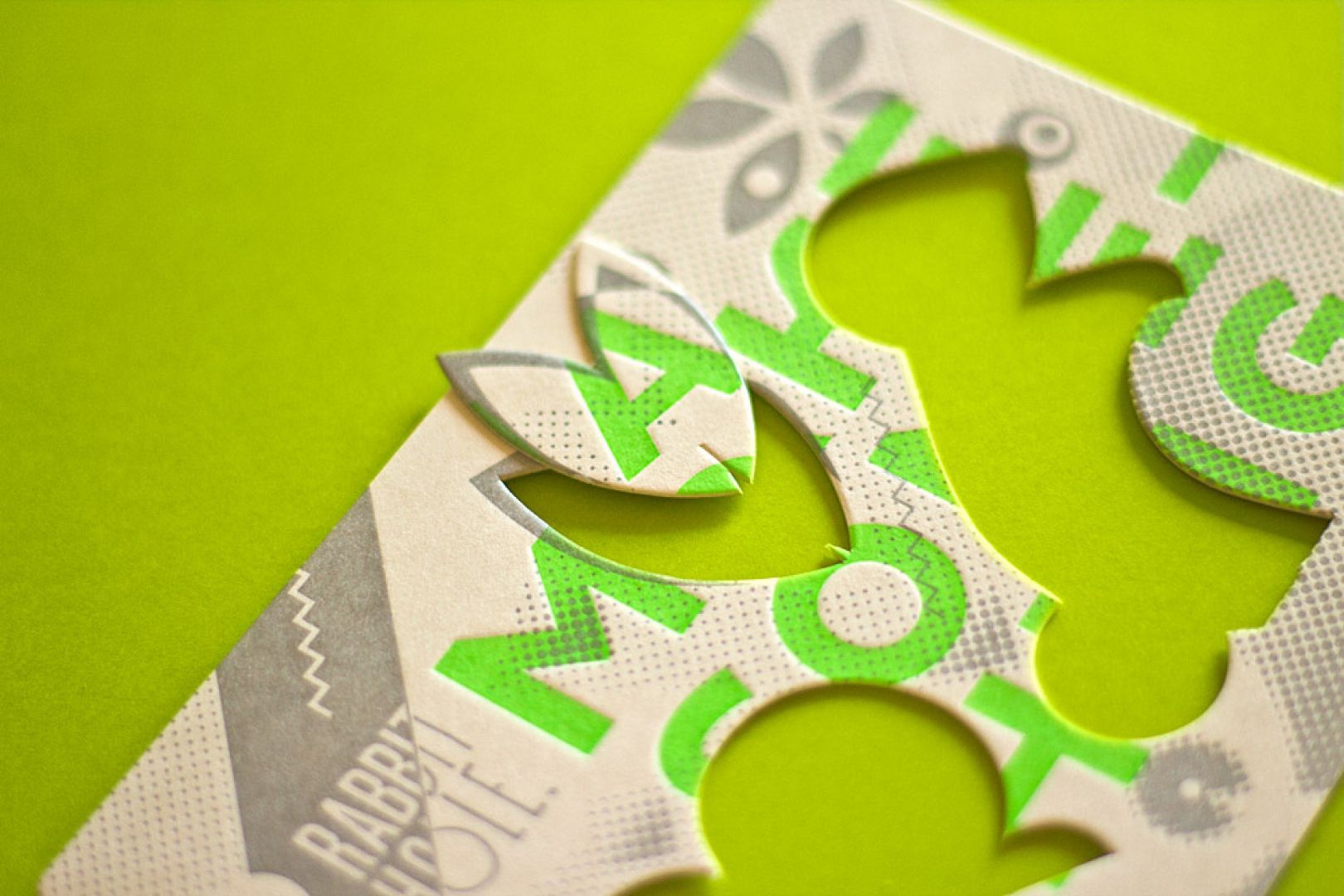
“Australian creative agency The Hungry Workshop created an identity for the Rabbit Hole Café, a co-working space for creative people. The business cards feature a “few fluoro green carrots for good measure, printed with a nice, deep impression”. Parts of the card can even be removed. How’s that for originality.”
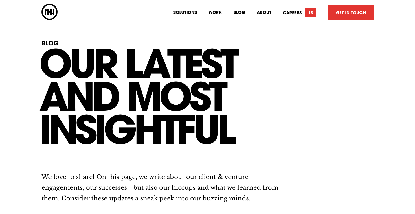
This blog, titled “Our latest and most insightful” is nicely designed and it introduces the reader with a general idea of what they’ll be reading about with large typography that grabs their attention right away.
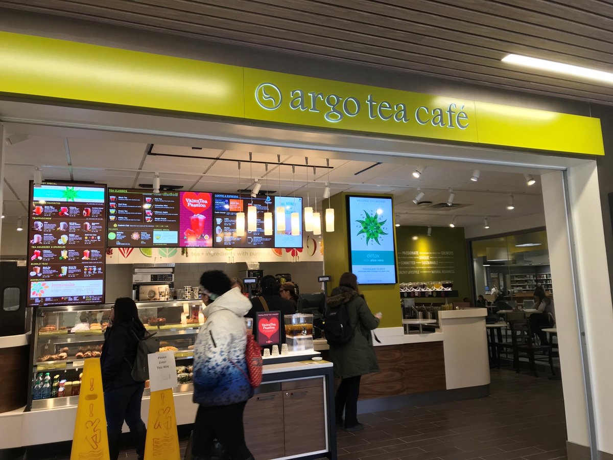
One of my most favorite places to visit on campus is the Argo Tea in Milne Library. At Argo, students can get a refreshing drink to help them study, as well as coffee and other foods. The typography of Argo tea is relaxed, being that it is all in lowercase letters, and the logo is simple but distinguishable. The light green that they use on their walls and banners is natural, calm, and serene, just like their tea and environment.
One of the most well-known restaurants in the world is McDonald’s, because of its consistency and convenience. It is globally recognized as the Golden Arches, and it is loved by many. This company as a whole has a good identity system because it’s logos and products are red and yellow, which psychologically induces hunger on the viewer. It is also easily recognized. Their mascot, Ronald McDonald, is a friendly clown who admires children and there are charity systems that run in his name. Both children and adults feel comfortable and happy when they walk into a McDonald’s. As well as their jingle, “I’m lovin’ it”, and the scent of their fried oil that can be detected from a mile away, this fast food chain is distinctive from its competitors. Designer Jim Schindler created the iconic M for the McDonald’s logo back in 1962, and it is still used to this day.
https://blog.logomyway.com/mcdonalds-logo-history/

The very first graphic design agency dates back to 1903, and it was called the Wiener Werksätte (Vienna Workshop). This workshop consisted of architects, artists, and designers who put their heads together to create designs to grab the attention of its viewers. Koloman Moser, a painter, Josef Hoffman, an architect, and patron Fritz Waerndorfer established this workshop and created a promotional banner for this new agency.
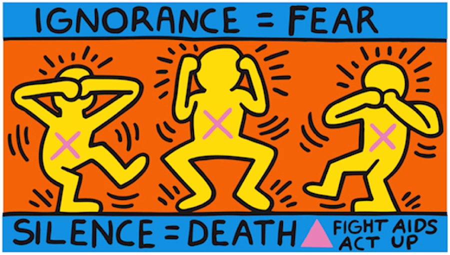
Throughout history, many artists have used their visual communication skills to convey topics that they felt needed dire attention or to be protested against. This is usually achieved by showing something to provoke shock value to the viewer or to make them think harder about something that they otherwise would not. Keith Haring, a famous artist from the 1980s, was no different. He is known for depicting his figures in joyous scenes, such as his easily distinctable but unnamed print of five dancing men in front of a yellow background. In a particular print of his titled Silence = Death, his usually peppy figures are drawn to be distressed by the silence against AIDS. Seeing brightly colored figures expressing negative emotions with X’s marked on their chests feels out of character for Harring’s designs, but this further emphasizes the importance of how necessary it is to fight against AIDS. Art historian, critic, and writer Ruth Millingon posted an article describing Harring’s picture amongst others made by different artists that also promote change or activism.
https://ruthmillington.co.uk/11-famous-protest-art-examples/
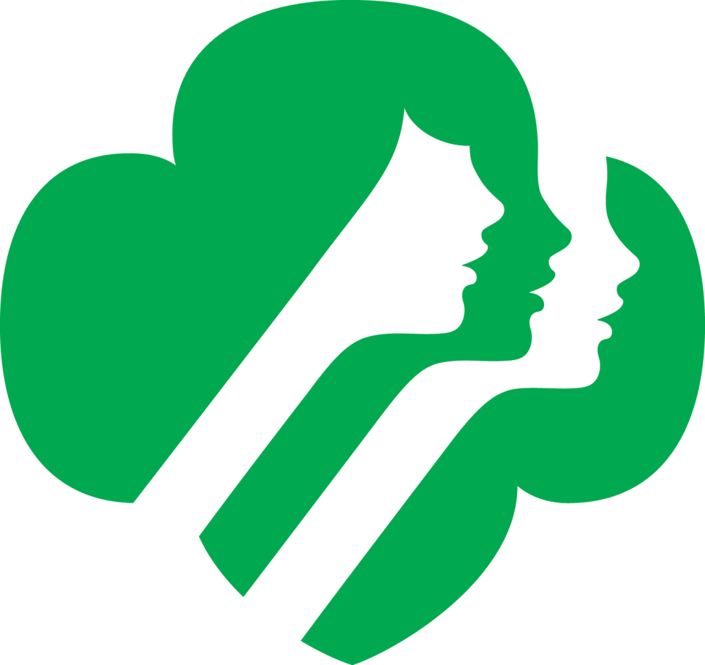
An example of a logo that utilizes ambiguity of positive and negative space to convey a meaning is the classic Girl Scouts logo. At first glance, one could see three side profiles of girls’ faces. Then, one may notice that the three faces are layered in a design that resembles a clover, a symbol that is commonly associated with luck and nature. The logo was created by a graphic designer named Saul Bass in 1978.
https://www.famouslogos.us/girl-scout-logo/
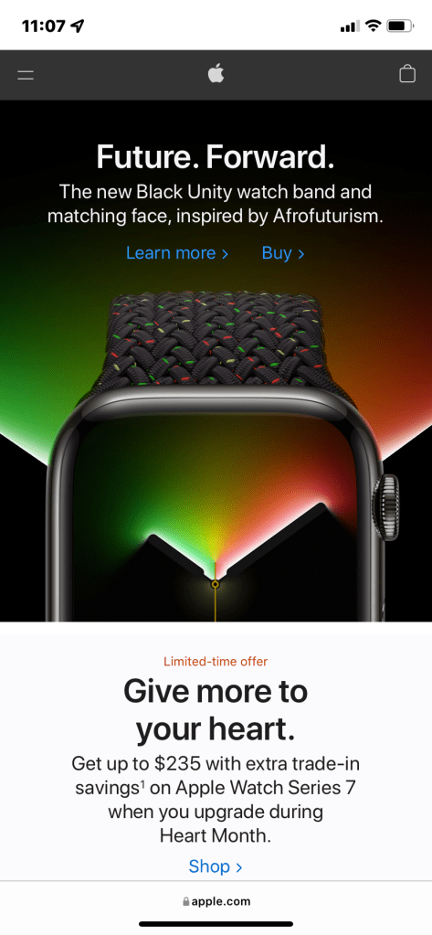
Apple’s page design is undoubtedly beautifully designed. It’s webpage showcases all of the devices that they are currently selling in a stunning display. A white background makes the text easy to read, and by scrolling down, each of the products shift effortlessly in a mesmerizing way while delivering promotional information about their products. The home page features backgrounds that are mostly white, but their most special products may have a colored background, making them stand out to the viewer. Even if a user has no intentions to actually buy a product, they would still likely enjoy the experience of scrolling through these beautiful designs.
The very first graphic design agency dates back to 1903, and it was called the Wiener Werksätte (Vienna Workshop). This workshop consisted of architects, artists, and designers who put their heads together to create designs to grab the attention of its viewers. Koloman Moser, a painter, Josef Hoffman, an architect, and patron Fritz Waerndorfer established this workshop and created a promotional banner for this new agency.
https://uxdesign.cc/a-brief-history-of-graphic-design-90eb5e1b5632

