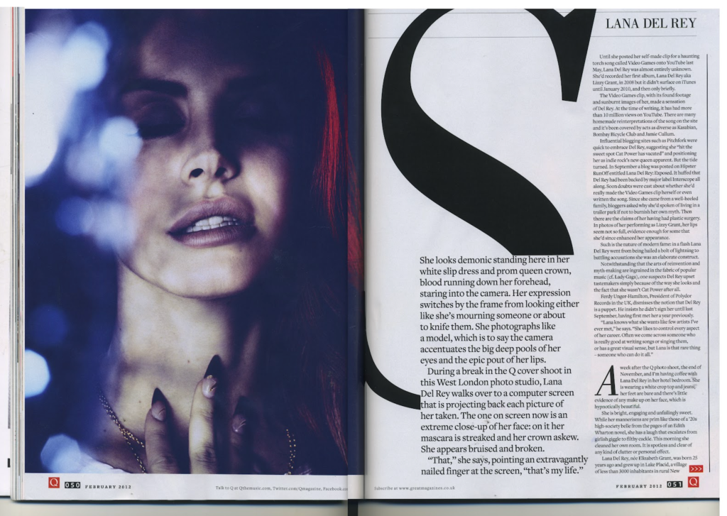
I love this magazine page layout because of how simplistic it is. It is straightforward and easy to read. The page gives the title of who they are reporting on as well as an image that takes up an entire page to really make it clear who this article is going to be about. The page has a clear introduction paragraph and two main paragraphs. The magazine uses negative space well. It centers the introduction paragraph on the bottom, which leads readers eyes to move to the top right, which is where the actual article starts. In total there are three main paragraphs, with mini paragraphs within them, making it easier to read since it doesn’t overwhelm people with several blocks of text.
There is a clear hierarchy of text within the article page. The introduction paragraph’s font size is bigger than the other article paragraphs and is bolded as well, making it clear that what people are reading is the beginning of the article. It then leads the readers eyes to the right column to where the article starts. In that column contains two big paragraphs, which then breaks down to smaller paragraphs of around 2-3 sentences, which makes it easier to read since the paragraph isn’t just one big blob of sentences, which people can easily lose focus in.

Hello! I love Lana Del Rey’s music so I felt I just had to reply to this post! I agree that Q magazine truly created a series of beautiful pages with this layout. Since we started talking about columns in class I now notice the number of columns the designers use in their work. I estimate that this designer used about seven columns to layout their work. I love how to the letters “S” and “A” act was an art piece within the article but it’s not distracting. I noticed that the text that the designer put in big letters is super intriguing and interesting like a story which would definitely encourage the viewer to read on. Great post!
LikeLike
hello, I also love Lana Del Rey’s music. the page you choose is very interesting, especially the image on the right. the color contrast used in the photo is great. the big s being used in beginning of the paragraph greats difference in the typing style.
LikeLike