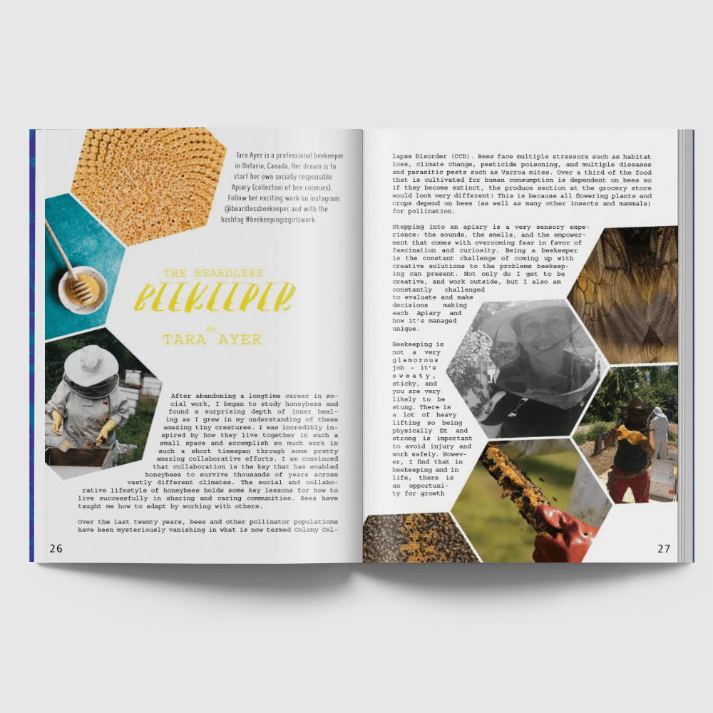
I think that this layout is very interesting and well thought about because of the way it uses the topic of the article to influence its layout theming. The article is on Beekeeping so the images within this article are all shaped like honeycombs which is a very fun artistic detail used to enhance the articles layout. The way the title is placed on the left page really helps give it the attention it deserves by being surrounded by empty white space. It also has the most visual hierarchy of all the other text because it is the only piece of colored type, it has a unique font and it is the largest size. I like how the images are laid out on the spread, the asymmetry created and the weight distribution helps the title breath on the left hand page and helps the body text fill up the white space on the right. I like how the text is wrapped around the pictures but leaves enough space for a border to be placed around the images. This gives attention to the images while also helping sperate the text in a interesting way.