Johnathan Barnbrook

Johnathan Barnbrook has been considered one of the most well-known and revered graphic designers of the past three decades which recently includes creating the visual identity for David Bowie’s 2016 album Blackstar. He has talked at a multitude of festivals and conferences where he has highlighted the importance of the use of graphic design for advocacy. He also claims that due to significant events in the past decade or two like the financial crash, rise of inequality, and the rise of social media and its political usage that designers of this generation are more focused on and aware of advocacy than any previous generation.

This is an image which Johnathan Barnbrook designed for an issue of Adbusters in 2001. Adbusters is a not-for-profit publication that criticizes and advocates against “the hostile takeover of our psychological, physical and cultural environments by commercial forces”. This image particularly advocates for issues that graphic designers face when working with big corporations and companies.
Blog Post 9: Self-Promotion

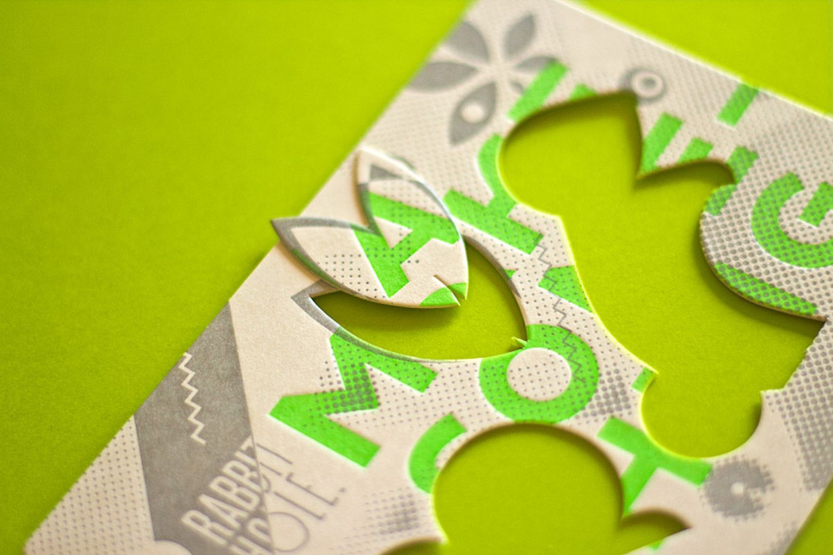
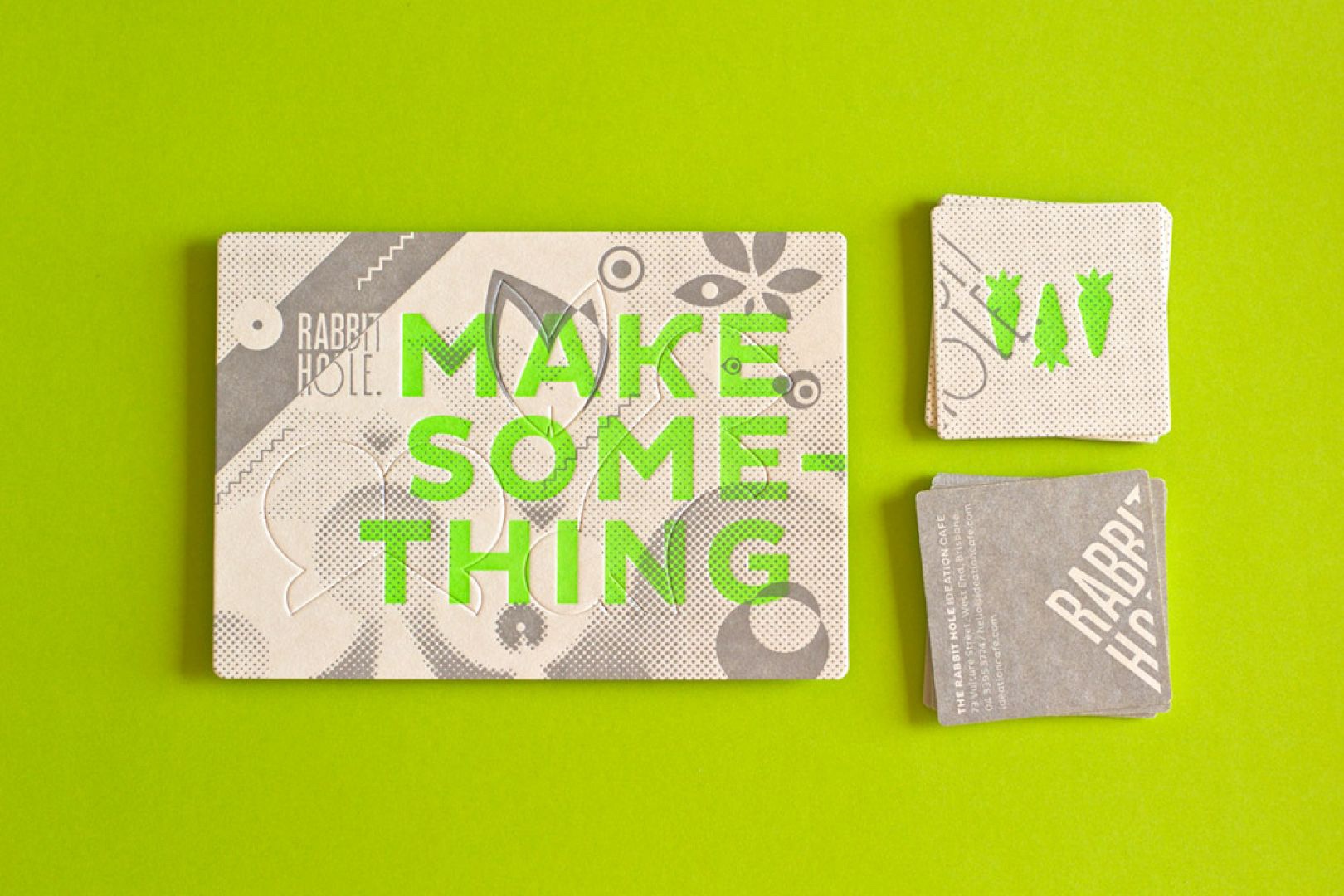
“Australian creative agency The Hungry Workshop created an identity for the Rabbit Hole Café, a co-working space for creative people. The business cards feature a “few fluoro green carrots for good measure, printed with a nice, deep impression”. Parts of the card can even be removed. How’s that for originality.”

https://www.creativeboom.com/inspiration/16-of-the-sweetest-business-card-designs-from-some-of-the-worlds-best-designers/

WIX


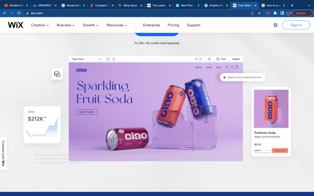
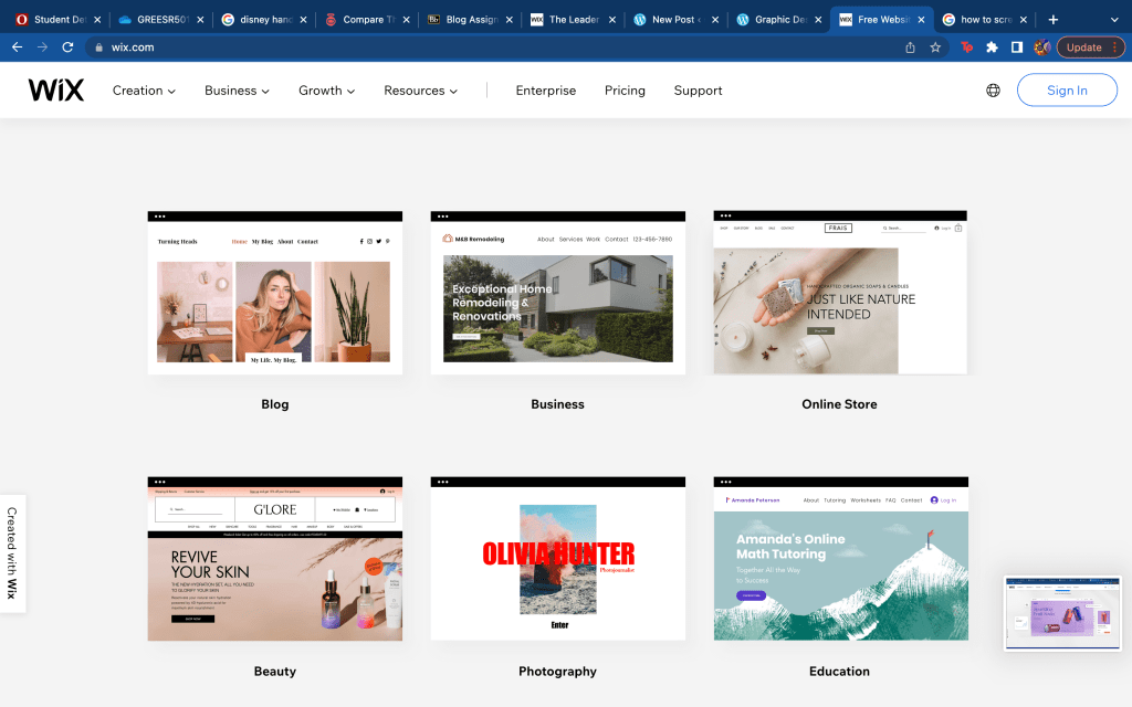
Wix is a platform where people can create their own website and design it how they choose to. People are able to express themselves by creating a site exactly how they want it to be. Wix gives you many templates to choose from and topics your website will be. Sites like this are able to give people a way to publish their work and make websites for themselves for people to use, explore or have people discover their work or what they are selling. People could also use Wix to create websites to be able to stand up for something they believe in or to create blogs. I think websites like these make it easier for people to create their own websites and show their work and what they are capable of doing to show future clients or to show future job opportunities their talents. It is easily accessible and easy to figure out based on directions they provide on how to create your site perfectly.

/https://www.wix.com/

Online Portfolio: PortfolioBox

Ivanah Alexandre

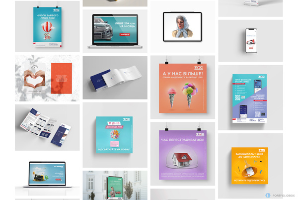
When I first went on Portfolio.net‘s website my first instinct of course was to scroll down to learn more about the site. Instead of the interface just scrolling down to display more information, the whole page zoomed out and showed a beautiful arrangement of portfolio work. I thought this feature was really engaging and different. Caught me by surprise. The design of the site is very sleek and user friendly. I like that this site caters towards many different art forms as opposed to just photography or just graphic design. The site provides you with a free domain and there is no coding needed. Another cool feature that PortfolioBox offers is allowing for the designer to interact and receive information from clients and viewers.

Self-Promotion piece: Jessica Walsh

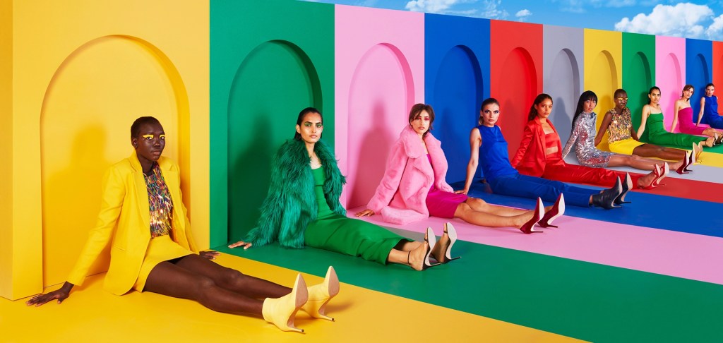
For this blog post I found Jessica Walsh’s website eye catching. After looking at her website and her work I was very intrigued with the colors she used and how her pieces are all clean but catch the viewers attention to make them more interested and invested. The point of putting your work on a website is to be more known and discovered by more potential clients. The first image I added to this blog is a really good image to catch peoples attention and promote her work. First, because the bright colors tend to catch viewers attention more. Secondly, It is made with the women wearing colors of the rainbow and posing in many different ways with different backgrounds and colors to show inclusiveness. The second image I included in this blog post is more simple however, Jessica Walsh uses her symbol a lot in her work. This symbol is simple yet bold since it is in majority of her work in a very large size. Jessica Walsh is promoting her use of design as well as photography and direction in her work. The pieces she has on her website are made to show clients what she can offer to them for any project they need. I really enjoyed looking through Jessica Walsh’s website and looking at the work she has created and what she is able to create. I recommend looking at her website and looking at her work.

https://andwalsh.com/

Self Promo: Tia Adeola

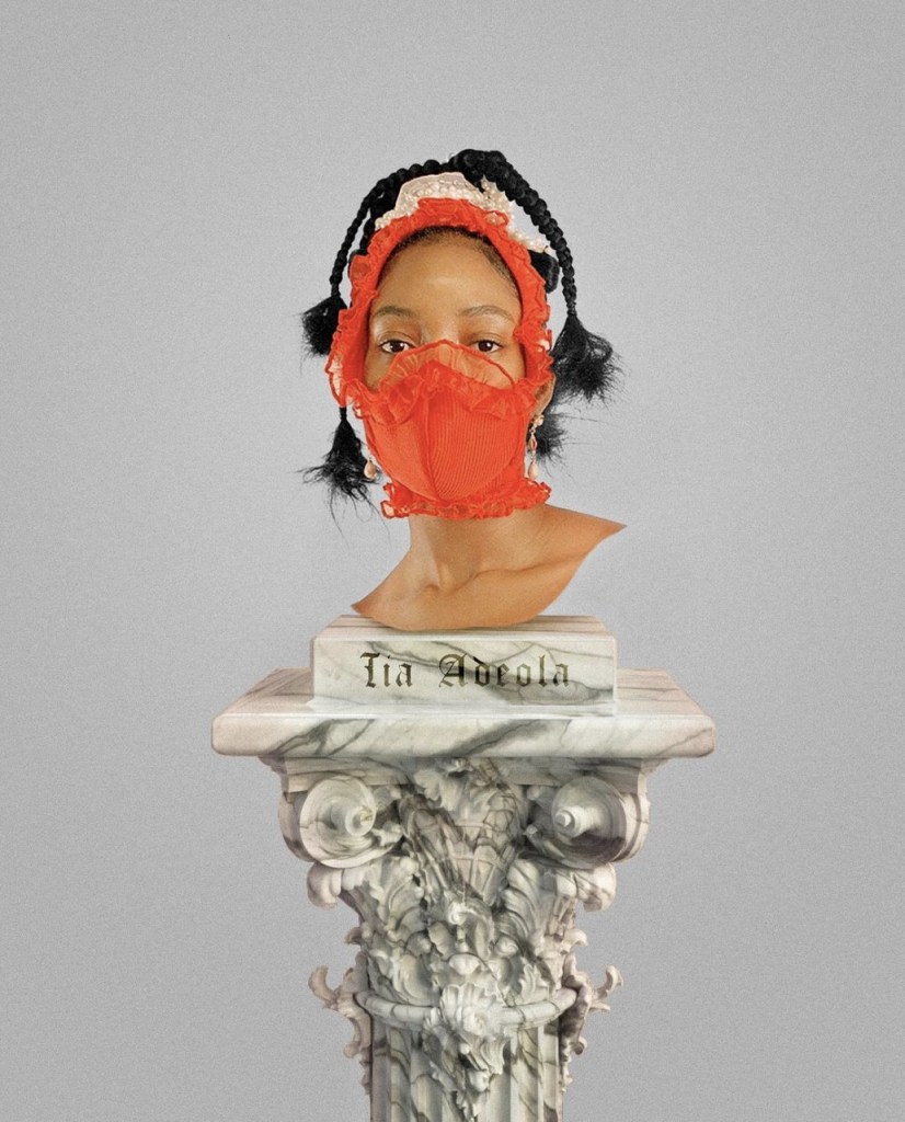
I found this self promotion of fashion designer Tia Adeola to be very interesting and creative. Tia Adeola is one of my favorite fashion designers. She inspires me so much! She’s about my age -maybe a couple years older- and she is also first generation American. She is so gifted and has developed an amazing brand. Here she is promoting the face masks that she started selling admist the pandemic. She essentially dressed up K-95s in beautiful fabric and ruffles. Many celebrities saw these promotions on Instagram and bought her masks! I think it is so cool that she made the model look like she is a statue head. The whole thing reminds me of a museum of course. Which is onboard for her because she is a big fan of Art History. I also love how simple it is. It just shows the mask, and her name. No unnecessary text. If you are interested in buying a mask all you would need is her name and that’s the only piece of text on this promotion.

Information Design: Suicide in the United States.

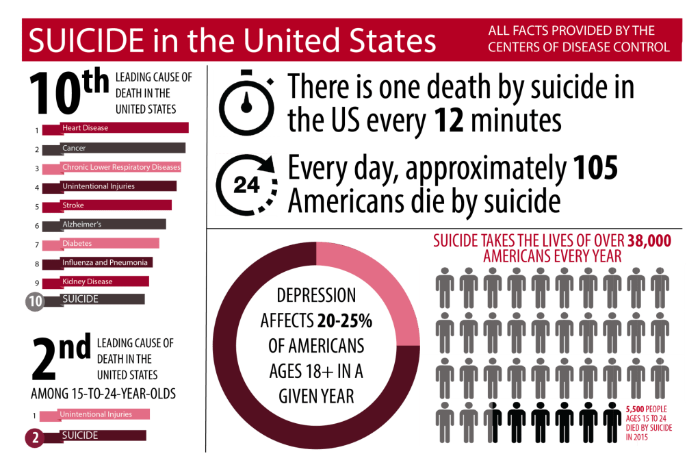
I chose to do an information graphic on suicide because I feel that not everyone really knows how often it happens and the information behind it other than just the surface. In this information design the creator uses their images to show the information they are trying to show other people. The percentage of depression is represented in a ring by different colors to show how many adults have depression in a year. The design also uses symbols of men to show how many deaths are caused by suicide. Each drawing of a man represents 1,000 lives. The grey men show how many lives in total are taken and the black ones represent the 5,500 people that are age 15-24. On the left hand side, there is a list of the top 10 causes of deaths in the United States and each section of it is drawn to length of how many deaths are calculated by that cause. All of these design factors such as color, symbols, size, shape and more all help portray the information that is meant to be heard.

Information Design: History of Communication

ThinkingPhones.com

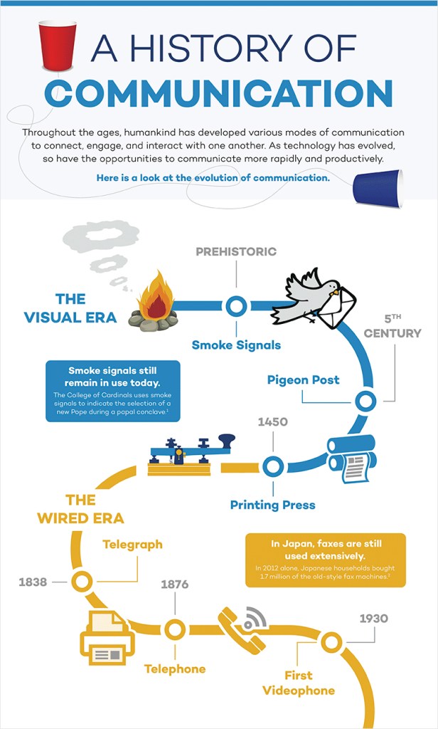
I find this infographic to be really effective for many different reasons. I like that the designer used images and text to communicate and illustrate the data. If I didn’t know how to read I feel like I would still be able to comprehend the history of communication because of the photos. The photos are super simple too which make the whole thing less complicated and easier to read. I also like the way the page is broken up by the timeline. Our eye naturally follows the swirl of the timeline from top to bottom. I also appreciate the use of color. Here color is breaking up “The Visual Era” (blue) with “The Wired Era” (orange). I noticed how the timeline goes off the page which shows that there is a future to communication and the videophone isn’t the last stop. This detail can have the viewer imagine what other communication inventions the future holds. Perhaps holographic communication or virtual reality communication that makes it feel like the person(s) you are communicating with are actually there! I also like how there is not that many words used, the designer only used necessary words!

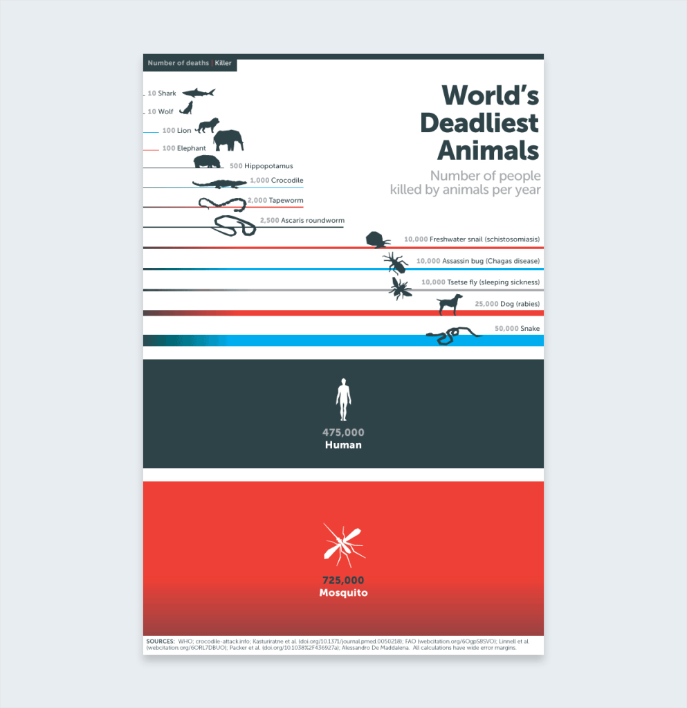
Information Design- World’s Deadliest Animals

Bill Gates has helped fight malaria, a disease that kills over one million children a year. In 2014 he published the above infographic to his blog. This really caught my attention. It has minimal words and bold lines and colors. The bold lines and colors are the main image and information. It is very clear that the mosquitos are a much higher threat than sharks. This information is very shocking, surprising, and awakening to those who don’t know much about mosquitos and malaria. The simple illustrations are very straight forward. You immediately know the message of the infographic and you know exactly what it means. This is very well-done.

https://www.gatesnotes.com/Health/Most-Lethal-Animal-Mosquito-Week