Great Design Blogs: Women Of Graphic Design

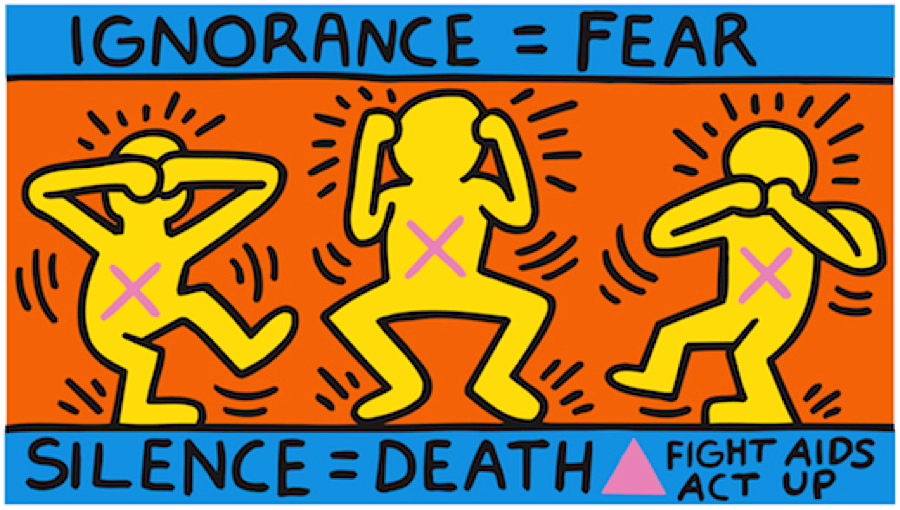
This graphic design blog caught my attention because it gives women a place and chance to show their work. This blog also explores issues of gender-equality by designs. I really liked this page seeing art showing their stands on political and economic issues and more. They took their designs and made it more related to the world. This blog includes many different forms of art between website designs, logo designs, typography, magazines and more this is a safe space to upload your art on different issues for it to be seen. If you are looking to see artwork with deeper meanings and pieces to take a stand on many problems this is the perfect blog post. The designs on this page take art and use it to express themselves while still creating work for clients. I really enjoyed this blog page and recommend it to any other readers looking for this type of blog.

Great Design Blog: Vogue Talents

Ivanah Alexandre

I decided to look through the winners and nominees of the awwwards to find some impressive blogs. They did not disappoint. Awwwards has a great catalog of great graphic design in the world of websites, blogging, apps, magazines, etc.. One of the blogs that caught my attention was the World of Vogue Talents blog.

What I found particularly interesting about this blog was how the designer decided to set up the blog. It is not your traditional blog set up. The blog is set up in an interactive way that simulates a fantasy world in which the user can “fly” around through. Using the mouse the user can glide to a page which would lead them to a link. It is very unique! I don’t see a lot of websites or blogs set up this way. The style of art reminds me of a modern video game but it is very chic and “tech”. The mouse “grows” greenery (leaves, plants, flowers) around it as it moves which is a detail I really love. There is also a sense of a foreground and a background. There are mountains in the background. Once you click on one of the links the the pictures sort of dance around which is cute.

Blog Assignment 6: Seen in the Real World

One of my most favorite places to visit on campus is the Argo Tea in Milne Library. At Argo, students can get a refreshing drink to help them study, as well as coffee and other foods. The typography of Argo tea is relaxed, being that it is all in lowercase letters, and the logo is simple but distinguishable. The light green that they use on their walls and banners is natural, calm, and serene, just like their tea and environment.

Seen in the Real World: Snickers

When looking for a brand to do this post I saw my roommate open a snicker and I just had to use it. I feel like the identity of this brand is famous and recognizable. Even when the logo is very simple and straightforward, its cachets people’s eyes and it creates an impact. Witch I feel is important if we consider how competitive the chocolate market can be. the logo is framed by a thin red line and features all-capital letters to one height. The lines of the typeface are refined giving a modernized look besides this the letters have a small white background, which adds volume and dynamics to the logo it also makes the letters more visible against the dark brown background. As I mentioned before it is a simple logo, but I feel it has so much personality. It really reflects the idea of sincerity that the brand is always trying to sell to its customer.

Bang Energy Logo and Packaging

The packaging for the Bang energy drinks caught my attention because of the color choices and the design to it. The flavor of this drink is cotton candy so using the bright colors pink and blue helps contribute to the feeling that it is a happy and sweet flavor. Also, the colors pink and blue are commonly associated with cotton candy. This is an energy drink so the design should symbolize being energetic, upbeat and strong and I think this design portrays that perfectly. The vibrant colors, font size and illustration make this drink seem more aesthetic and appetizing to the customers. I also believe that the “b” is made to look like either a speaker, a wave of sound or to catch your attention to also portray that being loud is apart of being energetic from the item. Already, the flavor being cotton candy makes it stand out over other energy drinks but the logo design with the splashes of color behind it make it much more appealing to people looking for this type of drink. I think this design works well because it is a simple logo that it is not too busy but also is not boring where the person looking at it is not uninterested.

Blog Assignment 5 : Identity System

One of the most well-known restaurants in the world is McDonald’s, because of its consistency and convenience. It is globally recognized as the Golden Arches, and it is loved by many. This company as a whole has a good identity system because it’s logos and products are red and yellow, which psychologically induces hunger on the viewer. It is also easily recognized. Their mascot, Ronald McDonald, is a friendly clown who admires children and there are charity systems that run in his name. Both children and adults feel comfortable and happy when they walk into a McDonald’s. As well as their jingle, “I’m lovin’ it”, and the scent of their fried oil that can be detected from a mile away, this fast food chain is distinctive from its competitors. Designer Jim Schindler created the iconic M for the McDonald’s logo back in 1962, and it is still used to this day.

https://blog.logomyway.com/mcdonalds-logo-history/

Monster Drink Identity System

There are many energy drinks such as redbull, bang, rockstar and more. However, the packaging for the monster drink catches a customers attention more than the other brands. Monster has designed its cans with a variety of vibrant colors for each flavor. The monster logo on each can remains the same but the silver pattern and color changes with each can. Monster is a huge company and a huge product that is very well known today. I think its design has something to do with the huge compel to choose monster over the other branded drinks. The bright colors are meant to catch your attention and draw you to their product. On their website, they have many different options of energy drinks such as Monster Energy, Monster Energy Ultra, Java Monster Coffee+Energy, Hydro, Rehab Monster. All of these different categories make monster more compelling to buy. On the website they say “Sweet and salty- It tastes like Monster!” The advertising with this product and the logo has made monster a very popular drink.
https://www.monsterenergy.com/https://www.monsterenergy.com/us/en/products/monster-energy?utm_source=google&utm_medium=cpc&utm_campaign=green_brand_exact&utm_adgroup=general&utm_objective=traffic&gclid=Cj0KCQiAmpyRBhC-ARIsABs2EAoL9NjK_aHqQkuHD_uG8xe3P9LwrQHkgrj3Gfr1rAPDDwTCxzyh5sIaApoiEALw_wcB

Blog Assignment 2: History of Graphic Design

The very first graphic design agency dates back to 1903, and it was called the Wiener Werksätte (Vienna Workshop). This workshop consisted of architects, artists, and designers who put their heads together to create designs to grab the attention of its viewers. Koloman Moser, a painter, Josef Hoffman, an architect, and patron Fritz Waerndorfer established this workshop and created a promotional banner for this new agency.

Blog Assignment 1: Graphics for Change

Throughout history, many artists have used their visual communication skills to convey topics that they felt needed dire attention or to be protested against. This is usually achieved by showing something to provoke shock value to the viewer or to make them think harder about something that they otherwise would not. Keith Haring, a famous artist from the 1980s, was no different. He is known for depicting his figures in joyous scenes, such as his easily distinctable but unnamed print of five dancing men in front of a yellow background. In a particular print of his titled Silence = Death, his usually peppy figures are drawn to be distressed by the silence against AIDS. Seeing brightly colored figures expressing negative emotions with X’s marked on their chests feels out of character for Harring’s designs, but this further emphasizes the importance of how necessary it is to fight against AIDS. Art historian, critic, and writer Ruth Millingon posted an article describing Harring’s picture amongst others made by different artists that also promote change or activism.

https://ruthmillington.co.uk/11-famous-protest-art-examples/