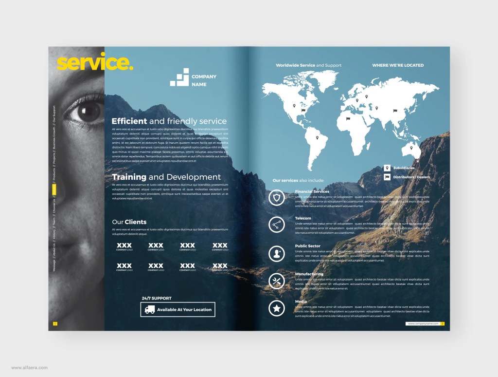
I really enjoyed the design on this page. I feel like the colors and the pictures work well together; I really like how there are no white spaces on these pages but it is still eye-catching whiteout being overwhelming to the reader. It has a lot of negative space but this one is active thanks to the picture acting as background and the text layout. I feel that the text also works well with the background, the white really stand out from the colors of the background and it makes it looks easy to read. The text is not extremely long and is organized neatly, the icons through the pages also help the organization of the design and it also helps to separate the text to make it more eye-catching to the readers as well as easier to interpret.
