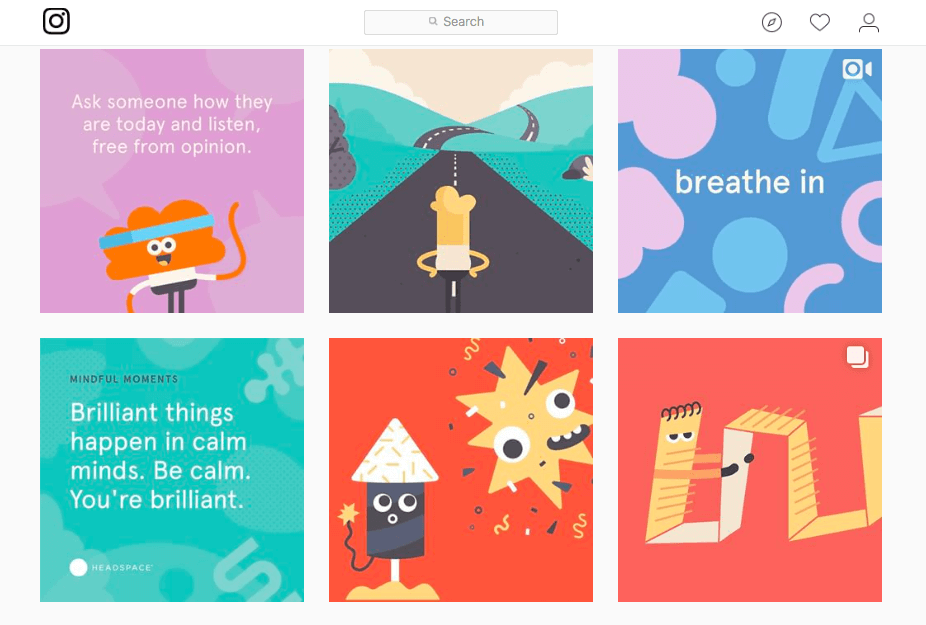
Headspace is a meditation app that uses science to help its users calm down from stressful days, lull users to sleep or boost their mood for a brighter day. The brand implements cute and colorful graphics to help push the calm and happy vibes. The color palettes used in most of their branding are calming blues popping yellows and serene purples bringing in the elements of stress relief, inviting joy and peaceful rest. They make great use of the cute characters within their branding as well making them flexible and fun shapes to bring home the message that anyone can use their app. These graphics are also very simplistic and fun to look at making their website and social media very easy to scroll through. I also like the name of this brand because this app is pushing to help users make their headspace a better place to be. So its a very straightforward name for this brand.
This is so cute! I love that the company still keeps its design really colorful, but not too bright or overbearing. Just like their goal, the color palette is toned-down just enough to have a calming effect without being gloomy and dull. Their design concept is very cute and consistent, love it!
Headspace has such a cute design. Their brand emanates calm vibes which I understand is the whole point of their design. The designers use calm pastel colors throughout all of their graphics and conveys the message of calm. I also enjoy that their banner when you first enter (looking at the pictures you posted) is calm and neutral tones. The consistency of the vibrancy of color really ties the brand together.
The design of Headspace is cute and pretty recognizable through the use of those little characters as well as the colorful palette. Though Headspace uses many different colors, none of them are overbearing and distract from being able to focus and navigate the website.


This is so cute! I love that the company still keeps its design really colorful, but not too bright or overbearing. Just like their goal, the color palette is toned-down just enough to have a calming effect without being gloomy and dull. Their design concept is very cute and consistent, love it!
LikeLike
Headspace has such a cute design. Their brand emanates calm vibes which I understand is the whole point of their design. The designers use calm pastel colors throughout all of their graphics and conveys the message of calm. I also enjoy that their banner when you first enter (looking at the pictures you posted) is calm and neutral tones. The consistency of the vibrancy of color really ties the brand together.
LikeLike
The design of Headspace is cute and pretty recognizable through the use of those little characters as well as the colorful palette. Though Headspace uses many different colors, none of them are overbearing and distract from being able to focus and navigate the website.
LikeLike