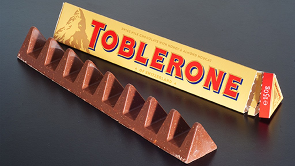
The Toblerone logo dates back to the year 1908 and was created by two men, Theodor Tobler and Emil Baumann. When creating the logo, their goal was to create the shape of a mountain to emulate the shape of their chocolate bar, as their chocolate bars are known for their triangular shape. In addition to echoing the bar shape, they wanted buyers to recognize the mountain icon as the Matterhorn in the Swiss Alps. Within the Matterhorn, Tobler and Baumann chose to incorporate the symbol of a bear in their logo due to the chocolate bars origins. Toblerone was created in Bern, Switzerland which is also known as the “City of Bears”. The bear is featured on the city’s coat of arms and by including the bear, they are paying homage to the treat’s birthplace. At first glance, the bear is hardly noticeable and many may dismiss it at the snow on the alps. If the viewer takes a moment to look at the logo more closely, they will notice the bear standing on its hind legs. This ambiguity is what I believe makes this logo a great example of using positive and negative space.
For more information on the development of Toblerone check out the link below: https://www.mondelezinternational.com/Our-Brands/Toblerone
Check out their brand website here: https://www.toblerone.co.uk/en
