Online portfolio

https://www.weebly.com/websites

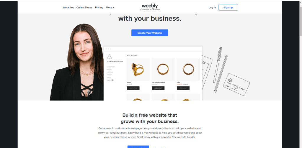
I chose to look at Weebly because it is a free way for someone to make a website for their portfolio. they give you lots of options to pick from when creating your website. once you create a website off off Weebly people can start viewing your work, and they can start purchasing designs or prints that you add to your website. I think it very cool that you could potentially make money off of a website your created for free. I really like that Weebly gives you the option to create a website for free because some people don’t have the money to pay a monthly subscription to have there own website. But with Weebly you can start getting your name out their for free.

Self Promo By Dalila Niespolo

I chose to show case Niespolo’s self promo because I think it is extremally well done. It is a resume that does such a good job of showing that she is a designer but keeping it very simple and easy to read. I also really enjoy her color choice, the blue fits well with her theme throughout the self promo. One of my favorite aspects is how she uses charts to show how proficient she is in each designer software. I think this is a unique touch to her resume that allows the viewer to very quickly see what she brings to the table. Lastly I really enjoy the little self portrait. I like that it breaks up the page into two parts. i also enjoy that it really takes this from being a normal resume to a designers resume.

https://www.behance.net/gallery/93844725/HELLO-personal-resume/modules/542264843

Information Design

I chose this info graphic because it did a good job of catching my eye out of all the others. Firstly I like how simple it is, it is very neatly broke up into four sections and each one gives you data. Secondly I like the use of color, I like that the Ukraine cites are in color and the equivalent cities are in gray. lastly I like how much information you get from it, but it doesn’t make you feel overwhelmed with to much information. This is definitely due to the nice and neat organization.

https://www.webdesignerdepot.com/

I choses to look at web designer depot. the fist thing that caught my eye was the colors and the logo. both are very well deigned and thought out and are a warm welcome to the web page. This web page is well designed and easy to find what you are looking for. there also seems to be a ton of resources to help you along in your graphic design career. I also really like the sub headlines that break up the first page, they help to organize and look visually pleasing. They also have a whole section just for free graphics design types/ Fonts. they also have a quiz section where you can test your knowledge on graphic design elements. this could be very helpful to someone teaching themselves and is a nice addition.

As seen in the real world

I chose to look at some student work by Isabella Greco from the digital illustration class. I really like here work because of how simple it looks on the surface but how truly detailed it is when you take a closer look. I like the simple the walk way in the middle is, but how well its able to lead your eye through the poster. then, I really like all of the fine details in the building. the closer you look the more you see when looking at the building, I especially like the top part of the roof. the pattern there is very well done. I also really like the color through. m favorite part is the contrast between the sunset and the green trees. the contrast between the two is very nice to look at.

If you wanna see this for yourself its on the third floor in FA.

Identity System, Goodiellow & CO 

Goodiellow & CO is a Men’s apparel and accessory line that was launched by target in 2017. In 2019 they launched a men’s grooming line to go along with the original apparel and accessory line. I’m going to display their men’s grooming line as it has become one of my favorites as late. 

What I really like about this brand is how it’s simply packing is the reason that it stands out on shelves. If you’ve ever walked through the men’s grooming isle before you would understand exactly why this product would stand out. Most men’s grooming products are very bright colors, have crazy names, over the top pictures and designs, and to me they all just scream “masculinity.” But Goodiellow is simple, straight forward, and to the point. It tells you what it is, the scent, the ingredients, and does not distract you with anything else.  

WWF Logo

I chose the WWF logo because it is such a simple but good example of ambiguity of positive and negative space. The Logo was created in 1961 by co-founder Sir Peter Scott and the negative positive space version was made in 1986 at the San Francisco office of Landor. The logo was based on Chi- Chi, a giant panda for The London Zoo. I feel like this is a fairly know Logo, as I can Remember seeing it often in commercials growing up. What I think is really well down about it is that it is almost hard to see that it uses positive negative space. The white space blends so well with the black to create the shape that you miss the use of the pos/neg space and just see it as a panda. I also like how simple it is, it’s highly effective at grabbing your attention quickly and then with the use of pos/neg space can hold your attention. 

https://www.creativebloq.com/design/10-logos-make-clever-use-negative-space-61621038

Beautiful Pages

I chose this as my Page to analyze because I think it does many things successfully. I think its very easy to read and follow, This is impart due too the hierarchy of how the page was made. Also it is due to how they use all of the white space to help guide your eyes through the story. I also like the use of Sub headlines throughout the text I think this helps to keep the text organized and help the reader follow along. I also like how the two mages on the right side break up the text, this isn’t something i see done a lot in other magazine pages and I think it is visually interesting. Another thing that caught my eye is how the color of the title matches that of the picture. I think this leads to a nice flow from the picture to the title and guides the viewers eyes from picture to title to text. The white space in these pages is another aspect I think is very important, it makes the pages not feel cluttered and not like a penny saver magazine.

April Greiman

I decided to take a look at April Greiman. She was born in 1948 in New York city where she grew up. She went to the Kansas City art institute and then went to Switzerland where she learned under Armin Hofmann and Wolfgang Weingart. After her time in Switzerland learning she moved to Los Angeles and started Made in Space. “Currently, April Greiman is appointed at the Woodbury University, School of Architecture as an art instructor. She also teaches at the Southern California Institute of Architecture” Her impact on graphic design has won her awards including the Gold Medal for lifetime achievement from the American Institute of Graphic Arts. If you would like to read more about this site, you should check out this article. 

April Greiman, 1987, Pacific Wave

“Explore Safely” by Yuko Shimizu, 2008 

Yuko Shimizu is a Japanese illustrator who works out of New York city. Her work is a combination of Japanese heritage and contemporary reference. She grew up both here in the US and in Japan. She also has two college degrees, one in both countries.  

She has worked as an illustrator for many prominent companies including The New Yorker, Rolling Stone, GQ, Apple, Adobe, Microsoft, MTV, Target, National Public Radio, Time, The New York Times, And The Library of congress. Also, in 2018 she won the Hamilton King award. Now She teaches Illustration at The school of visual arts.

“Explore safely” was created in 2008 to ‘better educate teenage girls in Europe about safe sex and AIDS prevention”(paperink). I think this work speaks to me so much because at first glance you could completely miss how provocative it is, only once you’ve taken a closer look at it do you see how provocative it is. I also really enjoy the look of the poster, even though the main focus is right in the middle there is still enough going on in the background to keep it very visually interesting.  

If you would like to see more of her work you can look at her web site https://yukoart.com/