Beautiful Page TIME Website

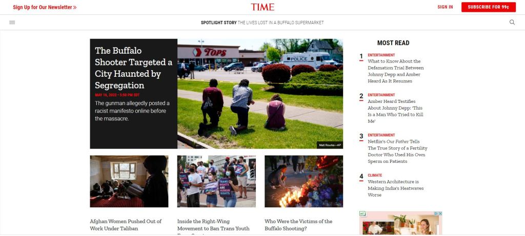
I decided with the time magazine home page because I wanted to choose something that related to my history major. This is an active news page with the purpose of being changed several times on a daily basis to show new information. As a result of this rapid cycling of information the webpage needs to be easy for a viewer to navigate and access so they continue coming back to see what is new. The simple choice of black, white, and red as a color pallet for the page makes the information being displayed very easy to read and navigate. However, this page does a great job of utilizing these basic colors as well as the font style to visually guide the viewer. For example, what is considered to be most important like topics of politics, human rights issues, and natural disasters are shown at the very center of the page behind a contrasting background but what articles are most read by viewers are beneath a bold label on the right side of the screen in smaller font without a background. This use of color and font style created a hierarchy from what they consider the most important articles and to the less important ones. Additionally, the balanced use of white space doesn’t leave the viewer overwhelmed and allows them to focus on one section of the page at a time. This white space creates a visible separation between the sections which also improves the hierarchy of the page.

Trinity Information Solutions

This simple, but effective design is what made me choose this website. This is the website of an IT/Software/Web Development company called “Trinity Information Solutions.” It is a simple website that is easy to navigate and has enough words to get the points across without overloading the viewer. The balance of white space consists of space above and below an image. The white bar at the top consists of links to other pages on his website and his logo, while the other white bar gets the importance of contact information across. The bottom dark grey portion gives a small amount of information about what the business is about and how experienced the employees are. I think this website’s simplistic design is successful due to the elements it consists of.

Website: http://trininfo.com/index.html

Beautiful Pages

This is a magazine spread that I thought was beautiful. One reason why I chose this page as a successful design was due to the interesting graphics included. I felt that this grabbed my attention and made me more interested in wanting to read what the article was about. There are thin lines interconnecting the devices which I believe it supposed to act as a wire, and I felt that this made it easy for my eyes to follow the page. I also enjoyed how the page was broken up since the designer created a clear side bar on the bottom of the page. While looking at the sidebar, I felt that the designer utilized the column spacing well as each statistical example is in its own space. They also used a different font and color for this sidebar which attracted my attention as well. It makes it easily known how you should read the graphics as well. As for the main part of the page, I felt that they used the white space pretty well. The top right edge on the first page leaves space next to the pink side bar instead of having the pink bar go all the way to the edge. In terms of the hierarchy, I noticed that their main point that the future may include a video tattoo as well as a “holiday” pod jumps out at me before the actual headlines. I was immediately interested in the ideas of futuristic inventions and led me to want to read more. It was also placed in a darker color pink than the pink side bar so I knew it was more important than the rest of the text. I believe that using the warmer color pink was a good choice and caught the attention of the reader quickly. This article looked really cute and I loved the aesthetic. The designer did a great job making their spread fun to read!

Beautiful Pages

I chose this as my Page to analyze because I think it does many things successfully. I think its very easy to read and follow, This is impart due too the hierarchy of how the page was made. Also it is due to how they use all of the white space to help guide your eyes through the story. I also like the use of Sub headlines throughout the text I think this helps to keep the text organized and help the reader follow along. I also like how the two mages on the right side break up the text, this isn’t something i see done a lot in other magazine pages and I think it is visually interesting. Another thing that caught my eye is how the color of the title matches that of the picture. I think this leads to a nice flow from the picture to the title and guides the viewers eyes from picture to title to text. The white space in these pages is another aspect I think is very important, it makes the pages not feel cluttered and not like a penny saver magazine.

Beautiful Pages

When I open up a magazine, pages like this are the ones that make me want to flip to the next page. Theres some sort of simplicity but complexity to this spread at the same time. I like it when the words on the pages are sectioned off, like the second. It makes me think that I can pick and choose what I can read based on my interests. If it consists of one big blob, I find that I have to read everything before the part that interests me. Although the text boxes are separated, it flows with the page and the visuals instead of feeling all over the place. The white spaces on the first page could be described as art alone. The image inside the letter keeps the readers eye interested for a couple seconds most likely too. The separation of images on the second page keep my eye bouncing around at first glance, It seems balanced in its own way. All around I love how this page is designed, and if I were reading I would definitely be eager to flip the page.

Beautiful Pages

I think that this layout is very interesting and well thought about because of the way it uses the topic of the article to influence its layout theming. The article is on Beekeeping so the images within this article are all shaped like honeycombs which is a very fun artistic detail used to enhance the articles layout. The way the title is placed on the left page really helps give it the attention it deserves by being surrounded by empty white space. It also has the most visual hierarchy of all the other text because it is the only piece of colored type, it has a unique font and it is the largest size. I like how the images are laid out on the spread, the asymmetry created and the weight distribution helps the title breath on the left hand page and helps the body text fill up the white space on the right. I like how the text is wrapped around the pictures but leaves enough space for a border to be placed around the images. This gives attention to the images while also helping sperate the text in a interesting way.

Blog Assignment 3: Beautiful Pages

Rumfoords | Metaverse Agency

Ivanah Alexandre

Rumfoords | Metaverse Agency Nominee for Awwwards

This website page was design by CTHDRL, a web designer from the United States. It was nominated for Awwwards -the awards for design, creativity and innovation on the Internet.- for its creative presence. The metaverse is a new yet interesting concept to me. From my understanding the metaverse is a fictional world that has a lot of nonfictional value to people especially in the tech world. According to Wikipedia it is is a network of 3D virtual worlds focused on social connection.

This web design captures exactly the vibe I get from the concept of the metaverse. The subject being a techy-futuristic creature that closely resembles a human being is perfect. I also like how simple it is. The brand name and the creature are the only things on the page but the artwork is exciting enough to keep the viewer engaged. I like how the creature blocks a part of the title but the viewer already know what the title is. The pages buttons at the top are in white and contrasting the black background so the viewer can easily see it and enticed to click on it. My eye goes directly to the creature first and then the silhouette of the create guides my eyes to the brand name and the page buttons.

The Beautiful Page: Magazine Spread

Image found from: Pinterest; Q Magazine, February 2012

I love this magazine page layout because of how simplistic it is. It is straightforward and easy to read. The page gives the title of who they are reporting on as well as an image that takes up an entire page to really make it clear who this article is going to be about. The page has a clear introduction paragraph and two main paragraphs. The magazine uses negative space well. It centers the introduction paragraph on the bottom, which leads readers eyes to move to the top right, which is where the actual article starts. In total there are three main paragraphs, with mini paragraphs within them, making it easier to read since it doesn’t overwhelm people with several blocks of text.

There is a clear hierarchy of text within the article page. The introduction paragraph’s font size is bigger than the other article paragraphs and is bolded as well, making it clear that what people are reading is the beginning of the article. It then leads the readers eyes to the right column to where the article starts. In that column contains two big paragraphs, which then breaks down to smaller paragraphs of around 2-3 sentences, which makes it easier to read since the paragraph isn’t just one big blob of sentences, which people can easily lose focus in.

Beautiful pages

I really enjoyed the design on this page. I feel like the colors and the pictures work well together; I really like how there are no white spaces on these pages but it is still eye-catching whiteout being overwhelming to the reader. It has a lot of negative space but this one is active thanks to the picture acting as background and the text layout. I feel that the text also works well with the background, the white really stand out from the colors of the background and it makes it looks easy to read. The text is not extremely long and is organized neatly, the icons through the pages also help the organization of the design and it also helps to separate the text to make it more eye-catching to the readers as well as easier to interpret.