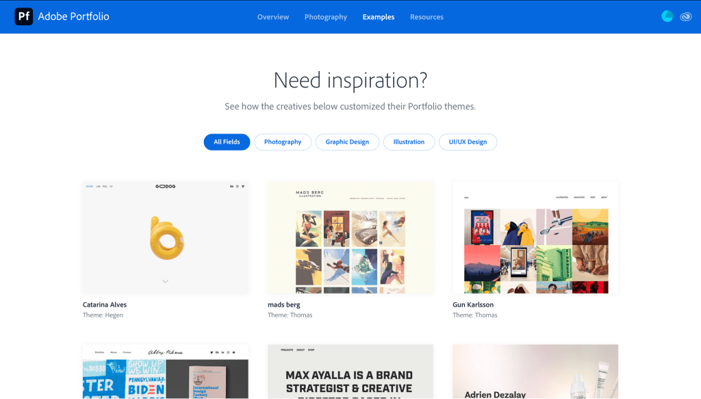
Click here to create your own and view Adobe Portfolios site.
Click here to create your own and view Adobe Portfolios site.


The first time I saw Reese Cooper was through Youtube. The video was about how his clothing and fashion got denied from fashion week. So, he rented a room in the same city as the current fashion week and put on a runway show with his clothing for free. He promoted his personal show and set everything up himself. I found it fascinating how he chose to make the venue look outdoors, especially in pictures, when they are actually in an all white room. This was the first encounter I had with Reese Coopers work.

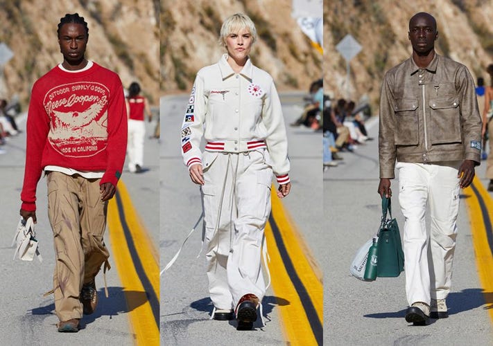
The second time I saw Reeses work was through Instagram. I saw he put on another runway show, but this time with more exposure and recognition from the first. The models walked on top of this rounded tower in the middle of nowhere. The scenery was beautiful but this looked so bizarre. The way he promoted his work seemed absolutely crazy and out of the box, I liked it.

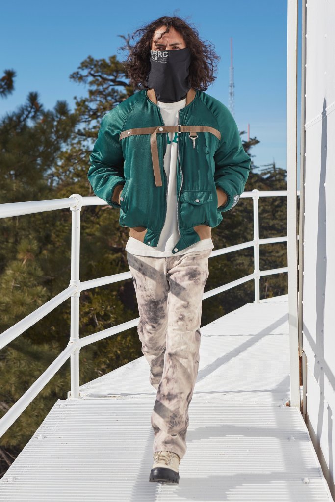
Most recently, I saw Reeses newest project, a runway on a bridge. The way he thinks of these absurd scenes to promote himself blows my mind. I think that’s the reason why he is so successful. After all that’s what attracts me to his work.
Visit Reese Coopers site here.
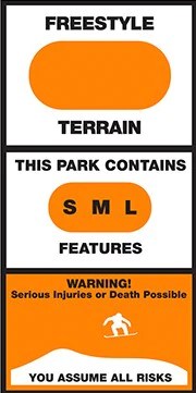
The reason I find these intriguing, especially the design above is how simple they are. While snowboarding/skiing past you can read and understand the whole sign very quickly. Some riders are faster than others and urgent readability is a must in order to understand what’s ahead.
Designers are unknown.
Read more about terrain park etiquette here.
Link to blog: https://fonts.ilovetypography.com
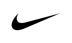
The original Nike Logo bought for $35
In Greek mythology, Nike is the Winged Goddess of Victory. The logo is derived from goddess’ wing, ‘swoosh’, which symbolizes the sound of speed, movement, power and motivation.
The reason why I feel this logo is an excellent example of a well-done identity system is because of its simplicity. Nowadays, almost everybody in the sports community and everyday people can recognize the swoosh. Its jet black design creates for a perfectly executed, unique, stand out logo.
Read more on the designer and history here: https://en.wikipedia.org/wiki/Carolyn_Davidson_(graphic_designer)
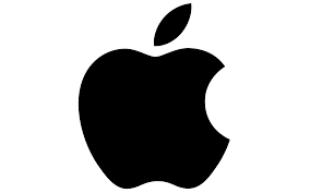
The Apple Logo was created by Rob Janoff in 1977. It’s easily one of the most recognizable logos today. The use of black and white makes the positive and negative space pop. At first glance most wouldn’t realize the technicality of such a simple logo, but when looked at deeper the design becomes genius. The bite out of the apple is perfectly placed and blended into the background with negative space. Rob Janoff has create a ton of other famous logos to date, here is a link to his site: https://robjanoff.com

Rodrigo, who is at the helm of Rodrigo Corral Studio, is a celebrated designer, and is also the Creative Director for Farrar, Straus & Giroux and Creative Director at Large for New Directions. Rodrigo published his own New York Times bestselling book, SNEAKERS, and launched an app called Wutch.
Rodrigo Corral Studio has delivered some of the most iconic visuals in publishing, and creates leading conceptual design and art for books, brands, interior spaces and film.
Your can read more on Rodrigo Corral here: http://rodrigocorral.com/about

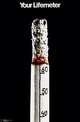
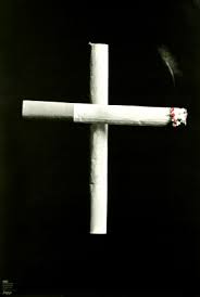
Kyösti Varis is a graphic designer born in Finland. He created this poster named “Your Lifemeter” in 1971.
Kyösti Varis started his career by getting basic training in some printing houses in Finland and Germany. This is what originally fueled the spark to a successful career. Over time, Varis has gained a ton of traction and received countless awards, one being The Graphic Designer Of The Year in 2002.
“Your Lifemeter” represents the effects of cigarettes on your health the more you smoke them. The clever simple design sends a moving message to all that encounter. The numbers counting down by tens on the cigarette display the years disintergrating off of your life the more puffs taken. The combination of the bold title, black background, and simplistic design makes for a straight forward, in your face poster. During this time period cigarettes were more accepted than they are today, and to some the effects were unclear. This message put this life threatening addiction/hobby into perspective for the world to see.
You can find more information about Kyösti Varis’ life and artwork here: http://www.varisoriginal.fi/posterartist.html
