Online Portfolio: WIX

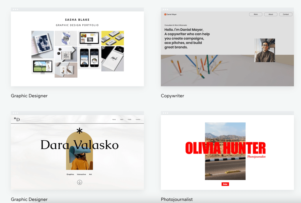
WIX is a is an Israeli software company that provides cloud-based web development services. It allows users to create HTML5 websites and mobile sites through the use of online drag and drop tools. its really easy to use and its really helpful when it come to helping designers and others artist to create and share their portfolio. its main goal t to make the work presentation easy and efficient. it no only allows artist to share their work and receive feedback and comments, it also counts with more than 800 templates for any type of proposes. This site has more than 215M user worldwide, form graphic designers to even to chefs this website is useful for any type of artist. Users can add social plug-ins, e-commerce, online marketing, contact forms, e-mail marketing, and community forums to their web sites using a variety of Wix-developed and third-party applications. Users must purchase premium packages to connect their sites to their own domains, remove Wix ads, access the form builder, add e-commerce capabilities, or buy extra data storage and bandwidth, but the its not necessary to asses some of the basic templates or to look at others peoples work, for that you will just need to make an regular account.

link: https://www.wix.com

Self-promotion: Wanda Priem

For this post, I decided to show Wanda Priem’s self-promotion portfolio. I think this portfolio looks very efficient and it works pretty well together. The colors and the negative space really activate the work and give it a professional look. It’s also nicely put together and brings up the artist personality a lot.

she decided to focus on the concept of “Prime” and use its different meanings to give life to the design. prime numbers are a constant idea here. the non-prime numbers are eliminated and only prime numbers are used. Trough this elimination, a pattern is formed, this pattern becomes a design element.The photographs also contribute to the concept. Through showing how prime numbers can onlybe divided through itself and one. Not only is this design very cohesive, but it has a complex message behind it. its meaningful its simple and very organized. I personally really like it.

Great Design Blogs: Abduzeedo

I love this website and I thought it will be a good idea to share it here. Abduzeedo is a collective of individual writers sharing articles about architecture, design, photography, and UX. Founded by Brazilian designer Fabio Sasso in 2006, it’s particularly strong on 3D work, which doesn’t get much attention from most design blogs. with its wide variety of topics and writers this is the perfect place to go when you are looking for inspiration. on the websites goal is to be an open and safe space for the design community, and it highly encourages feedback which this is one of the reasons I love it so much, is a great way to meet people and share work. beside this the website offers a wide variety of tutorial for the well know design apps and program. Created from artist to help artist.

Seen in the Real World: Snickers

When looking for a brand to do this post I saw my roommate open a snicker and I just had to use it. I feel like the identity of this brand is famous and recognizable. Even when the logo is very simple and straightforward, its cachets people’s eyes and it creates an impact. Witch I feel is important if we consider how competitive the chocolate market can be. the logo is framed by a thin red line and features all-capital letters to one height. The lines of the typeface are refined giving a modernized look besides this the letters have a small white background, which adds volume and dynamics to the logo it also makes the letters more visible against the dark brown background. As I mentioned before it is a simple logo, but I feel it has so much personality. It really reflects the idea of sincerity that the brand is always trying to sell to its customer.

PayPal

Identity System for brands includes all the visual elements that are associated with the brand like logos, product packaging designs web designs, and even the main colors that the brand uses. One of the identity systems that caught my attention was PayPal.

screenshot from PayPal’s official website.

PayPal acquired its brand identity in 2014 with the help of Fuseproject. To maintain its image and identity to “better express its innovative DNA and future as the leader in digital payments” PayPal is linked with a bolder wordmark, stronger monograms, more vibrant colors, and a dynamic angle graphic that increases user perceptions of trust and innovation. PayPal’s logo is also strategically placed on its credit card readers. I like its identity system because is simple but powerful, catches people’s attention and it gives this sense of security and power that they want to feel from a company that it’s handling their money.

Positive/Negative Space logos

The American Institute of Architects center logo by Pentagram

This is the American Institute of Architects Center Logo by Pentagram. I think this logo shows good use of positive and negative space. This logo is simple but at the same time, it has a lot going on. The overall active space works really well, it creates the shape of a key and it’s easy to locate for the viewer, I also like how the artist incorporates the city skyline within the key, it’s a great and creative way to active the negative space of the logo. Although this is a very simple design, overall I think this logo uses the white space well. 

http://www.pentagram.com/work/#/all/all/newest/

Beautiful pages

I really enjoyed the design on this page. I feel like the colors and the pictures work well together; I really like how there are no white spaces on these pages but it is still eye-catching whiteout being overwhelming to the reader. It has a lot of negative space but this one is active thanks to the picture acting as background and the text layout. I feel that the text also works well with the background, the white really stand out from the colors of the background and it makes it looks easy to read. The text is not extremely long and is organized neatly, the icons through the pages also help the organization of the design and it also helps to separate the text to make it more eye-catching to the readers as well as easier to interpret.

Paul Rand

Paul Rand Modernist Master (1914 - 1996)

In the story of graphic design, there are millions of people who now call themselves graphic designers but there are some that have left a remarkable mark in the industry. One of them is Paul Rand (1914-1996) many say that he is considered the father of graphic design. Paul Rand was an American art director and graphic designer that was well known for his corporate logo designs for major firms like Morningstar, Inc., NeXT Computer, Yale University, and Enron. He also was one of the first American commercial artists to embrace and practice the Swiss Style of graphic design. since the late 1930s, Rand adopted both European modernism and American spirit and functionalism in his graphic style and was highly rated for it. In 1947, Rand published his book titled Thoughts on Design which contained theories and beliefs that shaped the entire future of graphic design he introduces many ideas to the world of design, one of them being the ideology that graphic design should be a “functional-aesthetic perfection”. The balance between beauty and practicality was the major factor to make something look good while getting the message across in an effective manner to the public.

Design can be art. Design can be aesthetics. Design is so simple, that's why it is so complicated.”

― Paul Rand

Shepard Fairey

Above
Shepard Fairey, gun violence awareness

Shepard Fairey is an American contemporary artist and activist who is very open about his social and political opinion with his work. He is often seen creating and donating artwork to promote and create awareness of social issues such as women’s rights, gun regulation, human rights, and many more.

Fairey’s work combines elements of graffiti, pop art, business art, and Marxist theory. His work has been internationally shown in many galleries and museums

image:https://admin.itsnicethat.com/images/VQwG_rKosc5-TIIHih5Idktc8Rw=/40616/format-webp%7Cwidth-2880/5ab4ccea7fa44c83c7000604.jpg