Squarespace

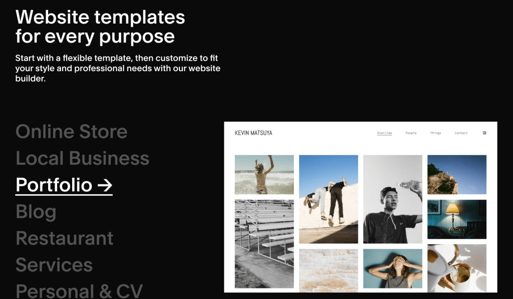
Squarespace is a platform where you can build a website and online presence with ease. When playing around on this website, it started by asking me a handful of questions to establish what I am looking for. It asked what my goal of the website is, what I will be putting on it, and what experience I have. It was very easy to get started with Squarespace.

There were many beautiful templates to pick from. I begun designing one myself. I made a login and it didn’t ask me for a charge card. They give you a 14 day free trial.

As shown in the image above, there are many things to discover within the website. Overall, it was really easy to use.

Looking through graphic design resume templates I found some interesting ones I thought I would add here.

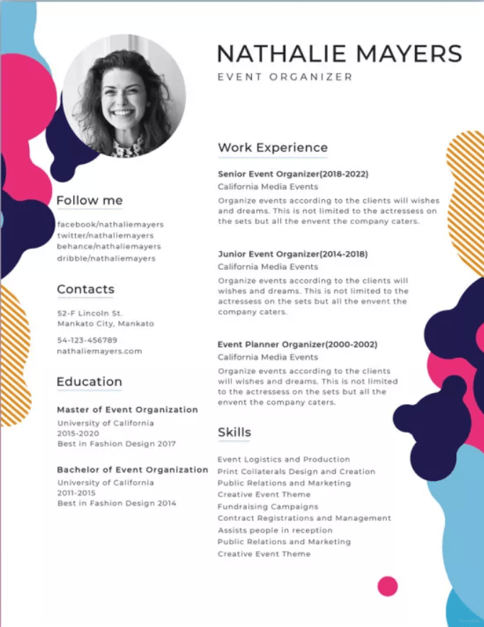
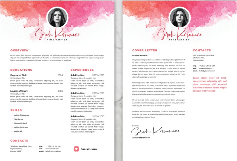
I am certainly draw to the ones with a splash of color. I also really like the look when the resume and cover letter have a connecting image, color, or symbol. Looking through these has given me a better idea of why why design resumes make a difference compared to a normal resume.

Bernstein & Andriulli

This interesting company promotion printed their illustrations onto matchbooks. Bernstein & Andriulli a company that showcases creative artists is a management agency and media consultant. They represent all types of artists such as “photographers, illustrators, stylists, hair and makeup artists, directors, production companies, animators, interactive and experiential producers (Bernstein & Andriulli). I found this self-promotion graphic and thought it was so interesting and nothing like I’ve seen before. This is the main reason it intrigued me, it was nothing I’ve seen before. I think that is a major part in self-promotion. To make yourself stand out from other designers is what will make you succeed. Thinking outside the box and taking risks. I also think it is very incredible that since this company represents many artists, that the matchbook campaign incorporated many illustrations to see/promote, not just one.
These matchbooks have the artists illustration and name. To me this is such a unique and memorable promotion piece.

The Bernstein & Andriulli website is so fascinating and incredible to look through. I really recommend visiting their site, so many cool and unique things to view. I think many of you would enjoy it.

https://www.ba-reps.com/

Information Design- World’s Deadliest Animals

Bill Gates has helped fight malaria, a disease that kills over one million children a year. In 2014 he published the above infographic to his blog. This really caught my attention. It has minimal words and bold lines and colors. The bold lines and colors are the main image and information. It is very clear that the mosquitos are a much higher threat than sharks. This information is very shocking, surprising, and awakening to those who don’t know much about mosquitos and malaria. The simple illustrations are very straight forward. You immediately know the message of the infographic and you know exactly what it means. This is very well-done.

https://www.gatesnotes.com/Health/Most-Lethal-Animal-Mosquito-Week

Creative Boom

https://www.creativeboom.com/

Creativeboom.com is website that welcomes artists, designers, illustrators, photographers, digital animation, and filmmakers to share their work and help educate one another. Creativeboom.com assists and supports artists at every stage in their career. From leaving college, freelance, or being part of a team Creative Boom supports your work.

Creativeboom.com has many resources on their site. Including news, inspiration, featured work, resources, tips, podcasts, shopping, newsletters, and many blogs. Looking through this website I felt such a strong community of artists and their want to grow and to help others. I really enjoyed scrolling through and reading the featured work. You don’t only learn about the work but you learn about the artist. What challenges they have faced, what they think makes them successful, and their creative process. It is a very interesting, fun, inspiring, and pleasing website.

I would highly recommend looking through Creativeboom.com. I have felt very inspired, moved, hopeful, and excited after viewing this and hearing words from so many artists.

https://www.creativeboom.com/

Seen In The Real World- Petco

When looking for real world examples of graphic design, typography, and illustration in Oneonta, I came across Petco’s logo. I found this interesting because of the illustration in the photograph above. The illustration of the blue cat and red dog hooking ears gives a cute and playful feeling to this logo. Both animals are simple, heavy black lined, and color filled shapes. Having the dogs floppy ear hang/hook between the cats ears, creates one unified image. I think this image is cute, simple, and a nice addition. I also think this friendly interaction between the animals creates a welcoming and caring feel.

Besides the feeling and cleaver interaction between the animals, I don’t love this logo. It feels big and bulky. But, I think Petco achieved its goal that the logo is very often recognized as their store.

Identity Systems- Apple and Tiffany & Co.

Apple

The company Apple is a very well-know company. Founded in 1976, the popularity of Apple has flourished greatly. Apple now sells 27 different products. From phones, to televisions, iPads, computers, and watched, Apple has it all.

The iconic Apple logo is known by almost everyone. The simple apple shape holds so much power. I think this is an excellent example of a well-done identity system because it is such a simple design but is known and recognized when you see it. It is great because the name of the company is the same word as the logo. People hear “apple” and they can quickly know what you are talking about. People see an “apple” outline or shape and immediately know the brand.

This logo was designed by Rob Janoff. He designed this logo based on his examination of the physical real apple.

https://robjanoff.com/

Tiffany & Co.

Tiffany and Co. a jewelry brand founded in 1837 is known for the “Tiffany blue” they use. This blue became iconic and Tiffany’s signature color.

I wanted to touch on Tiffany and Co. as there logo to me isn’t their strongest identity system but the color theme is. Everyone knows this color is “Tiffany blue” and associated with this company. This definitely benefits Tiffany and Co. as they have made a new meaning for this color. Seeing this color makes you think of their company.

Ed Benguiat had designed the Tiffany and Co. logo in 1974. The distinctive color known as “Tiffany Blue” was selected by the founder Charles Lewis Tiffany. He used this color in publication for the company in 1845 and it has stayed since.

https://www.tiffany.com/world-of-tiffany/blue-box-story/#:~:text=The%20distinctive%20color%20known%20as,was%20first%20published%20in%201845.

https://www.tiffany.com/world-of-tiffany/charles-lewis-tiffany/

https://www.rit.edu/carycollection/ed-benguiat

Toblerone Chocolate

This logo for Toblerone Chocolate uses the technique of ambiguity of positive and negative space to create an interesting hidden image. The first image above is the normal logo of Toblerone chocolate. The second image is enhancing the hidden message so it is clear.

Toblerone chocolate is a Swiss brand. The Swiss Alps (mountain) in the logo is very easy to notice. However, if you look closed with how the negative and positive space play with one another you discover something more. A bear in the negative space! The chocolate brand was established in Berne, Switzerland which is known as the “city of the bears”. Once you notice this cleaver image within the mountain it is hard to unsee it. This was such a good use of space and very thoughtful to relate it back to the region it is from. I really enjoy this graphic design logo.

https://1000logos.net/toblerone-logo/amp/

https://www.worldwidechocolate.com/shop-by-brand/toblerone/

The signature IBM logo

This memorable logo is so simple but impactful due to its unique design and concept. This logo is displayed in equal stripes. Besides the stripes there is nothing else to this logo. There are no other logos like this IBM one. This is a benefit for IBM because of the attention the logo draws. It is even more helpful that a unique design results into the logo being more attractive to the viewer. This is also an advantage because you are more likely to remember this brand and logo due to its design.

This technique incorporates both positive and negative space. The positive space allows for the shape of the “IBM” to be formed. These strong lines allow for the negative space to be just as strong. The negative space creates the “full” IBM letters to your eyes but allows more movement through the logo due to the negative space. This is beautifully done. This truly creates something complex but simple and something that you will remember.

Designer Paul Rand designed this smart and simple logo for IBM. This has been the IBM logo since 1972. Rand is best known for his corporate logo designs such as IBM, UPS, ABC, Enron, Morningstar, and many more. Rand approached his logo designs using asymmetrical layouts, typography (san serif in specific), photography, and montage. He once said “one quickly realizes that simplicity and geometry are the language of timelessness and universality” (Rand).

https://www.ibm.com/us-en/

https://www.paulrand.design/

The Beautiful Page

“PRAISE THE SEA, ON SHORE REMAIN.”

Searching through magazine spreads this one stood out to me. Its beauty and simplicity allows me to easily and happily read the loose and spaced out text. The paragraphs are spread out well which allows my eyes to go through the text at ease. The use of white space also helps guide my eyes through the spread. The images, text, and white space have a perfect balance. The images are fairly simple and have a blue theme to them. The designer has included a blue shape in the background to tie together the two sides, allowing them to feel as one. The margins create a beautiful structure to the work which leaves a crisp and clear look to the page. On the first side, an image comes out from the margin in a charming way. This allows for a feeling of asymmetry even though the magazine spread is fairly symmetrical, the use of shapes and the large image creates an interesting, asymmetrical look. The image on the margin also pulls your eye in while creating motion through the spread. The title of the page “Praise the Sea, on the Shore Remain”, stands out by using a bold, capitalized font. Although their aren’t other sub-headings, the paragraphs have clear spaces between them making it easy to view.

There are certainly things in this magazine spread that could be improved. Things such as more use of asymmetry and use of fonts, if their were sub-titles, but overall this spread is a beautiful sight to see. Its simple but interesting layout gives the reader a refreshing page. I was really attracted to the use of margins. How the image and shape were pushed beyond the white margin creating a different and beautiful set-up. The use of images, margins, and white space have really opened my eyes to the beauty of simplicity and ease.

https://design.tutsplus.com/articles/what-is-a-magazine–cms-37851

Stefan Sagmeister

Stefan Sagmeister is a known for his graphic design, performance art, and typography work based in New York City. In 1933, he founded his company Sagmeister Inc., specifically to create designs for the music Industry. Pictured above are two examples of album covers done by Sagmeister. He is known for his wide variety of tools, materials, and techniques, his typography, and his controversial imagery that shapes his artistic identity. He has done movies such as The Happy Film and has designed album covers for Lou Reed, OK Go, The Rolling Stones, David Byrne, Aerosmith, and Pat Metheny.

The images above Sagmeister makes the words come alive. Not only does he out type onto people but he makes the type apart of the person. The type is the focal point. He uses such bold and strong structure to his work that it really stands out.

Sagmeister’s website is truly brilliant. I would recommend checking it out! https://sagmeister.com/