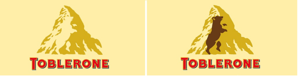
Toblerone chocolate is a Swiss brand. The Swiss Alps (mountain) in the logo is very easy to notice. However, if you look closed with how the negative and positive space play with one another you discover something more. A bear in the negative space! The chocolate brand was established in Berne, Switzerland which is known as the “city of the bears”. Once you notice this cleaver image within the mountain it is hard to unsee it. This was such a good use of space and very thoughtful to relate it back to the region it is from. I really enjoy this graphic design logo.

Hey Kelly, I really like the toblerone logo because of how subtly they used the positive and negative space. The bear mascot was important to their identity enough that they made it apart of their logo but not so important that it had to have an overpowering or even noticeable part of the logo. The minimal graphic on the simple creme colored background also gives a very nostalgic feeling to the logo
LikeLike