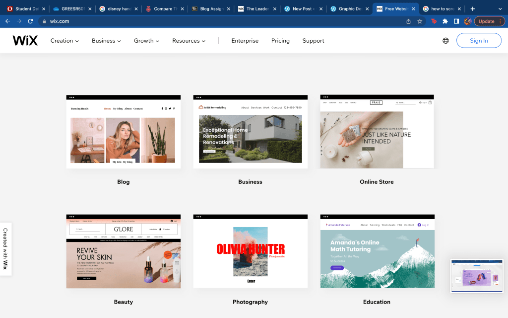
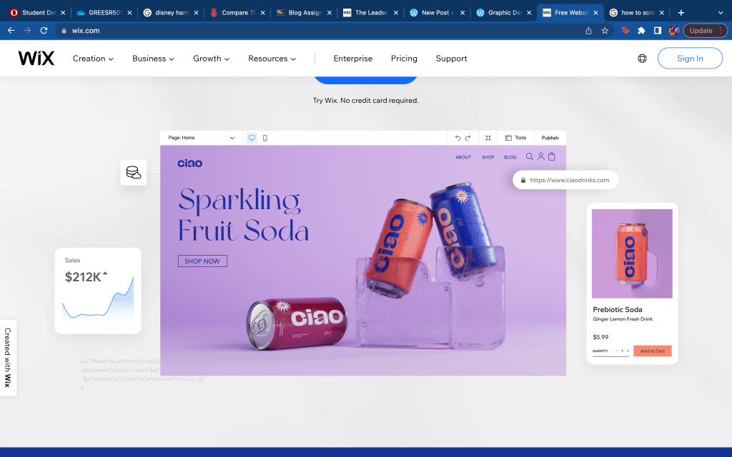
Author / sarahhgreenn
Self-Promotion piece: Jessica Walsh
For this blog post I found Jessica Walsh’s website eye catching. After looking at her website and her work I was very intrigued with the colors she used and how her pieces are all clean but catch the viewers attention to make them more interested and invested. The point of putting your work on a website is to be more known and discovered by more potential clients. The first image I added to this blog is a really good image to catch peoples attention and promote her work. First, because the bright colors tend to catch viewers attention more. Secondly, It is made with the women wearing colors of the rainbow and posing in many different ways with different backgrounds and colors to show inclusiveness. The second image I included in this blog post is more simple however, Jessica Walsh uses her symbol a lot in her work. This symbol is simple yet bold since it is in majority of her work in a very large size. Jessica Walsh is promoting her use of design as well as photography and direction in her work. The pieces she has on her website are made to show clients what she can offer to them for any project they need. I really enjoyed looking through Jessica Walsh’s website and looking at the work she has created and what she is able to create. I recommend looking at her website and looking at her work.
Information Design: Suicide in the United States.
Great Design Blogs: Women Of Graphic Design
This graphic design blog caught my attention because it gives women a place and chance to show their work. This blog also explores issues of gender-equality by designs. I really liked this page seeing art showing their stands on political and economic issues and more. They took their designs and made it more related to the world. This blog includes many different forms of art between website designs, logo designs, typography, magazines and more this is a safe space to upload your art on different issues for it to be seen. If you are looking to see artwork with deeper meanings and pieces to take a stand on many problems this is the perfect blog post. The designs on this page take art and use it to express themselves while still creating work for clients. I really enjoyed this blog page and recommend it to any other readers looking for this type of blog.
Bang Energy Logo and Packaging
Monster Drink Identity System
Starbucks Logo
Beautiful Pages
These magazine pages made by Form caught my attention with how they altered the normal use of these materials to create their own creative images. The first image has piano keys coming out of a pair of lips. Even with that to catch your attention there are more random objects and colors behind it to draw your eye over to it as well. The color use in this page is very well done and how some of the patterns and colors overlap shows depth to it. The second image is a mans coat and body and where his head is supposed to be is just clouds of smoke instead. These ideas take any object and alter it to however they want it to which is just beautiful itself. The third image, is a mans face and over his skin are these blue scales that range from light to dark blues. These three magazine pages are extremely creative and very well done. The text is simple since the background is so busy the text is centered in white to draw attention to it against the darker background.
http://www.formmagazine.com/en/