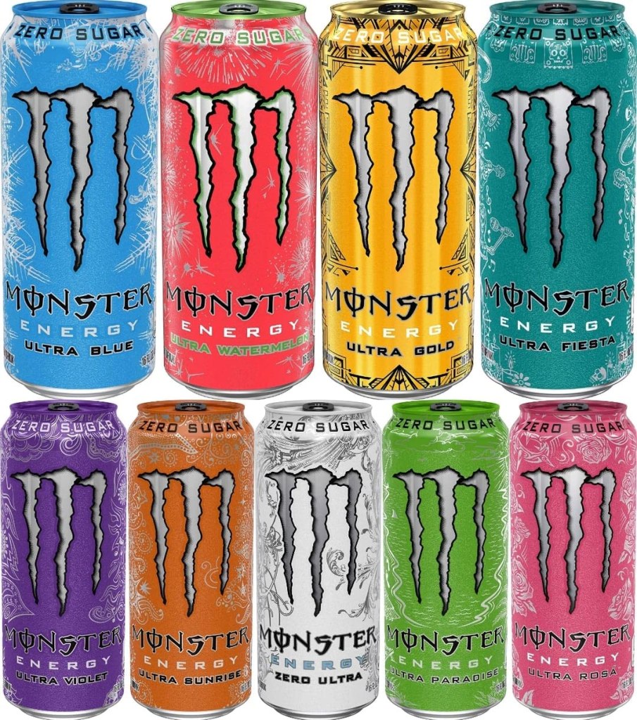
Monster Drink Identity System

There are many energy drinks such as redbull, bang, rockstar and more. However, the packaging for the monster drink catches a customers attention more than the other brands. Monster has designed its cans with a variety of vibrant colors for each flavor. The monster logo on each can remains the same but the silver pattern and color changes with each can. Monster is a huge company and a huge product that is very well known today. I think its design has something to do with the huge compel to choose monster over the other branded drinks. The bright colors are meant to catch your attention and draw you to their product. On their website, they have many different options of energy drinks such as Monster Energy, Monster Energy Ultra, Java Monster Coffee+Energy, Hydro, Rehab Monster. All of these different categories make monster more compelling to buy. On the website they say “Sweet and salty- It tastes like Monster!” The advertising with this product and the logo has made monster a very popular drink.
https://www.monsterenergy.com/https://www.monsterenergy.com/us/en/products/monster-energy?utm_source=google&utm_medium=cpc&utm_campaign=green_brand_exact&utm_adgroup=general&utm_objective=traffic&gclid=Cj0KCQiAmpyRBhC-ARIsABs2EAoL9NjK_aHqQkuHD_uG8xe3P9LwrQHkgrj3Gfr1rAPDDwTCxzyh5sIaApoiEALw_wcB

One Comment

  1. Monster does a really great job at reinventing each drink flavor or can while still being completely cohesive as a brand. They make really great use of color with each can. I also like that the decorative background also varies through each can.

    Like

    Reply

Leave a comment