Off White

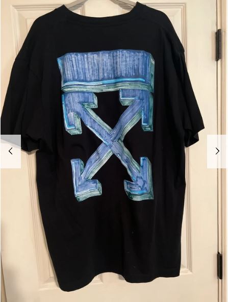
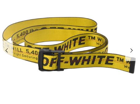
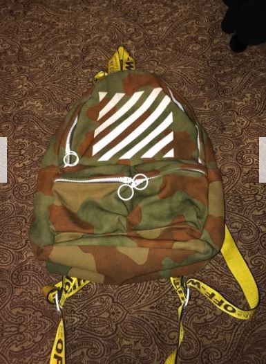
I chose the clothing brand Off-White for this identity post. I think that the identity system that the brand utilizes is intuitive and provoking which is why I chose it. As you can see from these pictures the brand often utilizes logos and designs that have a crude, industrial feeling to them. The arrow design in their most well known logo seem like it comes from a diagram from an instruction manual. This logo is used on a t shirt pictured but instead in 3D with added color. Although, the logo is somewhat embellished from its former state it still utilizes a color scheme and design which almost emulates rusted metal. This can be seen within their other products like the belt pictured even though it doesn’t utilize the diagram type logo. This belt is designed and colored to look like a safety belt for heavy machinery but with a modern twist.

Even the protective bags that the products came in were given a striped design which gives the vibe of a warning label on a dangerous machine.

This identity system is not only eye catching but goes against the societal norms for much of the clothing we see everyday which Off-White has developed as one of their the staple values as a company.

Virgil Abloh created the designs which make the identity system for the Off-White clothing lines. He was also the artistic director of Louis Vuitton’s menswear collection in 2018. Unfortunately, Abloh was diagnosed with Cardiac Angiosarcoma, a type of cancer, in 2019 and passed away due to the sickness in 2021. However, his legacy still lives on at the Off-White company.

https://www.off—white.com/en-us/

Identity Systems – YETI

https://www.yeti.com/en_US/accessories

Yeti is an American company known for their products that include drinkware, coolers, bags, gear, apparel and much more. The YETI was founded in 2006 with their headquarters is located in Austin,TX.

What I enjoy about this company is the creativity behind some of their designs and colors chosen for their products. In the image above, people can see the idea of having a bronze-like secondary color with the a design of the American worked in with the YETI logo. YETI does a great job of keeping the company logo focused around the environment, hunting, wildlife, and nature as a whole. I like how simple the brand name is with a variety of colors for the product itself, while creating different designs that work into the brand name. A few examples of this are below:

Red Bull Identity System

A brand that I believe has a great identity system is Red Bull. Everyone knows the energy drink advertised around the world with its bright and vibrate colors and distinct logo, along with their well known slogan from countless commercials, “Red Bull gives you wings.” It was created to draw viewers in through advertising that their drink gives you so much energy that you’ll have the wings to get things done. The iconic “gold and red” color scheme is what makes the logo recognizable. All of the Red Bull cans have this logo slapped on, front and center, to make them recognizable, no matter the color of the can. The logo also features two bulls about to collide with their horns against the backdrop of the sun. The thin and tall shape of a Red Bull can is also a feature more unique to them. The logo and slogan were made by the company owner Dietrich Mateschitz in 1987. He is the co-founder and owns about half of the company. The vibrant colors and recognizable logo is what makes Red Bull a strong identity system.

https://www.redbull.com/us-en/energydrink/company-profile

Identity Systems – Nike Swoosh

Nike was founded on January 25, 1964 in Eugene OR. Their infamous logo can be spotted and recognized almost immediately by most. At first, their logo design wasn’t the same as we know it today. The original design was bought for $35 from Carolyn Davidson, she later created the swoosh that we all know today.

The original Nike Logo bought for $35

In Greek mythology, Nike is the Winged Goddess of Victory. The logo is derived from goddess’ wing, ‘swoosh’, which symbolizes the sound of speed, movement, power and motivation.

The reason why I feel this logo is an excellent example of a well-done identity system is because of its simplicity. Nowadays, almost everybody in the sports community and everyday people can recognize the swoosh. Its jet black design creates for a perfectly executed, unique, stand out logo.

Read more on the designer and history here: https://en.wikipedia.org/wiki/Carolyn_Davidson_(graphic_designer)

Identity Systems: Headspace

Headspace is a meditation app that uses science to help its users calm down from stressful days, lull users to sleep or boost their mood for a brighter day. The brand implements cute and colorful graphics to help push the calm and happy vibes. The color palettes used in most of their branding are calming blues popping yellows and serene purples bringing in the elements of stress relief, inviting joy and peaceful rest. They make great use of the cute characters within their branding as well making them flexible and fun shapes to bring home the message that anyone can use their app. These graphics are also very simplistic and fun to look at making their website and social media very easy to scroll through. I also like the name of this brand because this app is pushing to help users make their headspace a better place to be. So its a very straightforward name for this brand.

Identity Systems – Walt Disney

By: Jolie Siegel

The Walt Disney Company, more commonly known as Disney, was founded October 16, 1923. Since its founding Disney has released over 119 feature films as of June 25, 2021. Their empire encompasses animated films, TV shows, cartoons, short films, live-action movies etc. They are also huge producers of merchandise ranging from toys to backpacks to popcorn buckets. Many of their products are sold at franchise stores all over the world.A large contributor to their success is from the ever growing list of films they are set to release, along with the merchandise they will generate their money from. Disney has 6 Disney resorts and 12 theme parks, each that offer another method of Disney pushing their brand to consumers.

Locations include:
Walt Disney World Resort, Orlando FL
Disneyland Resort, Anaheim CA
Tokyo Disney Resort, Tokyo Japan
Disneyland Paris, Paris France
Hong Kong Disneyland Resort, Hong Kong
Shanghai Disney Resort, Shanghai China

Evolving Logos

When people think of Disney, they immediately think about the castle and Mickey Mouse. These associations are key to their brand identity. Their original logo, while beautiful, needed to be recognized on various platforms where the large logo was not ideal. Over the last few years, they managed to easily transition their logo to a single letter that would still be easily recognized as Disney. This modernized logo was created by animator Mike Gabriel and producer Baker Bloodworth.

Mike Gabriel Website: http://www.mikegabrielart.com

Baker Bloodworth Website: https://mubi.com/cast/baker-bloodworth

There is one other way Disney has managed to secure their foothold over their brand, and that is through the use of the character Mickey Mouse. Mickey Mouse is the original character designed by Walt Disney and many consumers resonate deeply with the character. The Disney company has found a way to exploit this feeling of nostalgia though their sales of Mickey Ears, sold exclusively at their Disney parks.

Original Website: https://www.disney.com

Disneyworld Website: https://disneyworld.disney.go.com

Identity Systems- Apple and Tiffany & Co.

Apple

The company Apple is a very well-know company. Founded in 1976, the popularity of Apple has flourished greatly. Apple now sells 27 different products. From phones, to televisions, iPads, computers, and watched, Apple has it all.

The iconic Apple logo is known by almost everyone. The simple apple shape holds so much power. I think this is an excellent example of a well-done identity system because it is such a simple design but is known and recognized when you see it. It is great because the name of the company is the same word as the logo. People hear “apple” and they can quickly know what you are talking about. People see an “apple” outline or shape and immediately know the brand.

This logo was designed by Rob Janoff. He designed this logo based on his examination of the physical real apple.

https://robjanoff.com/

Tiffany & Co.

Tiffany and Co. a jewelry brand founded in 1837 is known for the “Tiffany blue” they use. This blue became iconic and Tiffany’s signature color.

I wanted to touch on Tiffany and Co. as there logo to me isn’t their strongest identity system but the color theme is. Everyone knows this color is “Tiffany blue” and associated with this company. This definitely benefits Tiffany and Co. as they have made a new meaning for this color. Seeing this color makes you think of their company.

Ed Benguiat had designed the Tiffany and Co. logo in 1974. The distinctive color known as “Tiffany Blue” was selected by the founder Charles Lewis Tiffany. He used this color in publication for the company in 1845 and it has stayed since.

https://www.tiffany.com/world-of-tiffany/blue-box-story/#:~:text=The%20distinctive%20color%20known%20as,was%20first%20published%20in%201845.

https://www.tiffany.com/world-of-tiffany/charles-lewis-tiffany/

https://www.rit.edu/carycollection/ed-benguiat

Identity System, Goodiellow & CO 

Goodiellow & CO is a Men’s apparel and accessory line that was launched by target in 2017. In 2019 they launched a men’s grooming line to go along with the original apparel and accessory line. I’m going to display their men’s grooming line as it has become one of my favorites as late. 

What I really like about this brand is how it’s simply packing is the reason that it stands out on shelves. If you’ve ever walked through the men’s grooming isle before you would understand exactly why this product would stand out. Most men’s grooming products are very bright colors, have crazy names, over the top pictures and designs, and to me they all just scream “masculinity.” But Goodiellow is simple, straight forward, and to the point. It tells you what it is, the scent, the ingredients, and does not distract you with anything else.  

Identity System: Pandora

Pandora Jewelry is most known for having high qualitiy jewelry at an afforadable price. “Pandora designs, manufactures and markets hand-finished and contemporary jewelery made from high-quality materials at affordable prices.” – About Pandora

Pandora’s home page
Exploring Pandora’s page

Pandora’s website is minimalistic and uses three main colors: pink, white, and black. Pandora’s website is classy and clean. It is designed to help people easily navigate what they are looking for.

Pandora first started in 1982 as a jeweler’s shop in Copenhagen, Denmark by Danish goldsmith Per Enevoldsen and his wife Winnie. Over the years they became more successful as wholesalers. Today Pandora is about inspiring women to express their individuality.

In 2000, Pandora’s charm bracelet concept was first launched in the Danish market and has grown since then. Pandora is well known for their charms and being able to pick and choose which ones match a person’s personality. Their website allows for easy navigation to pick which specific charms a person would like that suits them best.

Pandora’s Charms & Braclets subtab allows for easy navigation.

Links Used:

PayPal

Identity System for brands includes all the visual elements that are associated with the brand like logos, product packaging designs web designs, and even the main colors that the brand uses. One of the identity systems that caught my attention was PayPal.

screenshot from PayPal’s official website.

PayPal acquired its brand identity in 2014 with the help of Fuseproject. To maintain its image and identity to “better express its innovative DNA and future as the leader in digital payments” PayPal is linked with a bolder wordmark, stronger monograms, more vibrant colors, and a dynamic angle graphic that increases user perceptions of trust and innovation. PayPal’s logo is also strategically placed on its credit card readers. I like its identity system because is simple but powerful, catches people’s attention and it gives this sense of security and power that they want to feel from a company that it’s handling their money.