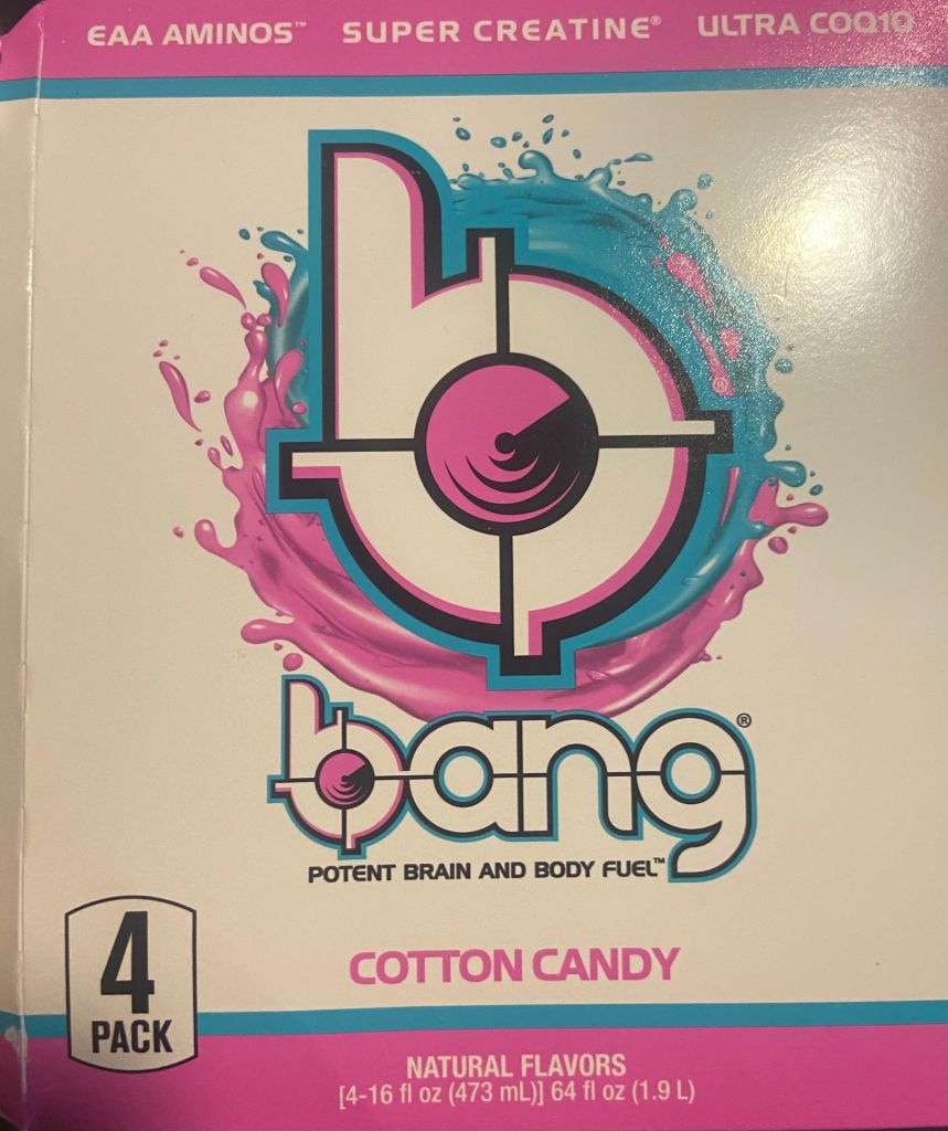
The packaging for the Bang energy drinks caught my attention because of the color choices and the design to it. The flavor of this drink is cotton candy so using the bright colors pink and blue helps contribute to the feeling that it is a happy and sweet flavor. Also, the colors pink and blue are commonly associated with cotton candy. This is an energy drink so the design should symbolize being energetic, upbeat and strong and I think this design portrays that perfectly. The vibrant colors, font size and illustration make this drink seem more aesthetic and appetizing to the customers. I also believe that the “b” is made to look like either a speaker, a wave of sound or to catch your attention to also portray that being loud is apart of being energetic from the item. Already, the flavor being cotton candy makes it stand out over other energy drinks but the logo design with the splashes of color behind it make it much more appealing to people looking for this type of drink. I think this design works well because it is a simple logo that it is not too busy but also is not boring where the person looking at it is not uninterested.