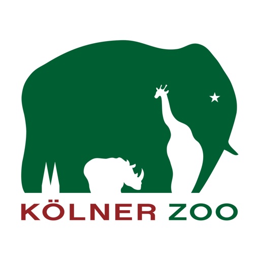
This logo is from the Kolner Zoo. I choose this logo because its very simple to comprehend and make analysis about. The logo shows a green symbol of an elephant, and has other animal silhouettes in it. on the far left it is shows a building, helping to show that its the zoo. the home of the place where the animals are located. Their safe place.

I really love this logo, their use of negative space is fantastic. The designer is able to create a whole new set of animals alongside the ones that they are already depicting. The elephant is the primary focus, but by having the giraffe in the negative space the viewer is clearly able to understand that this also doubles as a trunk of the elephant. While the shapes are not perfect, the message is conveyed well enough. The rhino creates the legs of the elephant which is also a neat visual. Each shape was carefully placed and I really enjoy looking at the logo. They managed to include the important aspects of the zoo into the design and I love that about it.
LikeLike