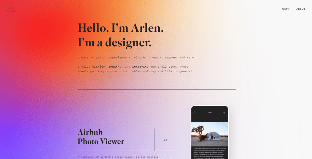
Arlen McCluskey is a UX designer, so naturally they have a super clean digital portfolio that effectively makes use of software and web design. I love how simple the landing page is and how the design is a reflection of the designer’s values. The soft gradient background is a perfect visual representation of clarity, empathy, and integrity.
I also love that all of their projects offer a phone-like screen click through. For the full experience you can visit their website here. I think that this is really effective to get a quick grasp of their design in action. When you do click on each individual work, there’s a more in-depth case study-like article explaining how they reached the final product.
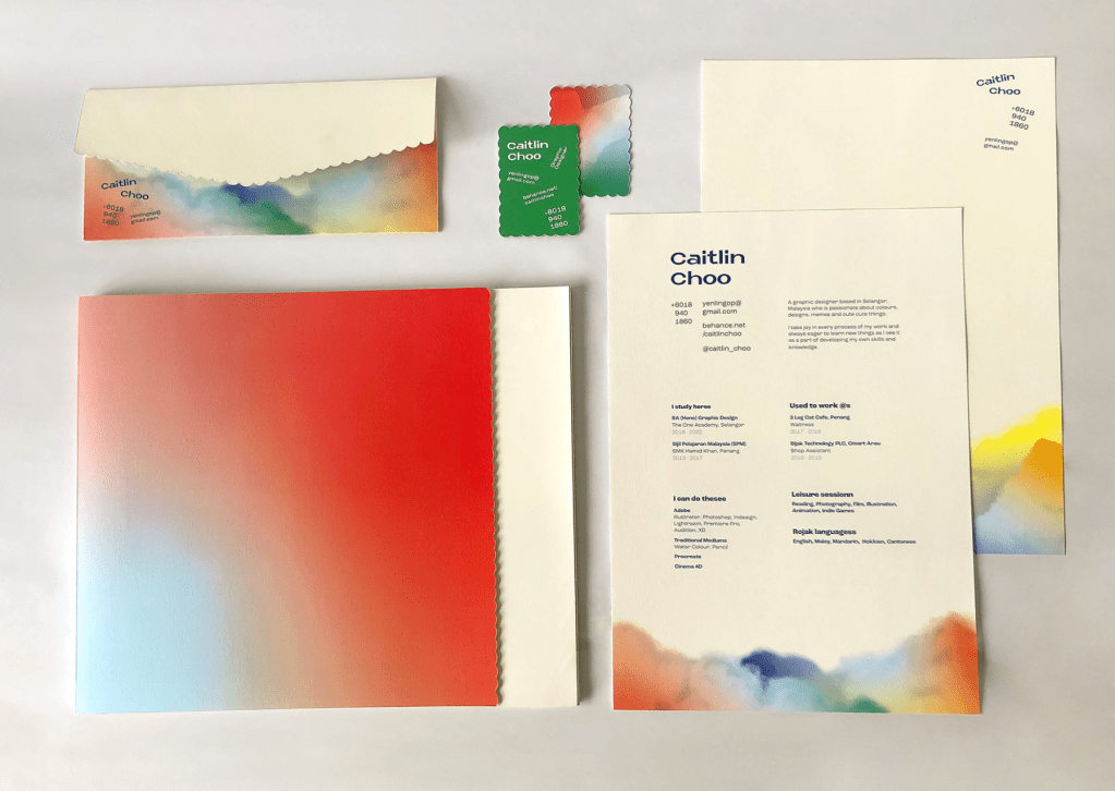
I found this project on Behance and thought it was a really strong design. The designer was inspired by clouds and how colors represent different moods and emotion. Not only is this design very cohesive, but it has a beautiful message behind it. Choo is putting forth that she is not perfect just like the clouds and her moods are frequently changing. Employers are always looking for the perfect candidate for a job, but the inspiration behind the design makes Choo all that more compelling. I love that this design is very simple and there is really strong use of white space.
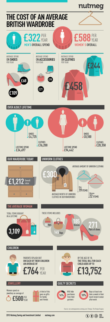
This infographic is done by Surgery Redcow for a series called Nutmeg. Click here to see more, but I really enjoyed this one specifically. I didn’t need to do much reading to understand the information, which is key to a strong design. They made use of color to compare both men’s and women’s spending habits when it comes to clothing. The design is very clean and the information is easy to navigate.
The designer also used size as a defining element to visualize the information. The more money spent or the larger the number of items owned impacts the size of the graphic paired with the information. For example, women spend more than men overall and the coin graphic for women is larger. This is used all throughout the infographic making it easier to digest the information while not having to read all too much.
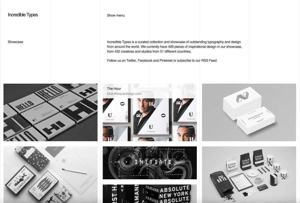
I think http://incredibletypes.com/ is a great example of a nicely done design blog. This page is very simple and clean. I love that you can see the columns on the webpage, at first I thought that it could be a programming error, but I like that from a designers perspective, you know exactly what the columns were used for.
This blog is a curation of many different graphic designers and I like that it’s in black and white when you first open the page. When you scroll over an image, it turns to color and includes the title and page that the design originates from. This makes the design stand out against the rest without clicking to a new page.
I was standing idle at work when I realized I had a blog post due tomorrow, luckily Boba Yaga has a really well designed menu that’s perfect to write about.
I think this design is very clean and consistent. The designer made really great use of spacing and margins. There’s nothing out of place and it’s all even, which makes it very readable to customers. Each section has some visual aid, which is great because it makes customers more likely to add to their order because visuals are much more intriguing than just words.
I also enjoy the small design aspects, such as the witch character who’s actions match the food options on each panel. A lot of the decor around the cafe is Studio Ghibli themed, so I also like that there’s a reference to the studio on each panel as well!
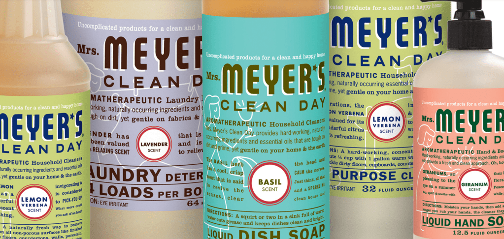
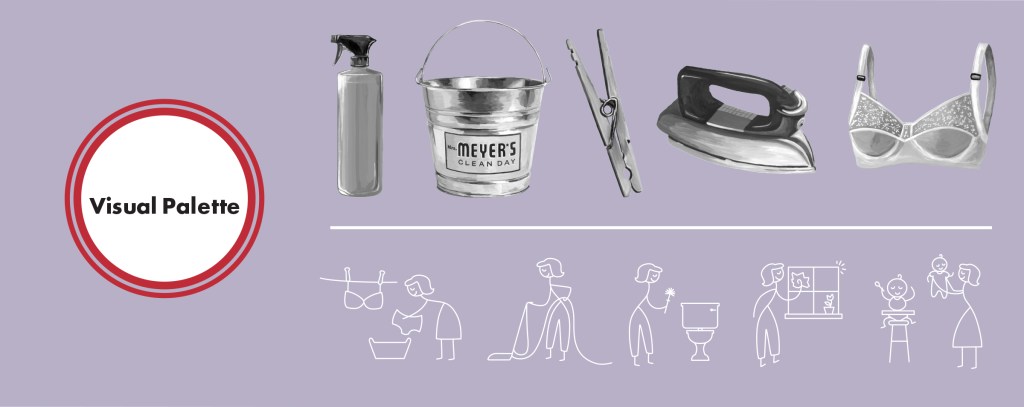
I think Mrs. Meyer’s design and branding are very strong amongst other cleaning supplies. Walking down the cleaning aisle at Target, there’s a lot of bold and loud packaging coming from big brands such as Lysol, Windex, or Fabuloso. Not only does Mrs. Meyers’ branding match their non-toxic products, but the packaging and design also set them apart from the other cleaning products on the market.
Monica Nassif, the founder of Caldrea Company, came to Werner Design Werks asking them to help her essentially “rip=off” her successful high-end cleaning supply brand. She wanted to take aromatherapeutic cleaning and make it much more accessible and affordable.
Together, they were able to come up with a brand concept that tells a timeless story with amazing graphics and packaging!
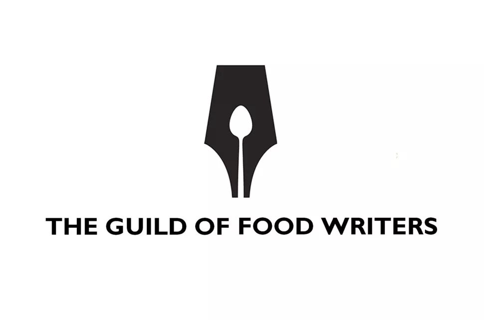
Image: The Guild of Food Writers logo | Design Studio: 300Million
Founded in 1984, The Guild of Food Writers is a professional association of the UK’s top food writers, broadcasters, and critics. This organization is dedicated to creating networks and communities within food journalism and culinary education.
This logo makes great use of both positive and negative space. 300Million took two concepts, writing and food, and created a logo that perfectly combined the two. The designers used the negative space from a fountain pen nib and designed it to look like a spoon.
300Million was founded in 2004 and gained a lot of recognition and praise for their work, but fell into administration in 2012.
While searching for layout inspirations, I found this beautiful e-book/workbook template. This caught my attention because of its mellow and neutral color palette. I find that neutral color palettes are very easy on the eye and I’m able to absorb the information better against these colors. There is also a healthy balance between empty space, text, and images on most pages. Some of these spreads have way less text and more empty space. This makes it much easier to digest the information on the page. There is something so elegant and clean about the design that makes me want to keep flipping through the pages. I think the arches add an interesting element that frames both the images and text nicely.
Picture this: It’s the year 1927 and you’ve been granted the Tiffany Foundation Scholarship to attend Pratt Institute. Fast forward to 1931, after your skills flourish, you finally graduate, and you are ready to enter the workplace. But here’s the issue – you’re a woman.
Despite being a talented hopeful, Cipe Pineles faced many challenges finding work and a creative safe space after graduating from Pratt Institute. She would eventually find comfort in a group of European immigrant designers who were also trying to make a name for themselves. The company became Contempora Ltd. and there Pineles’ skills only grew by designing advertisements and pattern updates.
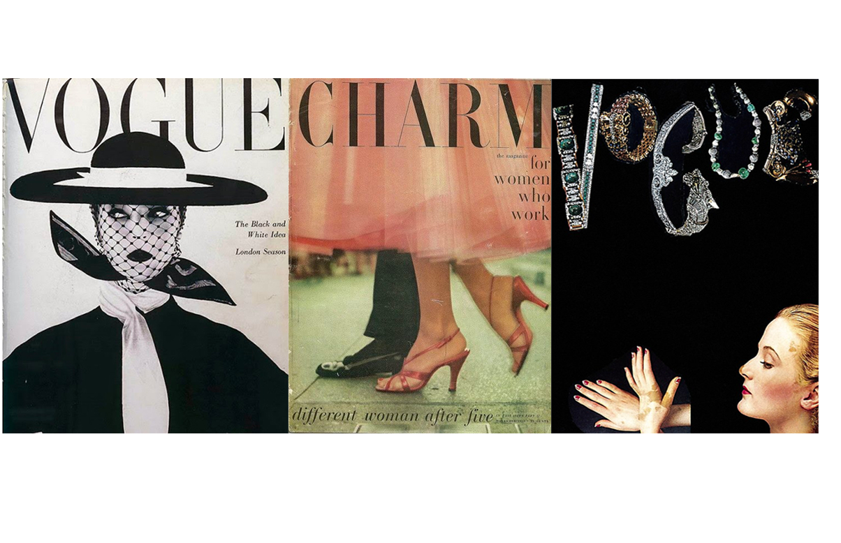
At a Gala event put on by Contempora Ltd., Pineles met the wife of Conde Nast who was fully impressed by her work. Shortly after Pineles became an assistant to M.F. Agha, then art director of Condé Nast publications. After about 10 years working under Agha, Pineles was titled the art director of Glamour magazine in 1942. Her art direction and design were also brought to publications such as Seventeen, Charm, Vogue, and Vanity Fair.
Pineles was so innovative for her time, not only because she was a successful woman working in a male-dominated industry, but because she blurred the lines between fine art and publication design. Before Pineles, hiring and commissioning fine artists for publications was unheard of.
Images (Left to Right):
Cipe Pineles, Vouge cover, 1950, photograph: Irving Penn
‘Hiroshima Appeals’ was a campaign initiated by Japan Graphic Association Inc. to promote peace through posters. The idea stemmed from the theme “Hiroshima’s Spirit” and the designs focused on conveying the prayers and wishes of Hiroshima. Since 1983, these posters have been designed annually by different Japanese graphic designers. ‘Burning Butterflies’ by Yusaku Kamekura was the groundbreaking start of this poster series.
Yusaku Kamekura was a leading graphic designer post-World War II, so much so that he was literally nicknamed “Boss” or “godfather of post war Japanese graphic design”. Kamekura was also the founder of Japan Graphic Association Inc. and served as president when ‘Hiroshima Appeals’ first launched.
Kamekura truly was a leader in building a strong graphic design community in Japan. Before Japan as a country opened up to western concepts, art and design was very traditional. Kamekura was on the forefront of bringing graphic design into the nation and design industry. As the “godfather of graphic design”, Kamekura mentored and taught many young graphic designers that would later become notable names in the industry.
Other than ‘Burning Butterflies’, some of Kamekura’s most notable work is from the 1964 Olymics as well as corporate logos for NTT, Nikon, Meiji, and TDK.
Image: Poster, ‘Hiroshima Appeals 1983’, colour offset lithograph, designed by Yusaku Kamekura, illustration by Akira Yokoyama, printed by Toppan Printing Co Ltd, sponsored by Hiroshima International Cultural Foundation Inc and Japan Graphic Design Association Inc (JAGDA), Tokyo, Japan, 1983