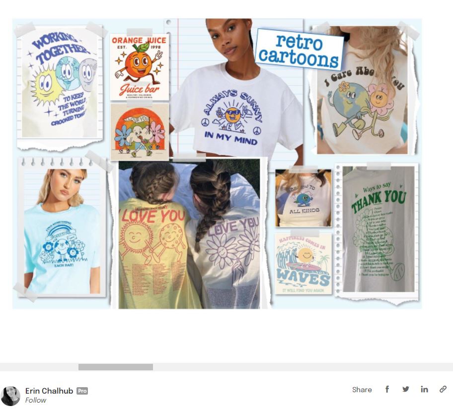
The pictures above are from a portfolio on the website Coroflot. This website covers a large spectrum of designing areas like 3d modelling, web development, motion graphics, photography, and much more. This website offers the ability for designers to not only post their work to their portfolio but also include an in depth About page including all of their details. This page includes education, industries, awards and former experience. The designer that created the portfolio above also composed her designs into collages based on different styles she uses which is even more inviting to a viewer.
This is a self promotional flyer for a meet and greet with the graphic designer Mike Perry. Perry has plenty of well known projects and designs which can be searched up easily on the web or found on his webpage if someone was interested in seeing his work. His name speaks for himself so he could have just made a black and white flyer without graphics. However, he still designed a new, unique flyer with one of a kind illustrations for the event as a form of self promotion for his style.
I chose this infographic on narcan because drug abuse advocacy has been a theme I have stuck to during this course. I think this graphic does a great job of not only telling what narcan does to someone when it is administered but showing it in the form of images as well. Many people don’t understand how many overdose deaths can be prevented with narcan. Additionally, many of these same people don’t know how to administer narcan either. This infographic also shows how to administer a nasal syringe of narcan with the use of simple graphics. I think that this infographic is very simple but it should be so people can learn the importance narcan without being overwhelmed.
I found this infographic available to be used on pinterest at
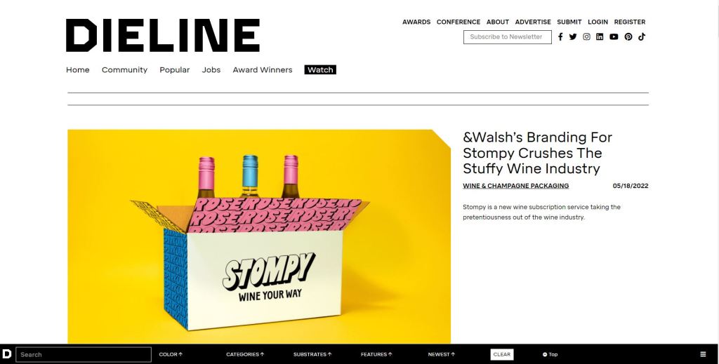
Dieline is a blog which focuses specifically on packaging design. I thought this blog was especially interesting after our identity project. Dieline is considered to be the “Bible” of the packaging design sector. Here, designers can review, critique, and stay informed of the latest industry trends as well as check out design projects that are being created in the field. For graphic designers that specialize in packaging design Dieline is crucial to know about.
This blog is designed with a sleek, modern tone with the viewers usability kept in mind. This can be seen by the unique search bar located at the bottom of the screen. This bar utilizes a plain, black background with simple, white text over the top. The bar not only has a keyword search but 5 different categories to filter the results. The search bar includes multiple aspects that can be manipulated but utilizes simplicity with color and font to keep it from becoming too complicated for users.
The simple and sleek design can be seen when diving into any of the posted articles as well. Their main goal as a blog is to keep designers informed and it is obvious that they want to do it by giving the reader/viewer little to no distractions from the information.
This is a picture of the storefront of the sign and print shop I work in back home. As you can see they have chosen a bright green to be a staple within their identity system. Additionally, they utilize a single, distinct font to be a staple throughout their identity. They have adopted this specific example of typography as their primary logo. The “Decal Designs” name can be seen in the distinct font and green color with a staggered orientation on their signs and trucks. I hadn’t known about identities before this course but now that I do I can see that they have developed one which is a constant within their company. I also know now how important this is for the success of a company. Its very interesting to me to see many of the things I have learned about in class in the real world.
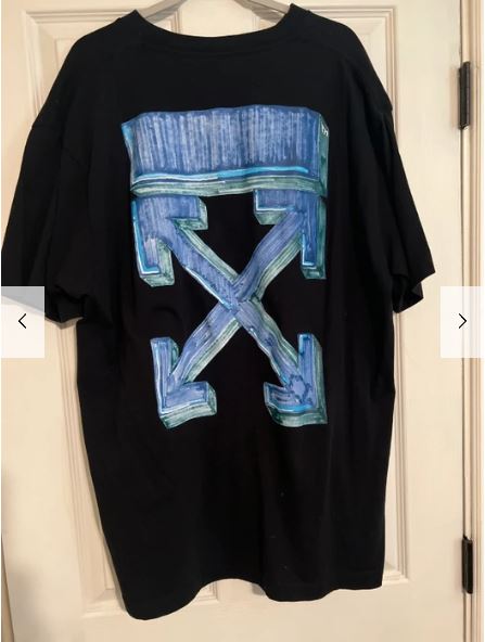
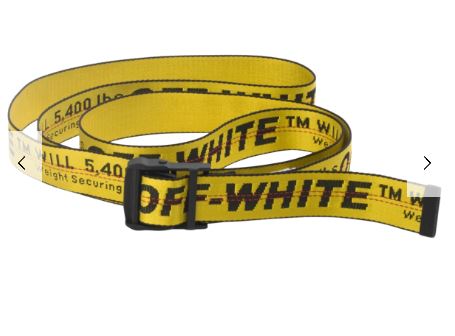
I chose the clothing brand Off-White for this identity post. I think that the identity system that the brand utilizes is intuitive and provoking which is why I chose it. As you can see from these pictures the brand often utilizes logos and designs that have a crude, industrial feeling to them. The arrow design in their most well known logo seem like it comes from a diagram from an instruction manual. This logo is used on a t shirt pictured but instead in 3D with added color. Although, the logo is somewhat embellished from its former state it still utilizes a color scheme and design which almost emulates rusted metal. This can be seen within their other products like the belt pictured even though it doesn’t utilize the diagram type logo. This belt is designed and colored to look like a safety belt for heavy machinery but with a modern twist.
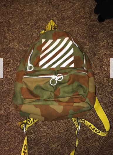
Even the protective bags that the products came in were given a striped design which gives the vibe of a warning label on a dangerous machine.
This identity system is not only eye catching but goes against the societal norms for much of the clothing we see everyday which Off-White has developed as one of their the staple values as a company.
Virgil Abloh created the designs which make the identity system for the Off-White clothing lines. He was also the artistic director of Louis Vuitton’s menswear collection in 2018. Unfortunately, Abloh was diagnosed with Cardiac Angiosarcoma, a type of cancer, in 2019 and passed away due to the sickness in 2021. However, his legacy still lives on at the Off-White company.
I decided to choose this logo created for a genomics company because it utilizes a technique of ambiguity of positive and negative space perfectly. The logo uses positive and negative space at the back of the characters head with a silhouette of a DNA strand which creates the signature knot that flows behind a ninjas head from his mask. Additionally, the ninjas head has a cut out exposing negative space behind it with a small red dot. This use of positive and negative space creates the signature mask for the ninja as well as it’s eye.
The creator of this image, Onripus, is a logo creator on that submitted this design and many others into a contest on 99designs. He or she utilizes the technique of ambiguity of positive and negative space in a multitude of their logo designs. These contests are held by companies where graphic designers are given certain parameters like color and font to create a logo design that matches the brand. The winner of the contest gets their design purchased by the company.
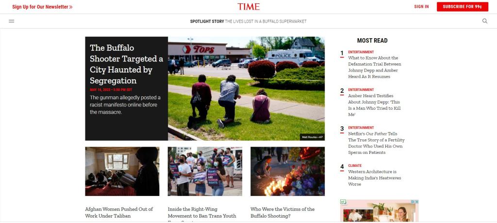
I decided with the time magazine home page because I wanted to choose something that related to my history major. This is an active news page with the purpose of being changed several times on a daily basis to show new information. As a result of this rapid cycling of information the webpage needs to be easy for a viewer to navigate and access so they continue coming back to see what is new. The simple choice of black, white, and red as a color pallet for the page makes the information being displayed very easy to read and navigate. However, this page does a great job of utilizing these basic colors as well as the font style to visually guide the viewer. For example, what is considered to be most important like topics of politics, human rights issues, and natural disasters are shown at the very center of the page behind a contrasting background but what articles are most read by viewers are beneath a bold label on the right side of the screen in smaller font without a background. This use of color and font style created a hierarchy from what they consider the most important articles and to the less important ones. Additionally, the balanced use of white space doesn’t leave the viewer overwhelmed and allows them to focus on one section of the page at a time. This white space creates a visible separation between the sections which also improves the hierarchy of the page.
Mike Perry is an award winning artist for a multitude of mediums not just graphic design. However, he claims that his creative purpose across all of his pieces is to “conjure that feeling of soul soaring wonder you have when you stare into distance galaxies on a dark night”. This can be seen from how vibrant and colorful these two graphic design pieces are from Perry. Also, Perry’s work has been exhibited across the globe including solo shows in London and Los Angeles. He is also the curator of the ongoing series “#GetNudeGetDrawn” which had a recent installment in 2018. He had also done continued work in graphic animations for Comedy Central’s Broad City. Below is a link to his webpage which features all of his art and more.
Johnathan Barnbrook has been considered one of the most well-known and revered graphic designers of the past three decades which recently includes creating the visual identity for David Bowie’s 2016 album Blackstar. He has talked at a multitude of festivals and conferences where he has highlighted the importance of the use of graphic design for advocacy. He also claims that due to significant events in the past decade or two like the financial crash, rise of inequality, and the rise of social media and its political usage that designers of this generation are more focused on and aware of advocacy than any previous generation.
This is an image which Johnathan Barnbrook designed for an issue of Adbusters in 2001. Adbusters is a not-for-profit publication that criticizes and advocates against “the hostile takeover of our psychological, physical and cultural environments by commercial forces”. This image particularly advocates for issues that graphic designers face when working with big corporations and companies.