
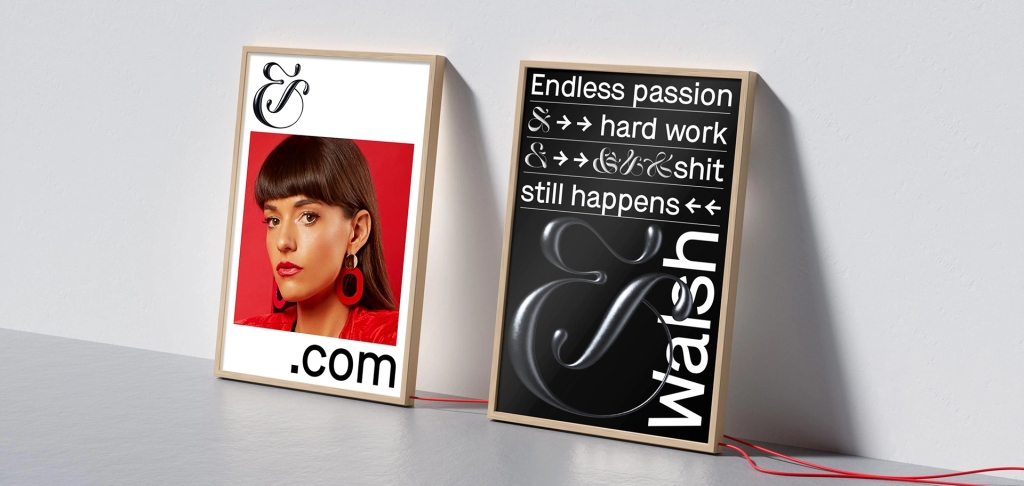
For this blog post I found Jessica Walsh’s website eye catching. After looking at her website and her work I was very intrigued with the colors she used and how her pieces are all clean but catch the viewers attention to make them more interested and invested. The point of putting your work on a website is to be more known and discovered by more potential clients. The first image I added to this blog is a really good image to catch peoples attention and promote her work. First, because the bright colors tend to catch viewers attention more. Secondly, It is made with the women wearing colors of the rainbow and posing in many different ways with different backgrounds and colors to show inclusiveness. The second image I included in this blog post is more simple however, Jessica Walsh uses her symbol a lot in her work. This symbol is simple yet bold since it is in majority of her work in a very large size. Jessica Walsh is promoting her use of design as well as photography and direction in her work. The pieces she has on her website are made to show clients what she can offer to them for any project they need. I really enjoyed looking through Jessica Walsh’s website and looking at the work she has created and what she is able to create. I recommend looking at her website and looking at her work.
