Identity System for brands includes all the visual elements that are associated with the brand like logos, product packaging designs web designs, and even the main colors that the brand uses. One of the identity systems that caught my attention was PayPal.
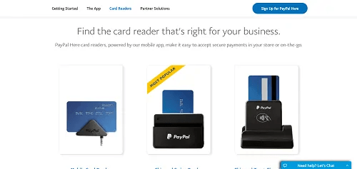

PayPal acquired its brand identity in 2014 with the help of Fuseproject. To maintain its image and identity to “better express its innovative DNA and future as the leader in digital payments” PayPal is linked with a bolder wordmark, stronger monograms, more vibrant colors, and a dynamic angle graphic that increases user perceptions of trust and innovation. PayPal’s logo is also strategically placed on its credit card readers. I like its identity system because is simple but powerful, catches people’s attention and it gives this sense of security and power that they want to feel from a company that it’s handling their money.

I think PayPal was a great and significant identity system to look into. The logo has reached many people to the point where most would recognize this if seen. They also have many products where their logo is on. I agree with you that the logo is “simple but powerful”, and “catches people’s attention”. This was a great sentence to describe the excellence of PayPal’s identity system. I also really connected with your statement of this logo holding a sense of security with it. You feel trust with it, trust holding the credit card, trust holding the logo.
LikeLike