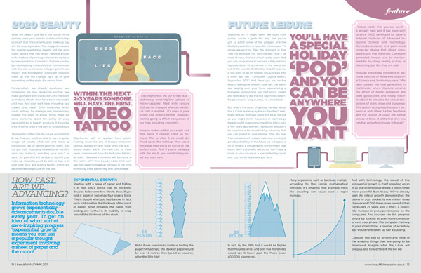
This is a magazine spread that I thought was beautiful. One reason why I chose this page as a successful design was due to the interesting graphics included. I felt that this grabbed my attention and made me more interested in wanting to read what the article was about. There are thin lines interconnecting the devices which I believe it supposed to act as a wire, and I felt that this made it easy for my eyes to follow the page. I also enjoyed how the page was broken up since the designer created a clear side bar on the bottom of the page. While looking at the sidebar, I felt that the designer utilized the column spacing well as each statistical example is in its own space. They also used a different font and color for this sidebar which attracted my attention as well. It makes it easily known how you should read the graphics as well. As for the main part of the page, I felt that they used the white space pretty well. The top right edge on the first page leaves space next to the pink side bar instead of having the pink bar go all the way to the edge. In terms of the hierarchy, I noticed that their main point that the future may include a video tattoo as well as a “holiday” pod jumps out at me before the actual headlines. I was immediately interested in the ideas of futuristic inventions and led me to want to read more. It was also placed in a darker color pink than the pink side bar so I knew it was more important than the rest of the text. I believe that using the warmer color pink was a good choice and caught the attention of the reader quickly. This article looked really cute and I loved the aesthetic. The designer did a great job making their spread fun to read!

This spread, simply put, is so cute! I think the colors and type are very visually pleasing. I really like the shadow effect on the title type and pull quotes. It’s very eyecatching and creates a sense of hierarchy between the spread’s needs. I also really like the simple graphics filling the page. What’s interesting is that there’s not a lot of white space, but I don’t think the spread feels crowded at all.
LikeLike