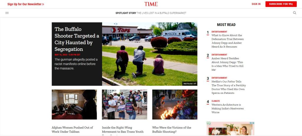
I decided with the time magazine home page because I wanted to choose something that related to my history major. This is an active news page with the purpose of being changed several times on a daily basis to show new information. As a result of this rapid cycling of information the webpage needs to be easy for a viewer to navigate and access so they continue coming back to see what is new. The simple choice of black, white, and red as a color pallet for the page makes the information being displayed very easy to read and navigate. However, this page does a great job of utilizing these basic colors as well as the font style to visually guide the viewer. For example, what is considered to be most important like topics of politics, human rights issues, and natural disasters are shown at the very center of the page behind a contrasting background but what articles are most read by viewers are beneath a bold label on the right side of the screen in smaller font without a background. This use of color and font style created a hierarchy from what they consider the most important articles and to the less important ones. Additionally, the balanced use of white space doesn’t leave the viewer overwhelmed and allows them to focus on one section of the page at a time. This white space creates a visible separation between the sections which also improves the hierarchy of the page.