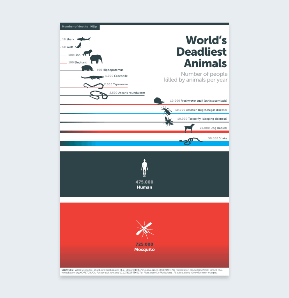
Bill Gates has helped fight malaria, a disease that kills over one million children a year. In 2014 he published the above infographic to his blog. This really caught my attention. It has minimal words and bold lines and colors. The bold lines and colors are the main image and information. It is very clear that the mosquitos are a much higher threat than sharks. This information is very shocking, surprising, and awakening to those who don’t know much about mosquitos and malaria. The simple illustrations are very straight forward. You immediately know the message of the infographic and you know exactly what it means. This is very well-done.
I feel like this infographic does a good job in making the information shown very easy to understand by keeping the colors simple and the text being minimal. Using the eye catching red for the biggest part of this infographic was a smart move because the red really helps to emphasize its importance without being too overwhelming. I wouldn’t expect mosquitoes to cause the most human deaths per year and its interesting to see in contrast that sharks only account for about ten deaths per year, though we as humans fear them more than the tiny annoying mosquito.

I feel like this infographic does a good job in making the information shown very easy to understand by keeping the colors simple and the text being minimal. Using the eye catching red for the biggest part of this infographic was a smart move because the red really helps to emphasize its importance without being too overwhelming. I wouldn’t expect mosquitoes to cause the most human deaths per year and its interesting to see in contrast that sharks only account for about ten deaths per year, though we as humans fear them more than the tiny annoying mosquito.
LikeLike