Mike Perry Meet and Greet Flyer
Blog Assignment #9
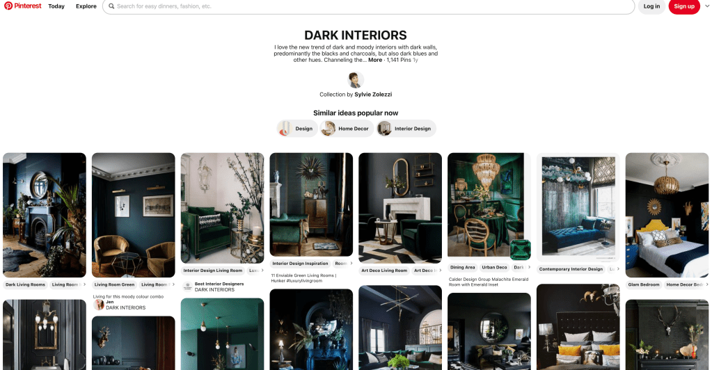
Pinterest is a social network where ideas are shared with the public. There are a variety of ideas within the service many pick from, depending on their search that could include home decor, recipes, graphic designs, resume ideas, and many more. This service is a great way to spread your own ideas and build a portfolio for yourself using different images and uploading to the social network. By creating your own material, you will begin to construct a platform for yourself where others will see you grow as work or ideas are being posted. While there are other platforms for creators to use, Pinterest is just as good as the others and I find this a great way to share your work and allow others to pin/save your work that they are interested in. I could scroll through Pinterest for hours if I wanted to, and pinpoint the different ideas for a project, ideas for a graphic design, or even how to cook a certain recipe.
https://www.pinterest.com: Self Promo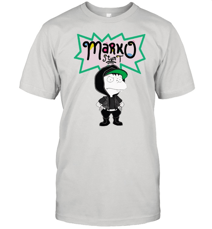
Marko is a youtuber who creates lots of designs on everyday objects using paint pens and other artist mediums. He created this merchandise for his viewers to buy, which works as a form of self-promotion, when the viewers wear the shirt. The artist elements of his shirt and his cartoon character, based off of The Rugrats, shows what he really does and what his personality is like. I believe this is a good form of self-promotion because it gets his name out all around the world when his viewers choose to buy his shirt. It allows a large number of people to see it without a lot of effort on his end.
Website: https://dontsleep.shop
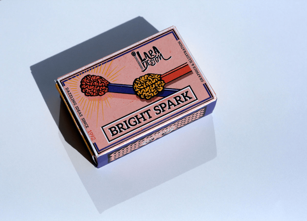
this is a self promotional design for a match box. it shows pieces of matches on the box and the top the matches is in a form brains. the colors used in this design is perfect for the theme it represents.
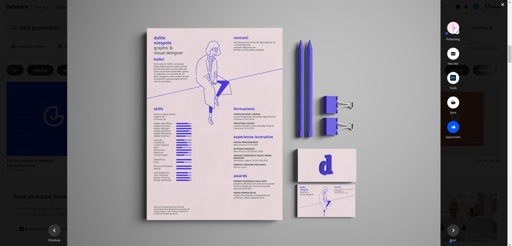
I chose to show case Niespolo’s self promo because I think it is extremally well done. It is a resume that does such a good job of showing that she is a designer but keeping it very simple and easy to read. I also really enjoy her color choice, the blue fits well with her theme throughout the self promo. One of my favorite aspects is how she uses charts to show how proficient she is in each designer software. I think this is a unique touch to her resume that allows the viewer to very quickly see what she brings to the table. Lastly I really enjoy the little self portrait. I like that it breaks up the page into two parts. i also enjoy that it really takes this from being a normal resume to a designers resume.
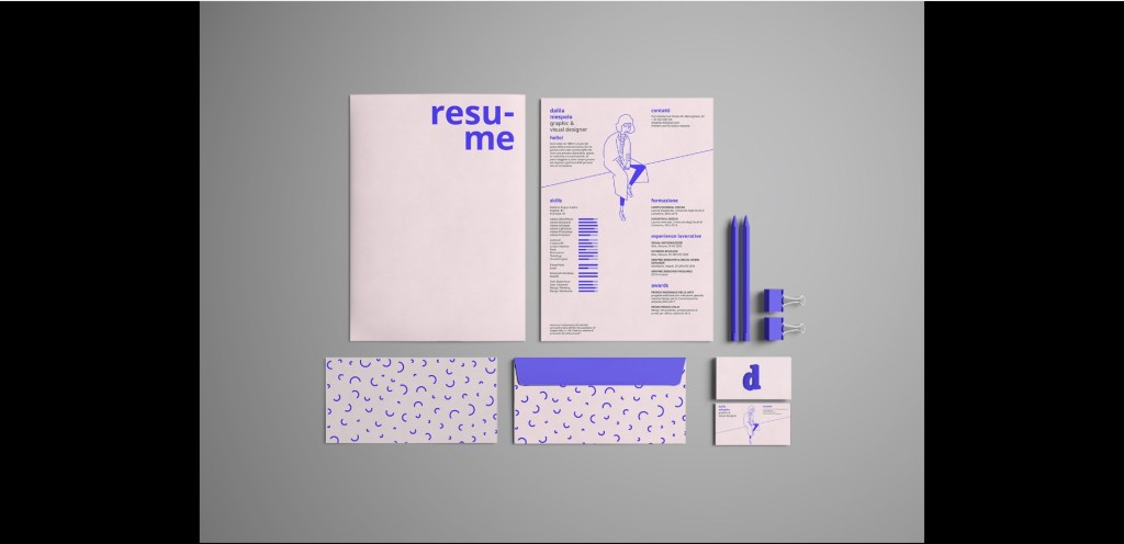

https://www.behance.net/gallery/93844725/HELLO-personal-resume/modules/542264843

Studio Ethur Ethur is a “multidisciplinary brand design studio focusing on the intersection of art & commerce.” They works on projects mostly in branding and creating logos companies. They also make the illustrations and designs as well. This studio has a common feel of fresh and fun throughout their work and I feel like their website also helps promote how they work and what they make as artists. They keep things simple with a black white and salmon pink color palette throughout their website which helps keep the focus on their projects which are in full color. They include some cute flower motifs within their website that move showing off their animation capabilities as well as their illustrative skills. They include their Instagram, behance and Pinterest at the bottom of ever page on their website giving the viewer more incentive to look at their other platforms of choice.

Check out their website!
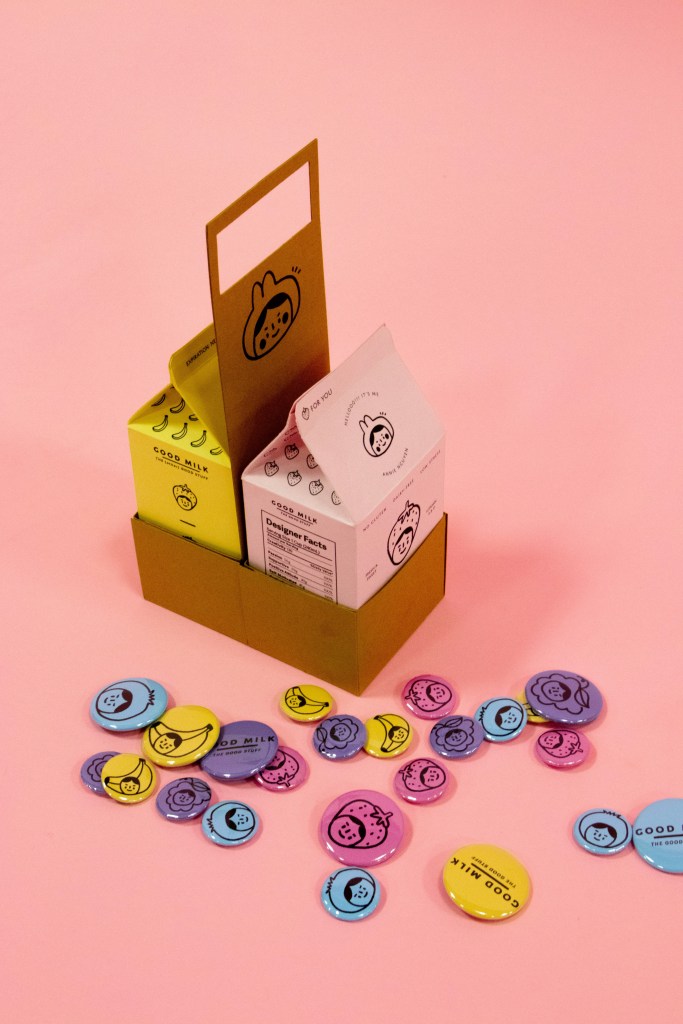
Good Milk by Annie Nguyen focused on creating ‘an effective and memorable self-promo to send to design studios.’ I think this self-promo is effective because her design is easy to recognize since it is cute and fun and uses pastel colors. Just by looking at the design and the use of the colorful background, Nguyen’s design is easily recognizable.
To see more of Good Milk by Annie Nguyen: https://www.behance.net/gallery/87746787/Good-Milk-Personal-Branding?tracking_source=search_projects_recommended%7CSelf%20Promotion
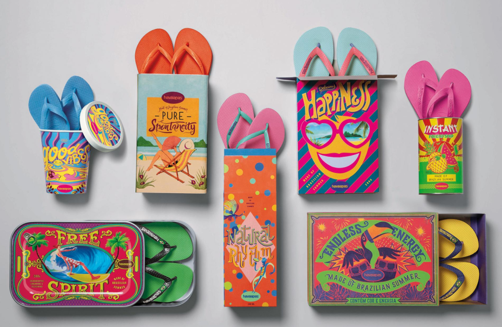
I found this designer to have created an eye-catching form of self promotion. The use of bright colors with varying designs is super attention grabbing and this makes people question what exactly is inside of these packages. People may question what “made of Brazilian summer” is and these packaging helps customers begin to associate the bright colorful designs with their brand. Additionally, the product of flip-flops are not usually what you would associate with these colors, however when you take into consideration that the bright colors are reflected in the color of the flip-flops that are being sold it makes total sense. This is just a super creative way to include the bright colors of the brand.
To see more of the designs click the link below!
https://www.adsoftheworld.com/media/integrated/havaianas_made_of_brazilian_summer
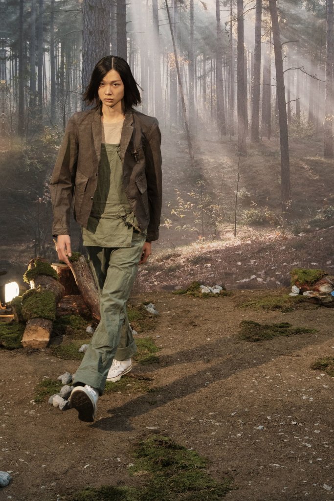
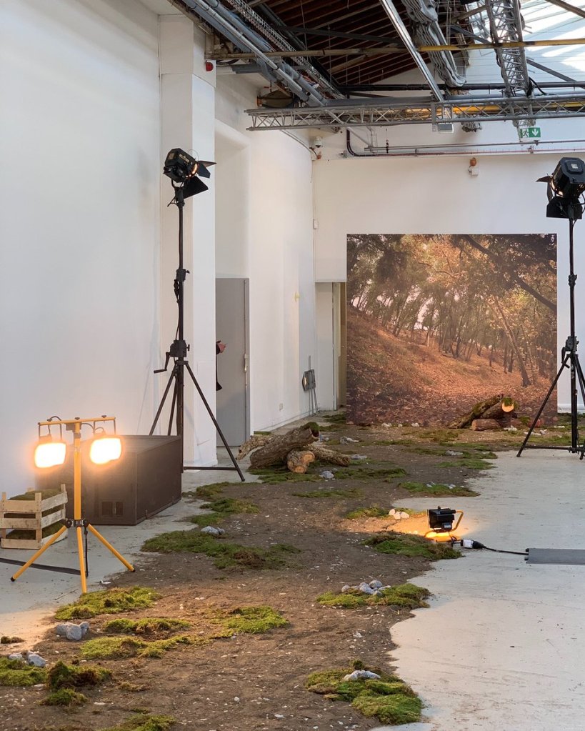
The first time I saw Reese Cooper was through Youtube. The video was about how his clothing and fashion got denied from fashion week. So, he rented a room in the same city as the current fashion week and put on a runway show with his clothing for free. He promoted his personal show and set everything up himself. I found it fascinating how he chose to make the venue look outdoors, especially in pictures, when they are actually in an all white room. This was the first encounter I had with Reese Coopers work.

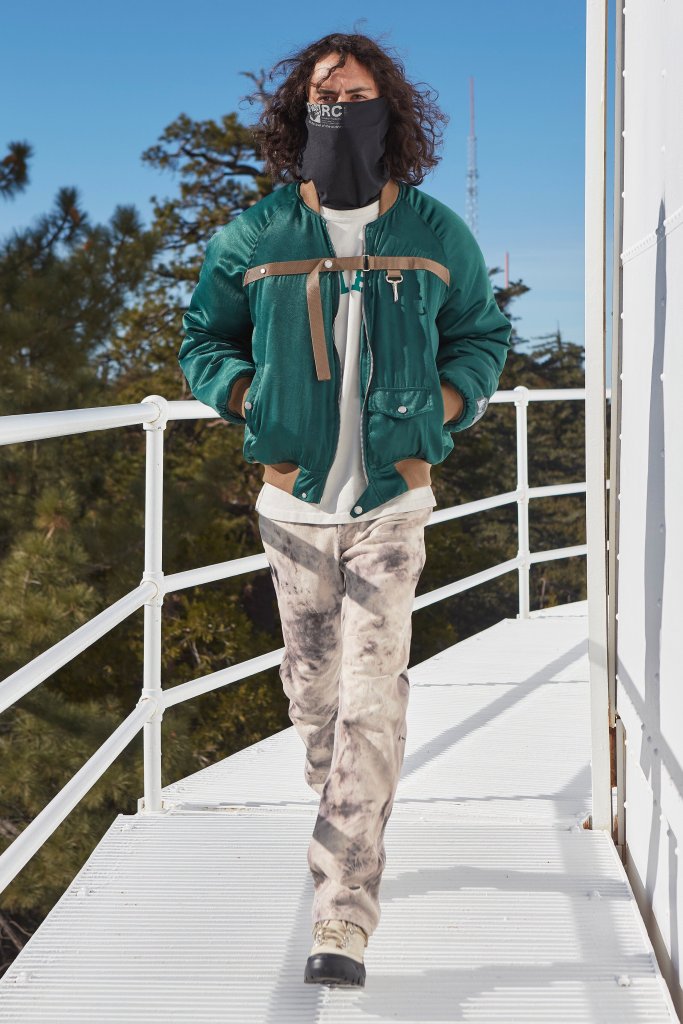
The second time I saw Reeses work was through Instagram. I saw he put on another runway show, but this time with more exposure and recognition from the first. The models walked on top of this rounded tower in the middle of nowhere. The scenery was beautiful but this looked so bizarre. The way he promoted his work seemed absolutely crazy and out of the box, I liked it.

Most recently, I saw Reeses newest project, a runway on a bridge. The way he thinks of these absurd scenes to promote himself blows my mind. I think that’s the reason why he is so successful. After all that’s what attracts me to his work.
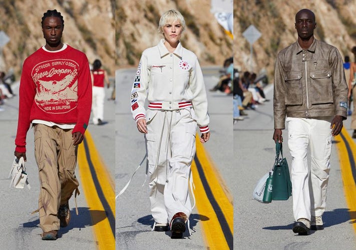
Visit Reese Coopers site here.
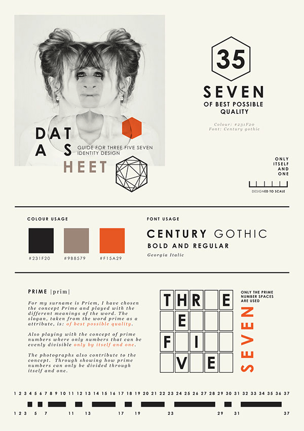
For this post, I decided to show Wanda Priem’s self-promotion portfolio. I think this portfolio looks very efficient and it works pretty well together. The colors and the negative space really activate the work and give it a professional look. It’s also nicely put together and brings up the artist personality a lot.

she decided to focus on the concept of “Prime” and use its different meanings to give life to the design. prime numbers are a constant idea here. the non-prime numbers are eliminated and only prime numbers are used. Trough this elimination, a pattern is formed, this pattern becomes a design element.The photographs also contribute to the concept. Through showing how prime numbers can onlybe divided through itself and one. Not only is this design very cohesive, but it has a complex message behind it. its meaningful its simple and very organized. I personally really like it.