Online Portfolio: Behance

Behance is a free online design portfolio owned by Adobe, where uses can share their work and view and interact with other artists’ work. The main focus of Behance is to showcase and discover creative work.

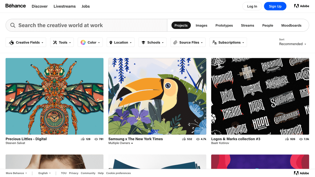
When a person clicks on Behance to visit the webpage, it automatically goes into artists designs and shows a thumbnail of the art, how many likes and views it has, and the artists who created it. From that homepage, you can use the search bar for projects, images, moodboards, people, streams, and prototypes. Or if you’re not entirely sure what you’re looking for you can search by creative field, tool (application used), color, location, or schools.

Link to Behance’s website: https://www.behance.net/

Self Promotion: Good Milk by Annie Nguyen

Good Milk by Annie Nguyen focused on creating ‘an effective and memorable self-promo to send to design studios.’ I think this self-promo is effective because her design is easy to recognize since it is cute and fun and uses pastel colors. Just by looking at the design and the use of the colorful background, Nguyen’s design is easily recognizable.

To see more of Good Milk by Annie Nguyen: https://www.behance.net/gallery/87746787/Good-Milk-Personal-Branding?tracking_source=search_projects_recommended%7CSelf%20Promotion

Information Design: Art of Layer – Cake

I think the infographic is so cute and effective! The designer of this infographic is Sung Hwan Jang. I love the use of pastel yet still bright a color palette. I love how the graphic includes general information such as the ingredients for the cake and the process of baking a cake. I also love that there is extra information about cake, such as different styles of the pastry bags, types of decoration, and the types of cake.

Unfortunately this graphic is mainly in Korean. It’s an obstacle to fully understand the graphic, however the titles of each section are in English which is helpful. It is also extremely helpful that the graphics can speak for themselves and one doesn’t necessarily need text to comprehend what the graphic is saying.

Cake Infographic Poster Link: https://www.behance.net/gallery/56458085/1708-Cake-Infographic-Poster?tracking_source=search%7Ccake

Great Design Blogs: The Design Blog

The Design Blog was founded, designed, and curated by Croatian designer, Ruby Bacanovic. TDB includes carefully curated design inspiration from designers and design studios, mainly focusing on young designers and students, all across the world.

Home page of The Design Blog

I love the color pallete of this blog: different shades of yellow, dark brown, white, and pops of bright blue. Every color contrasts each other so that it stands out. It makes the blog feel bright and fresh.

This blog is easy to navigate and provides a great source of visual inspiration. There are many specific categories to choose from, which makes finding artistic inspiration straightforward.

Some of the many categories The Design Blog has available.

Seen in the Real World: O-Factor poster

I knew I wanted to do some sort of poster for graphic design in the real world and this poster for O-Factor is perfect to talk about. I found it in the Wills’ dining hall lobby on the bulletin board.

For the design on the poster I would say it’s basic, but it gets the point across. The graphic shows music sound waves, which lets people know off the bat someone is going to be listening to something and it is going to be music related. The surrounding text lets viewers know what the poster is for (to vote) and when and where voting is going to be taking place.

Personally for me I don’t think the title of the poster works well in its favor. The first time I saw it, I thought it just said Factor and then I realized it was actually saying O-Factor instead. I did appreciate them trying to be creative and include the Activities Council symbol within the O, however I don’t think it easy to read at first glance, at least for me.

Identity System: Pandora

Pandora Jewelry is most known for having high qualitiy jewelry at an afforadable price. “Pandora designs, manufactures and markets hand-finished and contemporary jewelery made from high-quality materials at affordable prices.” – About Pandora

Pandora’s home page
Exploring Pandora’s page

Pandora’s website is minimalistic and uses three main colors: pink, white, and black. Pandora’s website is classy and clean. It is designed to help people easily navigate what they are looking for.

Pandora first started in 1982 as a jeweler’s shop in Copenhagen, Denmark by Danish goldsmith Per Enevoldsen and his wife Winnie. Over the years they became more successful as wholesalers. Today Pandora is about inspiring women to express their individuality.

In 2000, Pandora’s charm bracelet concept was first launched in the Danish market and has grown since then. Pandora is well known for their charms and being able to pick and choose which ones match a person’s personality. Their website allows for easy navigation to pick which specific charms a person would like that suits them best.

Pandora’s Charms & Braclets subtab allows for easy navigation.

Links Used:

Ambiguity of Positive & Negative Space: USA Network

USA Network Logo 2005-present

This simple, yet effective logo uses negative & positive space perfectly. The designer, Sean Serio, creates an ‘s’ between the ‘u’ and ‘a’ using negative space that connects all the letters within the word. This logo is clear and easy to understand and doesn’t overcomplicate the logo. USA Network changed their logo to this one in 2005 and have been using it since then.

Websites Used:

The Beautiful Page: Magazine Spread

Image found from: Pinterest; Q Magazine, February 2012

I love this magazine page layout because of how simplistic it is. It is straightforward and easy to read. The page gives the title of who they are reporting on as well as an image that takes up an entire page to really make it clear who this article is going to be about. The page has a clear introduction paragraph and two main paragraphs. The magazine uses negative space well. It centers the introduction paragraph on the bottom, which leads readers eyes to move to the top right, which is where the actual article starts. In total there are three main paragraphs, with mini paragraphs within them, making it easier to read since it doesn’t overwhelm people with several blocks of text.

There is a clear hierarchy of text within the article page. The introduction paragraph’s font size is bigger than the other article paragraphs and is bolded as well, making it clear that what people are reading is the beginning of the article. It then leads the readers eyes to the right column to where the article starts. In that column contains two big paragraphs, which then breaks down to smaller paragraphs of around 2-3 sentences, which makes it easier to read since the paragraph isn’t just one big blob of sentences, which people can easily lose focus in.

History of Graphic Design: Saul Bass

Saul Bass most notable graphic design works which include film posters and brand logos.

Both a filmmaker and graphic designer, Saul Bass is most known for his design of movie posters as well as logos for many famous corporations.

Born in 1920 in New York City, Saul Bass as a child had always been creative. In college he took classes at the Art Students League where he studied under Gyorgy Kepes.

After college, he left New York to go to California where he would work for advertising, until he gained popularity from working on the poster to Carmen Jones (1954). Through this poster, many filmmakers took notice of Bass and invited him to work with them, which lead to the making of Bass’ poster designs of The Man with the Golden Arm (1955) and Vertigo (1958) and many more.

He later also went on to design many famous logos for brands such as Quaker Oats, Girl Scouts, AT&T, Kleenex, and Warner Communications.

Ester Hernandez

Image: Hernandez, 1982, Sun Mad, screenprint.

Sun Mad by Ester Hernandez is a screeprint created in 1982. It stands to bring awareness to water contamination by pesticides and how it effects the environement, the farm workers, and those who consume. Hernandez created this image out of her anger of the loss of humans and environment of using pesticides within growing grapes in California.

Ester Hernandez is a visual artists known for her art work of latina and native women. Her work includes social, political, ecological and spirtual themes. Hernandez is considered to be an important figure within the Chicano civil rights movement of American in the 1960s.

Visit Ester Hernandez’s website