Blog Post 2 Mike Perry

Mike Perry is an award winning artist for a multitude of mediums not just graphic design. However, he claims that his creative purpose across all of his pieces is to “conjure that feeling of soul soaring wonder you have when you stare into distance galaxies on a dark night”. This can be seen from how vibrant and colorful these two graphic design pieces are from Perry. Also, Perry’s work has been exhibited across the globe including solo shows in London and Los Angeles. He is also the curator of the ongoing series “#GetNudeGetDrawn” which had a recent installment in 2018. He had also done continued work in graphic animations for Comedy Central’s Broad City. Below is a link to his webpage which features all of his art and more.

https://www.mikeperrystudio.com/

Rodrigo Corral

Rodrigo, who is at the helm of Rodrigo Corral Studio, is a celebrated designer, and is also the Creative Director for Farrar, Straus & Giroux and Creative Director at Large for New Directions. Rodrigo published his own New York Times bestselling book, SNEAKERS, and launched an app called Wutch.

Rodrigo Corral Studio has delivered some of the most iconic visuals in publishing, and creates leading conceptual design and art for books, brands, interior spaces and film.

Your can read more on Rodrigo Corral here: http://rodrigocorral.com/about

April Greiman

I decided to take a look at April Greiman. She was born in 1948 in New York city where she grew up. She went to the Kansas City art institute and then went to Switzerland where she learned under Armin Hofmann and Wolfgang Weingart. After her time in Switzerland learning she moved to Los Angeles and started Made in Space. “Currently, April Greiman is appointed at the Woodbury University, School of Architecture as an art instructor. She also teaches at the Southern California Institute of Architecture” Her impact on graphic design has won her awards including the Gold Medal for lifetime achievement from the American Institute of Graphic Arts. If you would like to read more about this site, you should check out this article. 

April Greiman, 1987, Pacific Wave

John Maeda

Ayannah Newton

John Maeda | Morisawa 10 Poster | 1996

John Maeda is a contemporary graphic designer. He is also an author, scholar, and computer scientist. His work mainly focuses on exploring the point where design, technology, and business come together. Maeda serves as a pioneer in interactive motion graphics. His work is considered groundbreaking in a way that it explores and alters the fundamentals of design. Maeda has written a number of books about design, however his book The Laws of Simplicity, is considered to be a landmark in the graphic design world. The book explores how to ‘need less but get more’ using ten laws for balancing both the complexity and simplicity within design, business, and technology. A portion of his work, including the above design, is stored in the permanent collection of the San Francisco Museum of Modern Art.

John Maeda | The Laws of Simplicity

View more of his work stored at the MoMA here:

https://www.moma.org/artists/30299

Stefan Sagmeister

Stefan Sagmeister is a known for his graphic design, performance art, and typography work based in New York City. In 1933, he founded his company Sagmeister Inc., specifically to create designs for the music Industry. Pictured above are two examples of album covers done by Sagmeister. He is known for his wide variety of tools, materials, and techniques, his typography, and his controversial imagery that shapes his artistic identity. He has done movies such as The Happy Film and has designed album covers for Lou Reed, OK Go, The Rolling Stones, David Byrne, Aerosmith, and Pat Metheny.

The images above Sagmeister makes the words come alive. Not only does he out type onto people but he makes the type apart of the person. The type is the focal point. He uses such bold and strong structure to his work that it really stands out.

Sagmeister’s website is truly brilliant. I would recommend checking it out! https://sagmeister.com/

Seymour Chwast: Roscoe (Fatty) Arbuckle

Seymour-Chwast-Roscoe-(Fatty)-Arbuckle_-PPG-its-nice-that.jpg

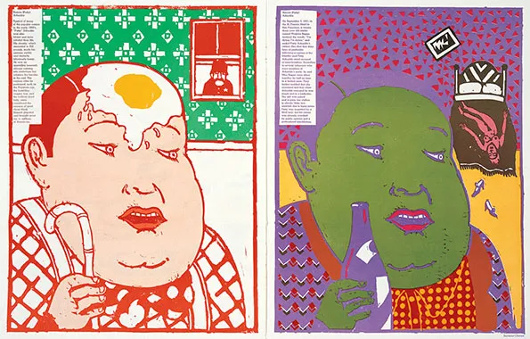
Seymour defined what graphic design and being a graphic designer meant in the twentieth century, creating graphics that not only looked amazing, but also communicated a message that might be anything from a light-hearted remark on design to an anti-smoking billboard. As seen by a terrific new online resource, the Seymour Chwast archive, his much-imitated graphic and illustration style still stands up well today. Chwast chose Roscoe Conkling “Fatty” Arbuckle, a silent cinema actor and comic who was allegedly accused of rapping and killing actress Virginia Rape, for “The Dark Side Of Good People” issue. this art shows two sides of the poster where in the first page the man has a nice pleasant interface and then the second poster has a darker side to it.

Louise Fili

Matches_Overview_2018-05-14.jpg

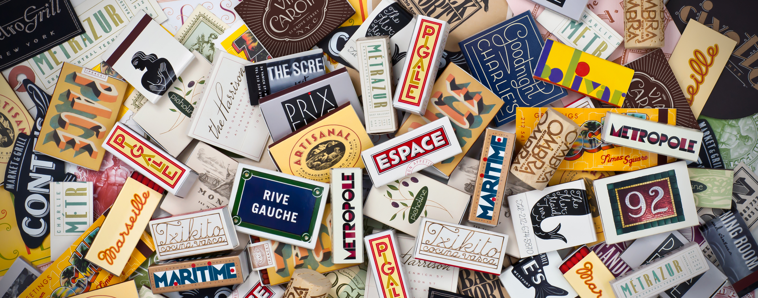
Louise Fili is an American graphic designer who draws heavy inspiration from her love of Italy, Modernism, and styles the of European art deco. She is based in New York and her work is mostly based around her work with typography. Her work is practically timeless in the way that it draws from the 1930s art deco style while still maintaining a modern and fresh feel. Fili taught herself how to do typography and she attended Skidmore College to study art after. Louise Fili opened up her own studio in the late 1980s. Her studio usually works with restaurant and food based marketing, packaging and branding. Along with this Fili also has made covers for over 2,000 books and has even co-written books with her husband Steven Heller, who is an author himself.

You can find more about Louise Fili and her work on her studios website: https://www.louisefili.com/

Barbara Kruger

Ivanah Alexandre

Untitled (Look and listen), 1996

Bio

Barbara Kruger (b. January 26, 1945) is an American artist who is most known for her collage art. Her artwork tends to combine black and white photography with bold statements in white boxed in a bold red rectangle. She is said to use Futura Bold Oblique or Helvetica Ultra Condensed as her font. She attended Syracuse University then Parsons School of Design in New York City. Kruger spent some time working for Conde Nast Publications as a graphic designer for their Mademoiselle magazine. She was even promoted to being the head designer at Mademoiselle magazine when she was only 22 years old.

Supreme

I’m sure a lot of us familiar with the super popular fashion brand Supreme. The brand has become iconic through there box logo (they call “logo”). It works because it is so simple and it’s easy to read and it’s bright. Kruger has confronted the fashion streetwear brand for appropriating her style for it’s logo. I suppose “imitation is the a form of flattery”.

Work

Untitled (We Don’t Need Another Hero), 1987

A lot of Kruger’s work focuses on media and politics. She tells a story in a simple and direct statement. Kruger says she likes to use personal pronouns such as “you”, “I”, “we” because they “cut through the grease”. She recognizes that we are the change. If we want the system to change the action begins with us. She is still alive at 72 years old and she lives and works in New York and California. A lot of her artwork lives at the Museum of Modern Art and the Los Angelos County Museum of Art.

Visit this Barbara Kruger tribute website to view the rest of her notable works.

Susan Kare

The Woman Who Gave the Macintosh a Smile | The New Yorker

Susan Kare is a graphic designer based on San Francisco, California. If you’ve ever used a computer before, you have most likely seen software icons designed by her. She graduated from New York University with a Ph.D. in fine arts. She began to work at a museum, and although creative, it wasn’t her thing. She then decided to work for Apple in 1982 and was the only one in charge of graphics. When working for Apple, she designed the Macintosh with a face, as seen above. About a decade later, she decided to create her own graphics studio called Susan Kare Design. She recently worked as the Creative Director at Pinterest, a well known website and app about creativity and inspiration. In the past she has also worked for Microsoft, IBM, Sony Pictures, Facebook, and now Niantic Labs.

Susan Kare has a ton of involvement in all things technology, symbolically. She has created icons for software for hundreds of different companies and was the creator of the command symbol. She is known as the “woman who gave the Macintosh a smile.” She also designed a bunch of fonts for Apple. Overall, Kare is one of the most significant technologists of the modern world.

To find out more about Susan Kare and see more of her work, you can visit: https://kareprints.com

History of Graphic Design: Saul Bass

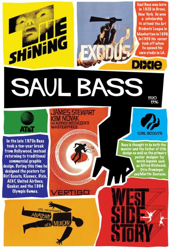
Saul Bass most notable graphic design works which include film posters and brand logos.

Both a filmmaker and graphic designer, Saul Bass is most known for his design of movie posters as well as logos for many famous corporations.

Born in 1920 in New York City, Saul Bass as a child had always been creative. In college he took classes at the Art Students League where he studied under Gyorgy Kepes.

After college, he left New York to go to California where he would work for advertising, until he gained popularity from working on the poster to Carmen Jones (1954). Through this poster, many filmmakers took notice of Bass and invited him to work with them, which lead to the making of Bass’ poster designs of The Man with the Golden Arm (1955) and Vertigo (1958) and many more.

He later also went on to design many famous logos for brands such as Quaker Oats, Girl Scouts, AT&T, Kleenex, and Warner Communications.