Online Portfolio Dribbble

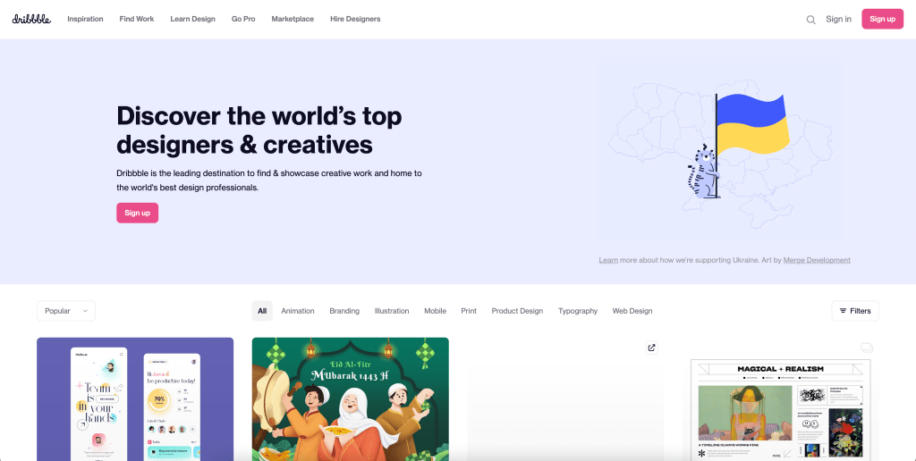
Dribbble is an online site aimed for people’s personal use. It allows individuals or teams of people to post all sorts of different work created by them. There are different categories including animation, branding, typography, web design, and more. Dribbble also allows the user to make comments on someones work, just like you can here on WordPress, as well allowing the user to like anyones post that you find interesting. It has options for regular memberships and has the option for a user to get a pro membership, which is exclusively for Freelancers.

Check it out here: https://dribbble.com

Self Promo MARKO

Marko is a youtuber who creates lots of designs on everyday objects using paint pens and other artist mediums. He created this merchandise for his viewers to buy, which works as a form of self-promotion, when the viewers wear the shirt. The artist elements of his shirt and his cartoon character, based off of The Rugrats, shows what he really does and what his personality is like. I believe this is a good form of self-promotion because it gets his name out all around the world when his viewers choose to buy his shirt. It allows a large number of people to see it without a lot of effort on his end.

Website: https://dontsleep.shop

Information Design How We use Social Media

How Adults and Teens Use Social Media Infographic - e-Learning Infographics

This Infographic was one that I thought was well done. There is lots of visual graphics instead of just stating facts, which gives information to readers quickly. I enjoy the way they broke down the facts into different visuals, instead of just repeating the same visual over and over. The charts are easy to understand when looking at comparisons because you can easily tell which group had used that form of social media most. The color scheme is also something to note. The infographic contains mostly orange and blue, which are complementary colors. The background is a tan color, so it doesn’t take away from the information given. I think this infographic is successful in the way the information is presented.

Source: Pew Research Center studies from August 2013, May 2013 and February 2013

https://elearninginfographics.com/how-adults-and-teens-use-social-media-infographic/

Design Week

Design Week is a company in the UK that used to be an actual magazine. In 2011, they switched to online-only viewing. They feature lots of posts and information regarding different brands, graphics, interiors, and more. There is tons of news about different designers and also have job postings right on their website. I think this is a great design blog because it offers many unique features, like the job postings, that make it stand out from other design blogs.

Feel free to check it out.

/https://www.designweek.co.uk

Seen in the Real World: Nerds

I chose Nerds for a design seen in the real world because of the bright colors. There is a large variety of vibrant colors to demonstrate that it is the rainbow version of Nerds. This is a candy that is supposed to be appealing to children (and me), so there are lots of fun shapes and characters. It has a playful composition to draw in children who see this sugary candy in the candy aisle. The Nerds mascots, which look like frogs, have very positive facial expressions. They are seen around the title and provide the character sense that children are easily drawn in by. Behind the title, Nerds, there are fun shapes that highlight the name of the candy. These are dark colors, which make the white words pop.

Red Bull Identity System

A brand that I believe has a great identity system is Red Bull. Everyone knows the energy drink advertised around the world with its bright and vibrate colors and distinct logo, along with their well known slogan from countless commercials, “Red Bull gives you wings.” It was created to draw viewers in through advertising that their drink gives you so much energy that you’ll have the wings to get things done. The iconic “gold and red” color scheme is what makes the logo recognizable. All of the Red Bull cans have this logo slapped on, front and center, to make them recognizable, no matter the color of the can. The logo also features two bulls about to collide with their horns against the backdrop of the sun. The thin and tall shape of a Red Bull can is also a feature more unique to them. The logo and slogan were made by the company owner Dietrich Mateschitz in 1987. He is the co-founder and owns about half of the company. The vibrant colors and recognizable logo is what makes Red Bull a strong identity system.

https://www.redbull.com/us-en/energydrink/company-profile

The NBC Logo

Gestalt Theory for Logo Designers
The NBC (National Broadcasting Company) logo is a good example of positive and negative space and ambiguity. It was designed by Graham and Herb Lublin. The main part of the logo shapes a peacock through the white space around the colors. NBC adopted this logo due to the bright colors, hues and overall richness in color. It was also chosen to catch the viewers attention because color TVs and Programs were on the rise. The six feathers of the peacock represent the network’s six divisions including yellow for news, red for entertainment, blue for network, orange for sports, green for productions, and purple for stations.

https://blog.logomyway.com/nbc-logo-history-behind/

Trinity Information Solutions

This simple, but effective design is what made me choose this website. This is the website of an IT/Software/Web Development company called “Trinity Information Solutions.” It is a simple website that is easy to navigate and has enough words to get the points across without overloading the viewer. The balance of white space consists of space above and below an image. The white bar at the top consists of links to other pages on his website and his logo, while the other white bar gets the importance of contact information across. The bottom dark grey portion gives a small amount of information about what the business is about and how experienced the employees are. I think this website’s simplistic design is successful due to the elements it consists of.

Website: http://trininfo.com/index.html

Susan Kare

The Woman Who Gave the Macintosh a Smile | The New Yorker

Susan Kare is a graphic designer based on San Francisco, California. If you’ve ever used a computer before, you have most likely seen software icons designed by her. She graduated from New York University with a Ph.D. in fine arts. She began to work at a museum, and although creative, it wasn’t her thing. She then decided to work for Apple in 1982 and was the only one in charge of graphics. When working for Apple, she designed the Macintosh with a face, as seen above. About a decade later, she decided to create her own graphics studio called Susan Kare Design. She recently worked as the Creative Director at Pinterest, a well known website and app about creativity and inspiration. In the past she has also worked for Microsoft, IBM, Sony Pictures, Facebook, and now Niantic Labs.

Susan Kare has a ton of involvement in all things technology, symbolically. She has created icons for software for hundreds of different companies and was the creator of the command symbol. She is known as the “woman who gave the Macintosh a smile.” She also designed a bunch of fonts for Apple. Overall, Kare is one of the most significant technologists of the modern world.

To find out more about Susan Kare and see more of her work, you can visit: https://kareprints.com

Hilppa Hyrkäs

Hilppa Hyrkäs is an Art Director from Finland. She designed this poster about climate change in 2006 and named it “Stop Climate Change.”

She thought mostly about what climate change is and how it affects the environment, the weather, health, and economy. When piecing together this poster, she took these ideas to create a simple yet effective piece. Polar bears are highly effected by climate change, as their entire environment is ruined if it isn’t cold enough for them to live. The melting of the ice caused by climate change has led Hyrkäs to take an image shaped like a polar bear to represent the ice, and have it breaking into pieces, just like the large sheets of ice are breaking.

Here you can find more of her artwork: https://www.behance.net/HILPPAHYRKf1c9