Online Portfolio: Behance

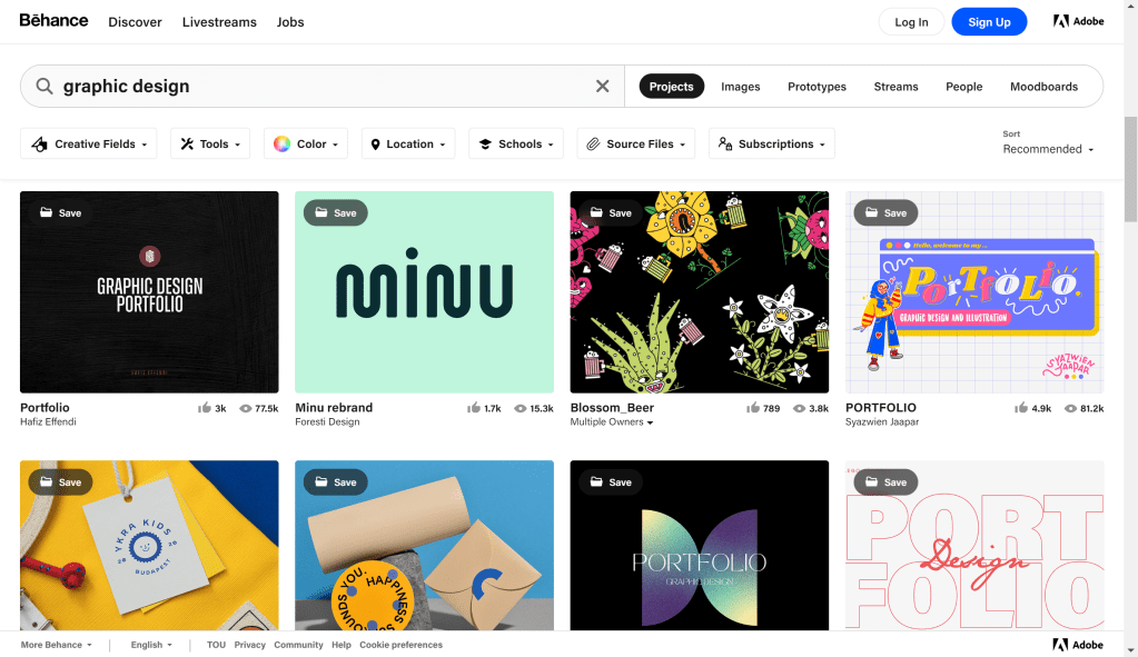
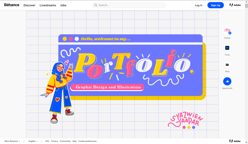
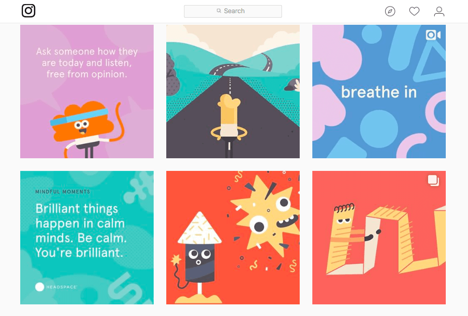
Behance is a portfolio website owned by adobe. Most use this website for displaying their artwork whether that be designing, illustration, or traditional artwork. You can create a website with their services for free and you can use your email address to make it our your Facebook, Gmail or apple account. On the main page of Behance they showcase artist pages. You can click on a page a view their page with ease. As you scroll through their page you can tell how much individuality is in their website, Each pages is unique to the artist that each of their own twist on their page. You can also follow and like these pages and on the main page of Behance you can see how many likes and views each pages has on the bottom of their photo show on the main page. One artists page stood out to me while I was look through the Behance website. The artists name is Syazwien Jaapar and she is an illustrator from Malaysia. Her page was full of bright and fun colors that caught my attention when scrolling through the main page of Behance and looking through her portfolio I really could get a feel for her as an artist and as a person. Like her portfolio her artwork also heavily featured bright and vibrant colors. Her work was incredible to look at and gave me a lot of inspiration for how I would like my portfolio website to look.

Here is the website for Behance and I have linked Syazwien’s portfolio to her name above

Self-Promo: Studio Ethur Ethur

Studio Ethur Ethur is a “multidisciplinary brand design studio focusing on the intersection of art & commerce.” They works on projects mostly in branding and creating logos companies. They also make the illustrations and designs as well. This studio has a common feel of fresh and fun throughout their work and I feel like their website also helps promote how they work and what they make as artists. They keep things simple with a black white and salmon pink color palette throughout their website which helps keep the focus on their projects which are in full color. They include some cute flower motifs within their website that move showing off their animation capabilities as well as their illustrative skills. They include their Instagram, behance and Pinterest at the bottom of ever page on their website giving the viewer more incentive to look at their other platforms of choice.

This is some of the projects that they have done with Redbull

Check out their website!

https://www.ethurethur.com/projects

Information Design: Gender Pay Gap

When looking at different infographics this one stuck out to me. I really enjoyed the color palette used for the design. They also didn’t use black instead they used a navy blue and they use a light beiges instead of white which I think give the design a light and less harsh feel than it would have with straight black and white. The titles to each categories really helps me as the reader find out what information can be found and where. It interesting to see the wage gap and how it effects different parts of the world.

This infographic was made by a woman named Heather Griffin, I unfortunately could find its origin.

Seen in the Real World: Tops Reusable Bag Illustration

This fun little graphic is on one of the reusable bags I take shopping with me. I really enjoy this design, although I’m not too sure why its shaped like a buffalo, but that animals shape comes across very clearly and I love that the shape is made up of other tiny graphics all in the shapes of grocery items. The food within the buffalo shape have all different types of line weights and I think that adds some visual breaks within the shape so it all doesn’t just get all lost because the line weight is the same throughout. There is a cutout heart in the middle of the buffalo shape and it was made not by cutting out the details of the smaller items that make up the shape but formed by the items making the edge clean and not splitting any of the small graphics in half and I think that was a very smart choice. There is one design element that I think is very cute and its that the horn on the buffalo is made with a croissant.

Identity Systems: Headspace

Headspace is a meditation app that uses science to help its users calm down from stressful days, lull users to sleep or boost their mood for a brighter day. The brand implements cute and colorful graphics to help push the calm and happy vibes. The color palettes used in most of their branding are calming blues popping yellows and serene purples bringing in the elements of stress relief, inviting joy and peaceful rest. They make great use of the cute characters within their branding as well making them flexible and fun shapes to bring home the message that anyone can use their app. These graphics are also very simplistic and fun to look at making their website and social media very easy to scroll through. I also like the name of this brand because this app is pushing to help users make their headspace a better place to be. So its a very straightforward name for this brand.

Logos: Girl Scouts

The girl scouts logo is a design that uses its negative and positive space design to create the faces of three girls. Saul Bass is the man who created this logo in 1978. Aiming for simplicity and a sense of unity. The women’s heads are shaped to form a four leaf clover to further push the ideas of looking toward the future, unity in the face of differences and female friendship. The green color palette also helps to push the Girl Scouts love for nature, with a few tint changes over the years its always been green. With its unique but simplistic design it is very recognizable even when slightly changed to modernize it.

Heres the Girl Scouts website where you can find out more on their history: https://www.girlscouts.org/en/discover/about-us/history.html

Beautiful Pages

I think that this layout is very interesting and well thought about because of the way it uses the topic of the article to influence its layout theming. The article is on Beekeeping so the images within this article are all shaped like honeycombs which is a very fun artistic detail used to enhance the articles layout. The way the title is placed on the left page really helps give it the attention it deserves by being surrounded by empty white space. It also has the most visual hierarchy of all the other text because it is the only piece of colored type, it has a unique font and it is the largest size. I like how the images are laid out on the spread, the asymmetry created and the weight distribution helps the title breath on the left hand page and helps the body text fill up the white space on the right. I like how the text is wrapped around the pictures but leaves enough space for a border to be placed around the images. This gives attention to the images while also helping sperate the text in a interesting way.

Louise Fili

Matches_Overview_2018-05-14.jpg

Louise Fili is an American graphic designer who draws heavy inspiration from her love of Italy, Modernism, and styles the of European art deco. She is based in New York and her work is mostly based around her work with typography. Her work is practically timeless in the way that it draws from the 1930s art deco style while still maintaining a modern and fresh feel. Fili taught herself how to do typography and she attended Skidmore College to study art after. Louise Fili opened up her own studio in the late 1980s. Her studio usually works with restaurant and food based marketing, packaging and branding. Along with this Fili also has made covers for over 2,000 books and has even co-written books with her husband Steven Heller, who is an author himself.

You can find more about Louise Fili and her work on her studios website: https://www.louisefili.com/

Shigeo Fukuda

Fukuda was commissioned to make posters for Earth Day. This piece with three other pieces were made, but this one is the most popular design. This piece was named “1982 Happy Earth Day”.

Shigeo Fukuda was a celebrated sculptor, poster designer and graphic artist of the twentieth century. Fukuda was born to a toy manufacturing family on February 14, 1932 in Tokyo, Japan. Fukuda expressed interest the minimalist swiss style of graphic design. This occurred at the end of the Second World War. He got his education in designing at the National University of Fine Arts and Music. He graduated in 1956. His work was first recognized and gained attention at a Czechoslovakian graphic design competition. His interest in illusionism started in the 1960’s. He wrote a column on visual magic for a Japanese newspaper. HIs column was named “Have you see The Dragon?” and there he would make bi-monthly features on illusionism. Fukuda made many pieces around his advocacy for pacifism and environmentalism. He cared more about the social impact than the commercialism of his pieces. He died of a heart attack in 2009.

You can find more information on Shigeo Fukuda on these websites:

http://www.designishistory.com/1960/shigeo-fukuda/