Cargo

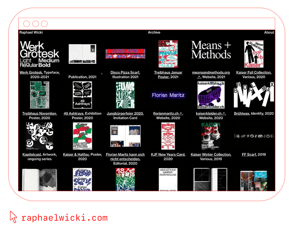
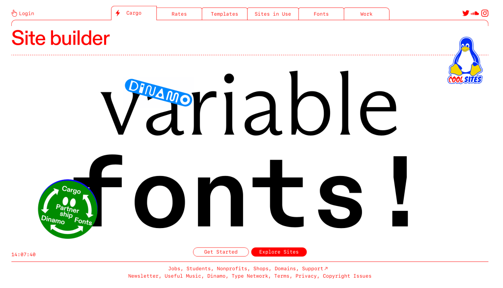
The creative viewing work site I chose for this vlog is the site Cargo. They allow for complete customization of your website. They give you a free trial and then you would be charged $14 per month billed yearly and $19 per month billed monthly. They have a wide variety in the fonts that one could choose from as well and feature the work of graphic designers on their page under their “sites in use tab” as well as show you what it can look like being used for graphic design under the templates tab. Overall, despite the price, Cargo is a great site for graphic designers to showcase their work. Below is an example of an artist utilizing their site. To see more about what the site has to offer, check it out here at https://cargo.site

Havaianas

I found this designer to have created an eye-catching form of self promotion. The use of bright colors with varying designs is super attention grabbing and this makes people question what exactly is inside of these packages. People may question what “made of Brazilian summer” is and these packaging helps customers begin to associate the bright colorful designs with their brand. Additionally, the product of flip-flops are not usually what you would associate with these colors, however when you take into consideration that the bright colors are reflected in the color of the flip-flops that are being sold it makes total sense. This is just a super creative way to include the bright colors of the brand.

To see more of the designs click the link below!

https://www.adsoftheworld.com/media/integrated/havaianas_made_of_brazilian_summer

Environmental Impacts of The Clothing Industry Infographic

I found this infographic interesting to look at because it uses a fairly consistent color palette using the green to highlight the most important areas the clothing industry impacts. There is a visual hierarchy on the page as the larger words and green boxes creates a sense of importance. The use of bold fonts they chose for this does a great job separating the information and highlighting which parts of the text are the most urgent. I also really enjoy how this designer chose to make the waste section pop off the page with the color red since it is the color complement of green. Additionally, this artist added a call to action at the bottom of the infographic which is a nice touch to balance out the dark and heavy feeling the top part of the infographic conveys.

Created by Jane Chow & Julian Chow and published by Ju Ju at the website https://visual.ly/community/Infographics/environment/environmental-impacts-clothing-industry

Femme Type

I found the design blog “Femme Type” to be beautifully done. This blog allows women a space to post about different styles of type whether they are type focused designers or creators. The header used for the website is eye-catching as it is built from a variety of type faces. This is appropriate for a design blog about type design and creation. As one scrolls down the page, women note each interesting piece of type they have found or are exploring. It is truly a fascinating collection of women who share the same love and interest. For a closer look, find the website here @ https://femme-type.com

Green Toad Bookstore

I chose to look at the Green Toad Bookstore’s logo and typography for this assignment. I thought the font that they chose was really interesting since it’s not a super common font that you’d see in the world typically such as serif. I also thought it was interesting that the little bullseye on either side of the toad are the inverse colors of the other. What I also found intriguing is the fact that the image the frog and the word bookstore are placed on top of two shapes that appear to look like books stacked on top of one another. It is such a simple shape but convey’s the store’s identity of being a bookstore. I also love that the tracking is fairly spread apart and makes it even more interesting to look at. This font style is also carried over on their open sign and window.

Identity Systems – Walt Disney

By: Jolie Siegel

The Walt Disney Company, more commonly known as Disney, was founded October 16, 1923. Since its founding Disney has released over 119 feature films as of June 25, 2021. Their empire encompasses animated films, TV shows, cartoons, short films, live-action movies etc. They are also huge producers of merchandise ranging from toys to backpacks to popcorn buckets. Many of their products are sold at franchise stores all over the world.A large contributor to their success is from the ever growing list of films they are set to release, along with the merchandise they will generate their money from. Disney has 6 Disney resorts and 12 theme parks, each that offer another method of Disney pushing their brand to consumers.

Locations include:
Walt Disney World Resort, Orlando FL
Disneyland Resort, Anaheim CA
Tokyo Disney Resort, Tokyo Japan
Disneyland Paris, Paris France
Hong Kong Disneyland Resort, Hong Kong
Shanghai Disney Resort, Shanghai China

Evolving Logos

When people think of Disney, they immediately think about the castle and Mickey Mouse. These associations are key to their brand identity. Their original logo, while beautiful, needed to be recognized on various platforms where the large logo was not ideal. Over the last few years, they managed to easily transition their logo to a single letter that would still be easily recognized as Disney. This modernized logo was created by animator Mike Gabriel and producer Baker Bloodworth.

Mike Gabriel Website: http://www.mikegabrielart.com

Baker Bloodworth Website: https://mubi.com/cast/baker-bloodworth

There is one other way Disney has managed to secure their foothold over their brand, and that is through the use of the character Mickey Mouse. Mickey Mouse is the original character designed by Walt Disney and many consumers resonate deeply with the character. The Disney company has found a way to exploit this feeling of nostalgia though their sales of Mickey Ears, sold exclusively at their Disney parks.

Original Website: https://www.disney.com

Disneyworld Website: https://disneyworld.disney.go.com

Toblerone Logo

The Toblerone logo dates back to the year 1908 and was created by two men, Theodor Tobler and Emil Baumann. When creating the logo, their goal was to create the shape of a mountain to emulate the shape of their chocolate bar, as their chocolate bars are known for their triangular shape. In addition to echoing the bar shape, they wanted buyers to recognize the mountain icon as the Matterhorn in the Swiss Alps. Within the Matterhorn, Tobler and Baumann chose to incorporate the symbol of a bear in their logo due to the chocolate bars origins. Toblerone was created in Bern, Switzerland which is also known as the “City of Bears”. The bear is featured on the city’s coat of arms and by including the bear, they are paying homage to the treat’s birthplace. At first glance, the bear is hardly noticeable and many may dismiss it at the snow on the alps. If the viewer takes a moment to look at the logo more closely, they will notice the bear standing on its hind legs. This ambiguity is what I believe makes this logo a great example of using positive and negative space.

For more information on the development of Toblerone check out the link below: https://www.mondelezinternational.com/Our-Brands/Toblerone

Check out their brand website here: https://www.toblerone.co.uk/en

Beautiful Pages

This is a magazine spread that I thought was beautiful. One reason why I chose this page as a successful design was due to the interesting graphics included. I felt that this grabbed my attention and made me more interested in wanting to read what the article was about. There are thin lines interconnecting the devices which I believe it supposed to act as a wire, and I felt that this made it easy for my eyes to follow the page. I also enjoyed how the page was broken up since the designer created a clear side bar on the bottom of the page. While looking at the sidebar, I felt that the designer utilized the column spacing well as each statistical example is in its own space. They also used a different font and color for this sidebar which attracted my attention as well. It makes it easily known how you should read the graphics as well. As for the main part of the page, I felt that they used the white space pretty well. The top right edge on the first page leaves space next to the pink side bar instead of having the pink bar go all the way to the edge. In terms of the hierarchy, I noticed that their main point that the future may include a video tattoo as well as a “holiday” pod jumps out at me before the actual headlines. I was immediately interested in the ideas of futuristic inventions and led me to want to read more. It was also placed in a darker color pink than the pink side bar so I knew it was more important than the rest of the text. I believe that using the warmer color pink was a good choice and caught the attention of the reader quickly. This article looked really cute and I loved the aesthetic. The designer did a great job making their spread fun to read!

Paula Scher

By: Jolie Siegel

Paula Scher is a well known graphic designer who has done work for companies such as Adobe, Microsoft, Coco-Cola, Walt Disney Company, and many more notable companies. She is known for her unique approach to typography, developing a new style based off of Art Deco and Russian Constructivism. She utilizes typography in a way that is unusual and new, yet instantly recognizable. This is why some consider her to be the most influential graphic designers in the world. Her work even has a permanent home in exhibitions such as the Museum of Modern Art, the Library of Congress and other various institutions.

Some notable achievements include; Art Director Hall of Fame (1998), Chrysler Award for Innovation in Design (2000), American Institute of Graphic Arts Medal (2001), and was the first woman awarded the Type Directors Club Medal (2006)

Some of her work that can be found in MOMA

Some more commonly recognized work of hers

“The things that make work interesting, and create invention, are accidents. You want to be in a position where you’re capable of making accidents”

Check out this link if you’re interested in learning more about “A Life in Her Work”

https://www.madamearchitect.org/interviews/2020/7/16/paula-scher

Check out this link if you’re interested in seeing more of her work

https://www.behance.net/PaulaScher

Baylee Luttrell

Jolie Siegel

Luttrell is a graphic designer from Tullahoma, TN who has done work in editorial design, branding, and illustration. This poster design was inspired by their experience as a mandated reporter while working with children at a daycare facility. Their goal with this poster is to advocate for child abuse victims. Luttrell states that he used simple geometric shapes in this poster in order to prevent it from becoming “too dark”. I thought that is was an interesting choice as the message the poster is conveying is already a dark theme. Additionally, the use of geometric shapes in a way allows for the viewer to decide who the abuser is, creating a sense of relatability to those whose abuser may not be their parent. The non-gender specific illustration allows people to come to their own conclusions about who the abuser may be, as a parent is not always the abuser in a child abuse situation. Luttrell does a great job conveying the message with the geometric rigidity as sharp figures don’t often represent comfort and safety. In this piece Luttrell includes a tag line “help defeat the monster” as well as including a statistic along the bottom with a call to action


Luttrell has also done an editorial inspired by the movie “Hidden Figures”. This piece was created with age in mind and they chose to use a monochrome palette to convey this message. The photos in this piece were carefully edited keeping the theme of old age in mind.

More of Luttrell’s work can be found on their website portfolio at https://bayleeluttrell.design/work