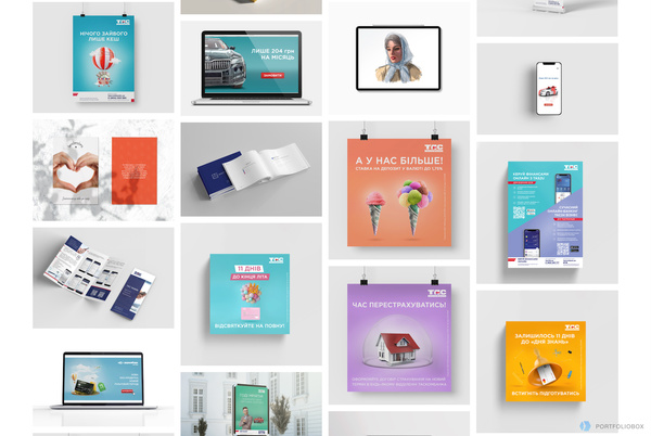
When I first went on Portfolio.net‘s website my first instinct of course was to scroll down to learn more about the site. Instead of the interface just scrolling down to display more information, the whole page zoomed out and showed a beautiful arrangement of portfolio work. I thought this feature was really engaging and different. Caught me by surprise. The design of the site is very sleek and user friendly. I like that this site caters towards many different art forms as opposed to just photography or just graphic design. The site provides you with a free domain and there is no coding needed. Another cool feature that PortfolioBox offers is allowing for the designer to interact and receive information from clients and viewers.
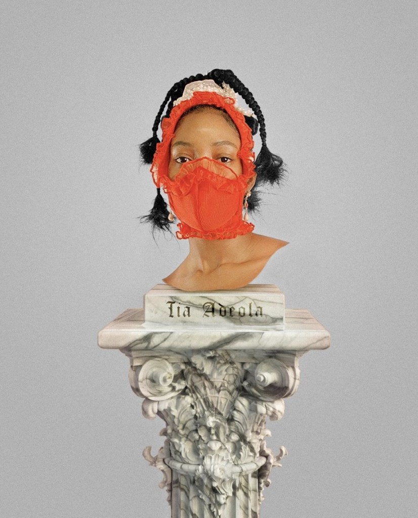
I found this self promotion of fashion designer Tia Adeola to be very interesting and creative. Tia Adeola is one of my favorite fashion designers. She inspires me so much! She’s about my age -maybe a couple years older- and she is also first generation American. She is so gifted and has developed an amazing brand. Here she is promoting the face masks that she started selling admist the pandemic. She essentially dressed up K-95s in beautiful fabric and ruffles. Many celebrities saw these promotions on Instagram and bought her masks! I think it is so cool that she made the model look like she is a statue head. The whole thing reminds me of a museum of course. Which is onboard for her because she is a big fan of Art History. I also love how simple it is. It just shows the mask, and her name. No unnecessary text. If you are interested in buying a mask all you would need is her name and that’s the only piece of text on this promotion.
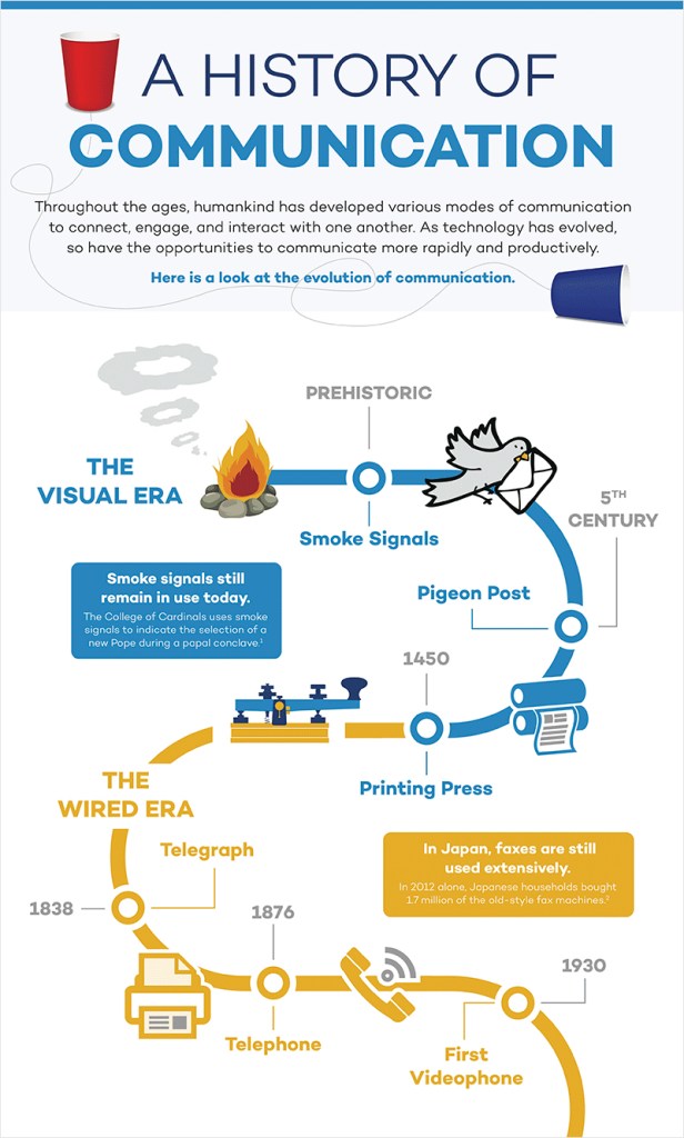
I find this infographic to be really effective for many different reasons. I like that the designer used images and text to communicate and illustrate the data. If I didn’t know how to read I feel like I would still be able to comprehend the history of communication because of the photos. The photos are super simple too which make the whole thing less complicated and easier to read. I also like the way the page is broken up by the timeline. Our eye naturally follows the swirl of the timeline from top to bottom. I also appreciate the use of color. Here color is breaking up “The Visual Era” (blue) with “The Wired Era” (orange). I noticed how the timeline goes off the page which shows that there is a future to communication and the videophone isn’t the last stop. This detail can have the viewer imagine what other communication inventions the future holds. Perhaps holographic communication or virtual reality communication that makes it feel like the person(s) you are communicating with are actually there! I also like how there is not that many words used, the designer only used necessary words!
I decided to look through the winners and nominees of the awwwards to find some impressive blogs. They did not disappoint. Awwwards has a great catalog of great graphic design in the world of websites, blogging, apps, magazines, etc.. One of the blogs that caught my attention was the World of Vogue Talents blog.
What I found particularly interesting about this blog was how the designer decided to set up the blog. It is not your traditional blog set up. The blog is set up in an interactive way that simulates a fantasy world in which the user can “fly” around through. Using the mouse the user can glide to a page which would lead them to a link. It is very unique! I don’t see a lot of websites or blogs set up this way. The style of art reminds me of a modern video game but it is very chic and “tech”. The mouse “grows” greenery (leaves, plants, flowers) around it as it moves which is a detail I really love. There is also a sense of a foreground and a background. There are mountains in the background. Once you click on one of the links the the pictures sort of dance around which is cute.
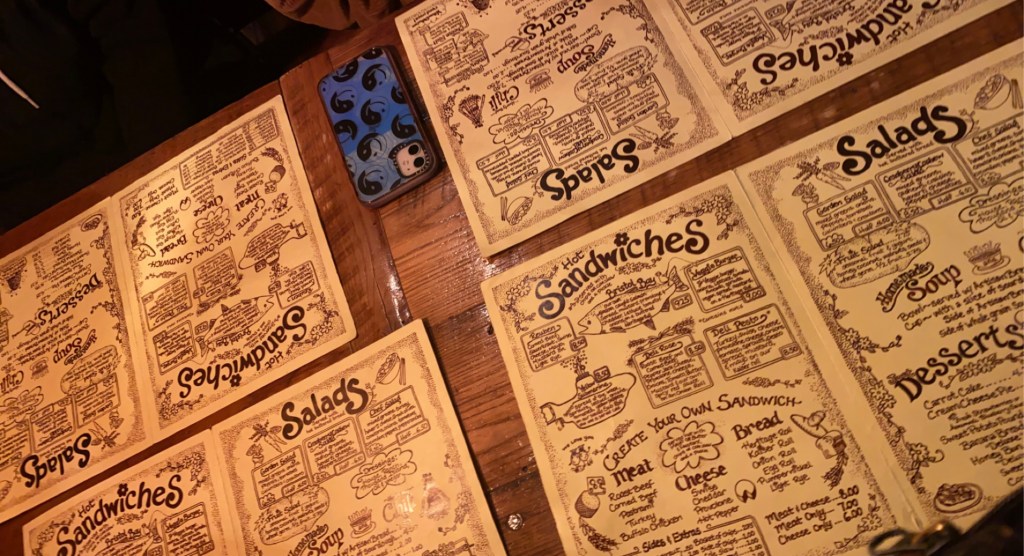
I find the typography in Yellow Deli’s menu to be very interesting. Here is a photo I took of the Yellow Deli’s menus while I went to grab dinner with some friends. I feel the typography is almost mimicking handwriting but because it is digitally done it is virtually “perfect” and doesn’t have the imperfections or irregularities that regular handwriting has. The graphic design of the whole menu looks as if someone just sat down with a pencil and doodled some doodles. I think it’s very cute and childish. Especially how they chose to dot their i’s with flowers. Flowers in a common theme throughout most of their in-store graphics and their collateral. The menu’s graphic design matches the overall vibe of the yellow deli; which is very warm, cozy, and “wholesome”.
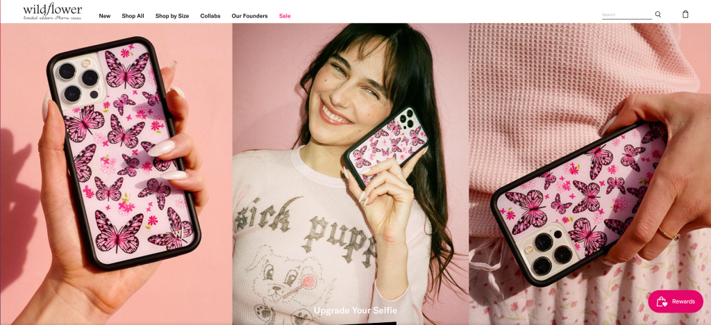
I am OBSESSED with the creative direction and the branding of Wildflower cases. The perfect mix of generation Z edge and Y2K flare. Might I also add they have the best lineup of influencers to represent their brand!!
Wildflower was founded by sisters Devon Lee Carlson and Sydney Carlson. The two are socialites that are often seen by IT girls (Bella Hadid, Kylie Jenner, Stassie Baby, etc.). Being that the two are influencers themselves, their digital presence is highly associated with the brand.
Y2K is back and Wildflower is onboard! Y2k is essential the style and fashion trends associated with the late 90s to early-mid 2000s. The creative direction of their campaigns and the designs of cases are highly influenced by that time period. I think they are so genius because they pay attention close attention to trend forecasts not only for their designs but also for the influencers they collaborate with. My favorite collaboration was with the mega popular YouTuber Emma Chamberlain. Emma Chamberlain’s audience and Wildflower’s audience are basically the same so that’s brilliant. I can predict with the popularity of the show Euphoria that their next collaboration will be with one of the Euphoria cast members (Alexa Demie, Sydney Sweeney, Hunter Schafer, Maude Apatow, etc.).
One of my favorite elements of the identity of Wildflower cases is how playful they are. Some of their designs are borderline childish! It’s cute and fun, it’s not intricate or complicated or complex. Their identity exudes an energy that I feel the average girl is striving for.
I noticed another classmate did the other logo I did so I am posting another one.
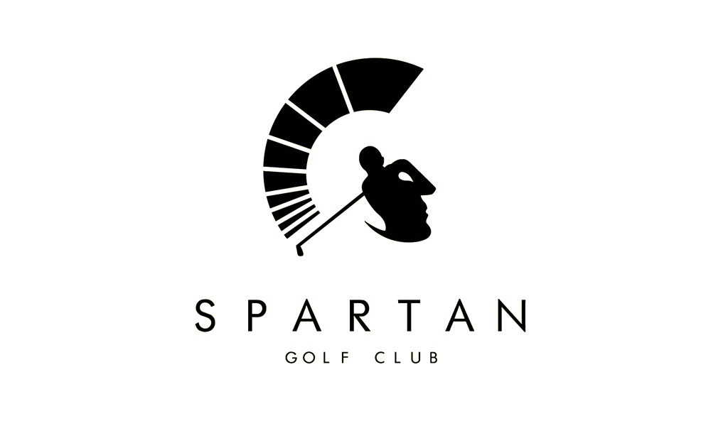
This is a absolutely BEAUTIFUL use of positive and negative space! This use of positive and negative and space is interesting because you can see both images almost immediately. You don’t have to “work” to understand it. Also the concept illustrates or articulates the brand perfectly; it is extremely relevant. The positive space is made to resemble a golfer following through on a powerful swing. The negative space is made to resemble a greek spartan warrior. The energy of the golf club doubles as the arc of the spartan helmet as the body of golfer doubles as the face of the spartan. This logo could not be more perfect!!
American Institute of Architects Center, by Pentagram.
This logo used positive and negative space very nicely. The viewer can recognize that the positive space is made to resemble a key and the negative space is meant to resemble a city skyline. The company that uses this logo is called American Institute of Architects Center. So the logo is relevant to the business as both a key and buildings have to do with architecture. I have however seen more creative uses of positive and negative space that better illustrate the purpose of a company. Like I could easily mistake this logo for a city based real estate company logo. However, architecture may be a harder concept to illustrate.
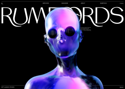
This website page was design by CTHDRL, a web designer from the United States. It was nominated for Awwwards -the awards for design, creativity and innovation on the Internet.- for its creative presence. The metaverse is a new yet interesting concept to me. From my understanding the metaverse is a fictional world that has a lot of nonfictional value to people especially in the tech world. According to Wikipedia it is is a network of 3D virtual worlds focused on social connection.
This web design captures exactly the vibe I get from the concept of the metaverse. The subject being a techy-futuristic creature that closely resembles a human being is perfect. I also like how simple it is. The brand name and the creature are the only things on the page but the artwork is exciting enough to keep the viewer engaged. I like how the creature blocks a part of the title but the viewer already know what the title is. The pages buttons at the top are in white and contrasting the black background so the viewer can easily see it and enticed to click on it. My eye goes directly to the creature first and then the silhouette of the create guides my eyes to the brand name and the page buttons.
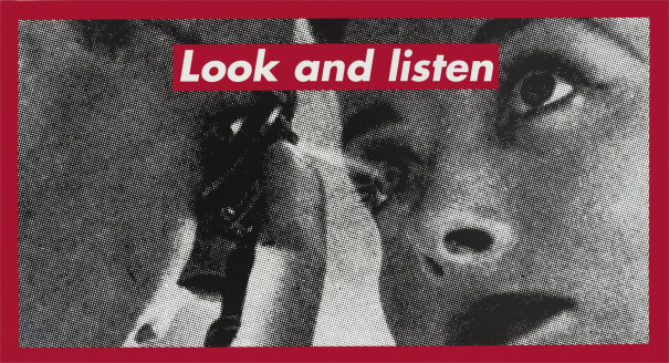
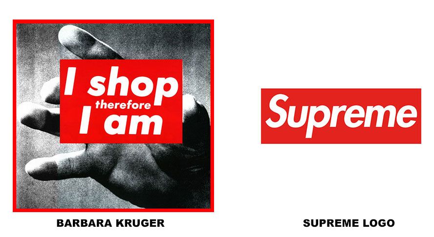
Barbara Kruger (b. January 26, 1945) is an American artist who is most known for her collage art. Her artwork tends to combine black and white photography with bold statements in white boxed in a bold red rectangle. She is said to use Futura Bold Oblique or Helvetica Ultra Condensed as her font. She attended Syracuse University then Parsons School of Design in New York City. Kruger spent some time working for Conde Nast Publications as a graphic designer for their Mademoiselle magazine. She was even promoted to being the head designer at Mademoiselle magazine when she was only 22 years old.
Supreme
I’m sure a lot of us familiar with the super popular fashion brand Supreme. The brand has become iconic through there box logo (they call “logo”). It works because it is so simple and it’s easy to read and it’s bright. Kruger has confronted the fashion streetwear brand for appropriating her style for it’s logo. I suppose “imitation is the a form of flattery”.
Work
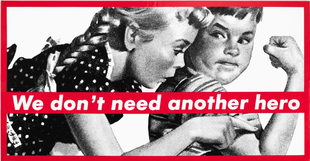
Untitled (We Don’t Need Another Hero), 1987
A lot of Kruger’s work focuses on media and politics. She tells a story in a simple and direct statement. Kruger says she likes to use personal pronouns such as “you”, “I”, “we” because they “cut through the grease”. She recognizes that we are the change. If we want the system to change the action begins with us. She is still alive at 72 years old and she lives and works in New York and California. A lot of her artwork lives at the Museum of Modern Art and the Los Angelos County Museum of Art.