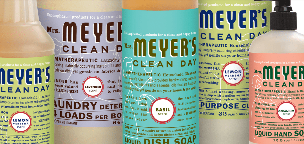
I think Mrs. Meyer’s design and branding are very strong amongst other cleaning supplies. Walking down the cleaning aisle at Target, there’s a lot of bold and loud packaging coming from big brands such as Lysol, Windex, or Fabuloso. Not only does Mrs. Meyers’ branding match their non-toxic products, but the packaging and design also set them apart from the other cleaning products on the market.
Monica Nassif, the founder of Caldrea Company, came to Werner Design Werks asking them to help her essentially “rip=off” her successful high-end cleaning supply brand. She wanted to take aromatherapeutic cleaning and make it much more accessible and affordable.
Together, they were able to come up with a brand concept that tells a timeless story with amazing graphics and packaging!
See more: http://wdw.com/case-studies/mrs-meyers-clean-day/
Carla Dadulla

Yes! I love the clean and simple look that Mr. Meyer’s has mastered. It remind me a lot of Dr. Bronner’s Castile Soap branding. The two brands are selling the same thing: cleanliness! I feel if the identity of either brand were to be complicated or cluttered it would steer potential buyers away. I am more likely to buy a cleaning/hygiene product when the branding looks clean and simple than I am to buy from a brand that has a busy identity system. For this reason we can recognize how important it is to consider what is being sold when creating an identity system. Great post Carla!
LikeLike
I really like the simple look as you stated. But also, I think part of the reason the packaging is so appealing is because of the bright pastel colors and the soft and very pretty colored text over it which makes the text stand out. The packaging looks very aesthetic and because of that customers are more inclined to buy it or notice it based on the design aspects of the bottles.
LikeLike