13th

Ayannah Newton

Netflix (2016)

The film “13th” by filmmaker Ava DuVernay was release on Netflix in October of 2016. “13th” is one of many on Netflix that bring awareness to racial inequality in the U.S. It specifically focuses on disproportionate rates at which African Americans are convicted in the States. The purpose of the film was to bring awareness to the affects that the 13th Amendment, as well as the Jim Crow laws and segregation have of on today’s conviction rates. Most people are aware that the 13th Amendment abolished slavery. However, it states “Neither slavery nor involuntary servitude, except as a punishment for crime whereof the party shall have been duly convicted, shall exist.” The exception basically means that forced labor, which is what slavery was, is justified as long as the person doing labor is a convicted criminal. Most schools in the U.S. don’t teach that part of it. The film presents the issue of the exception within the 13th Amendment serving as a loophole for continued domination over the black community, as well as other people of color, in this country.

“NOW MORE THAN EVER

SPEAKING TRUTH TO POWER HAS NEVER BEEN MORE VITAL THAN IT IS IN THIS MOMENT IN HISTORY. WATCH AVA DuVERNAY’S 13TH, AND THEN TAKE ACTION.”

The poster above is one of many created by Netflix to bring awareness to the film and the issues presented within it as a form of protest. Netflix created a website solely dedicated to giving viewers free access to download posters like the one above. The website also provides other graphics (png’s) available for download which allows the audience to create their own posters.

Visit for more “13th” posters:

https://beyond13th.com/

Erin Wright

Death Is Not Justice (2011)

Erin Wright got his Master of Fine Arts degree with a concentration in Graphic Design and Illustration at the University of Arizona and his Bachelor of Fine Arts degree in Graphic Design at Colorado State University. As a Graphic Designer he has participated in over 90 international exhibitions in 22 different countries. He has been honored multiple times, to name a few, he got a Honorable Mention at the second and third International Socio-Political Poster Biennale in Auschwitz, Poland; Silver Award for a poster that was in the Social/Political Posters book produced by Graphis; and Designer of the Year along with Illustrator of the Year at the Birmingham ADDY Awards. His work is part of many collections such as Robert Irwin archive at the J. Paul Getty Museum in Los Angeles; Fourth Block International Triennial of Eco Posters in Kharkov, Ukraine; and The International Poster Collection at Colorado State University. Wright is also the co-founder of Posters Without Borders, a biennial international invitational poster exhibition.

For his work, Death Is Not Justice, he created the poster for Tomorrow exhibition advocating for the abolishment of capital punishment. Wright believes there are many reasons to oppose the death penalty but he believes that a civil society doesn’t have the right to decide whether or not that person dies. He thinks that capital punishment is the death of justice. I like this poster because it reminds me of a tarot card which is what got my attention.

ReGENERATION (2020)

Candy Chang

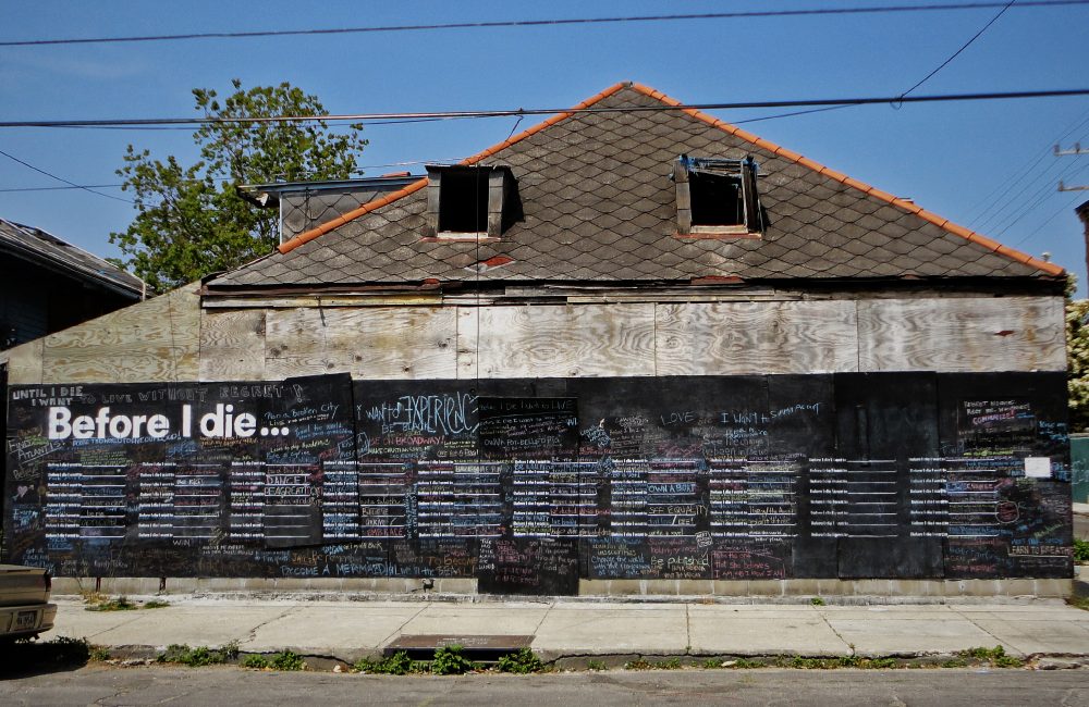
Candy Chang created the poster to create awareness of food security (2008-2010). Pieces of her work has been inspired through the hardships of others to bring awareness to their situation and making others aware of problems going on in the world as a whole or possibly within their own communities.

As an artist who strives to uncover specific problems or thoughts in our personal lives, Candy Chang’s work is considered to “make cities more comfortable for people”. She is well-known for her ideas that leave the viewers with a thought of what their end goal in life is. This piece is named “Before I Die”, which has been featured in the film known as project almanac. Chang art comes to life when the public/community has the ability to interact with her work. “Before I Die” Is not the only work of Chang’s that allows the public to be interactive. Not only is her work “Before I Die” well-known, it has been recreated in over 60 countries with a variety of languages worldwide, giving many the experience.

visit Candy Chang’s website to view more of her work: http://candychang.com

Shigeo Fukuda

Fukuda was commissioned to make posters for Earth Day. This piece with three other pieces were made, but this one is the most popular design. This piece was named “1982 Happy Earth Day”.

Shigeo Fukuda was a celebrated sculptor, poster designer and graphic artist of the twentieth century. Fukuda was born to a toy manufacturing family on February 14, 1932 in Tokyo, Japan. Fukuda expressed interest the minimalist swiss style of graphic design. This occurred at the end of the Second World War. He got his education in designing at the National University of Fine Arts and Music. He graduated in 1956. His work was first recognized and gained attention at a Czechoslovakian graphic design competition. His interest in illusionism started in the 1960’s. He wrote a column on visual magic for a Japanese newspaper. HIs column was named “Have you see The Dragon?” and there he would make bi-monthly features on illusionism. Fukuda made many pieces around his advocacy for pacifism and environmentalism. He cared more about the social impact than the commercialism of his pieces. He died of a heart attack in 2009.

You can find more information on Shigeo Fukuda on these websites:

http://www.designishistory.com/1960/shigeo-fukuda/

Ester Hernandez

Image: Hernandez, 1982, Sun Mad, screenprint.

Sun Mad by Ester Hernandez is a screeprint created in 1982. It stands to bring awareness to water contamination by pesticides and how it effects the environement, the farm workers, and those who consume. Hernandez created this image out of her anger of the loss of humans and environment of using pesticides within growing grapes in California.

Ester Hernandez is a visual artists known for her art work of latina and native women. Her work includes social, political, ecological and spirtual themes. Hernandez is considered to be an important figure within the Chicano civil rights movement of American in the 1960s.

Visit Ester Hernandez’s website

Kyösti Varis

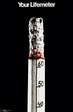
Kyösti Varis is a graphic designer born in Finland. He created this poster named “Your Lifemeter” in 1971.

Kyösti Varis started his career by getting basic training in some printing houses in Finland and Germany. This is what originally fueled the spark to a successful career. Over time, Varis has gained a ton of traction and received countless awards, one being The Graphic Designer Of The Year in 2002.

“Your Lifemeter” represents the effects of cigarettes on your health the more you smoke them. The clever simple design sends a moving message to all that encounter. The numbers counting down by tens on the cigarette display the years disintergrating off of your life the more puffs taken. The combination of the bold title, black background, and simplistic design makes for a straight forward, in your face poster. During this time period cigarettes were more accepted than they are today, and to some the effects were unclear. This message put this life threatening addiction/hobby into perspective for the world to see.

You can find more information about Kyösti Varis’ life and artwork here: http://www.varisoriginal.fi/posterartist.html

Blog Assignment 1: Graphics for Change

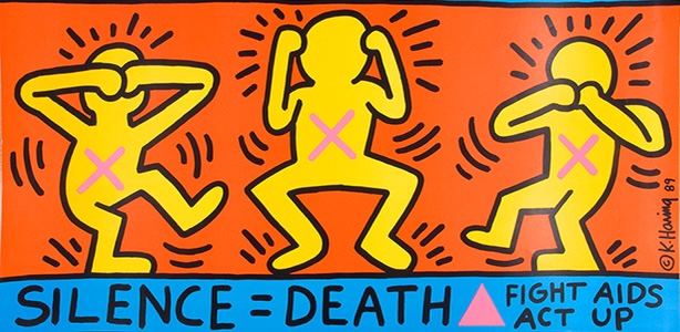
Throughout history, many artists have used their visual communication skills to convey topics that they felt needed dire attention or to be protested against. This is usually achieved by showing something to provoke shock value to the viewer or to make them think harder about something that they otherwise would not. Keith Haring, a famous artist from the 1980s, was no different. He is known for depicting his figures in joyous scenes, such as his easily distinctable but unnamed print of five dancing men in front of a yellow background. In a particular print of his titled Silence = Death, his usually peppy figures are drawn to be distressed by the silence against AIDS. Seeing brightly colored figures expressing negative emotions with X’s marked on their chests feels out of character for Harring’s designs, but this further emphasizes the importance of how necessary it is to fight against AIDS. Art historian, critic, and writer Ruth Millingon posted an article describing Harring’s picture amongst others made by different artists that also promote change or activism.

Keith Harring’s Silence = Death

Hilppa Hyrkäs

Hilppa Hyrkäs is an Art Director from Finland. She designed this poster about climate change in 2006 and named it “Stop Climate Change.”

She thought mostly about what climate change is and how it affects the environment, the weather, health, and economy. When piecing together this poster, she took these ideas to create a simple yet effective piece. Polar bears are highly effected by climate change, as their entire environment is ruined if it isn’t cold enough for them to live. The melting of the ice caused by climate change has led Hyrkäs to take an image shaped like a polar bear to represent the ice, and have it breaking into pieces, just like the large sheets of ice are breaking.

Here you can find more of her artwork: https://www.behance.net/HILPPAHYRKf1c9

Yusaku Kamekura

‘Hiroshima Appeals’ was a campaign initiated by Japan Graphic Association Inc. to promote peace through posters. The idea stemmed from the theme “Hiroshima’s Spirit” and the designs focused on conveying the prayers and wishes of Hiroshima. Since 1983, these posters have been designed annually by different Japanese graphic designers. ‘Burning Butterflies’ by Yusaku Kamekura was the groundbreaking start of this poster series.

Yusaku Kamekura was a leading graphic designer post-World War II, so much so that he was literally nicknamed “Boss” or “godfather of post war Japanese graphic design”. Kamekura was also the founder of Japan Graphic Association Inc. and served as president when ‘Hiroshima Appeals’ first launched.

Kamekura truly was a leader in building a strong graphic design community in Japan. Before Japan as a country opened up to western concepts, art and design was very traditional. Kamekura was on the forefront of bringing graphic design into the nation and design industry. As the “godfather of graphic design”, Kamekura mentored and taught many young graphic designers that would later become notable names in the industry.

Other than ‘Burning Butterflies’, some of Kamekura’s most notable work is from the 1964 Olymics as well as corporate logos for NTT, Nikon, Meiji, and TDK.

Image: Poster, ‘Hiroshima Appeals 1983’, colour offset lithograph, designed by Yusaku Kamekura, illustration by Akira Yokoyama, printed by Toppan Printing Co Ltd, sponsored by Hiroshima International Cultural Foundation Inc and Japan Graphic Design Association Inc (JAGDA), Tokyo, Japan, 1983

Carla Dadulla

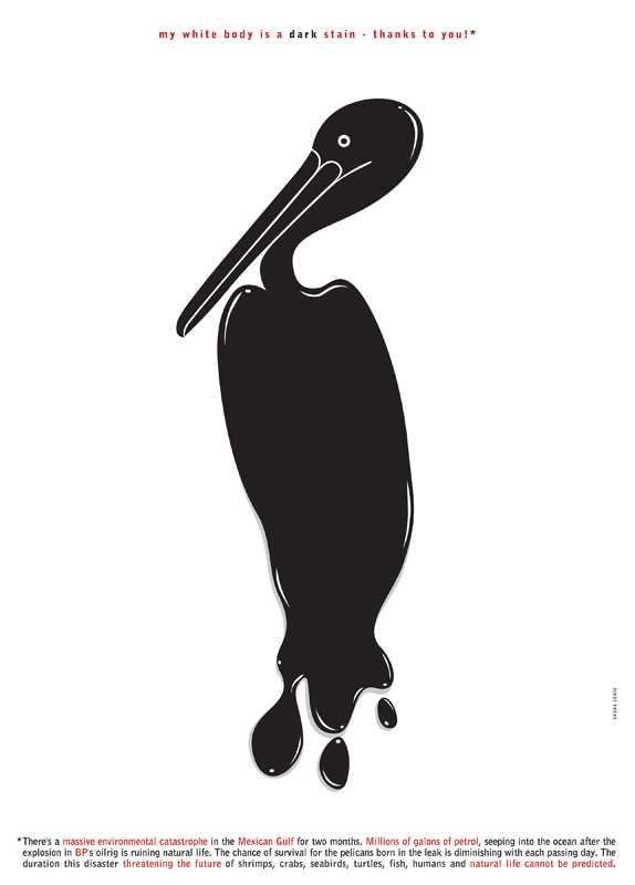
Savas Cekic

This piece is done by Savas Cekic. Cekic is a professional graphic designer and illustrator who works from their own studio. This piece is called “My White body is a Dark Stain – Thanks to you”.

In 2010, millions of gallons of petrol ran into the Gulf of Mexico following the British Petroleum oil rig explosion. Cekic stated that this piece is directed to put focus on the disaster and the negative health of animals such as the shrimp, crabs, seabirds, turtles, fish, humans, and every other living thing affected in the Gulf of Mexico.

Visit Savas Cekic’s website.

http://savascekicdesign.com/