Ivanah Alexandre
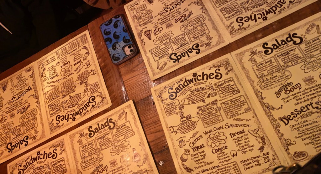
I find the typography in Yellow Deli’s menu to be very interesting. Here is a photo I took of the Yellow Deli’s menus while I went to grab dinner with some friends. I feel the typography is almost mimicking handwriting but because it is digitally done it is virtually “perfect” and doesn’t have the imperfections or irregularities that regular handwriting has. The graphic design of the whole menu looks as if someone just sat down with a pencil and doodled some doodles. I think it’s very cute and childish. Especially how they chose to dot their i’s with flowers. Flowers in a common theme throughout most of their in-store graphics and their collateral. The menu’s graphic design matches the overall vibe of the yellow deli; which is very warm, cozy, and “wholesome”.
