Yusaku Kamekura

‘Hiroshima Appeals’ was a campaign initiated by Japan Graphic Association Inc. to promote peace through posters. The idea stemmed from the theme “Hiroshima’s Spirit” and the designs focused on conveying the prayers and wishes of Hiroshima. Since 1983, these posters have been designed annually by different Japanese graphic designers. ‘Burning Butterflies’ by Yusaku Kamekura was the groundbreaking start of this poster series.

Yusaku Kamekura was a leading graphic designer post-World War II, so much so that he was literally nicknamed “Boss” or “godfather of post war Japanese graphic design”. Kamekura was also the founder of Japan Graphic Association Inc. and served as president when ‘Hiroshima Appeals’ first launched.

Kamekura truly was a leader in building a strong graphic design community in Japan. Before Japan as a country opened up to western concepts, art and design was very traditional. Kamekura was on the forefront of bringing graphic design into the nation and design industry. As the “godfather of graphic design”, Kamekura mentored and taught many young graphic designers that would later become notable names in the industry.

Other than ‘Burning Butterflies’, some of Kamekura’s most notable work is from the 1964 Olymics as well as corporate logos for NTT, Nikon, Meiji, and TDK.

Image: Poster, ‘Hiroshima Appeals 1983’, colour offset lithograph, designed by Yusaku Kamekura, illustration by Akira Yokoyama, printed by Toppan Printing Co Ltd, sponsored by Hiroshima International Cultural Foundation Inc and Japan Graphic Design Association Inc (JAGDA), Tokyo, Japan, 1983

Carla Dadulla
Savas Cekic

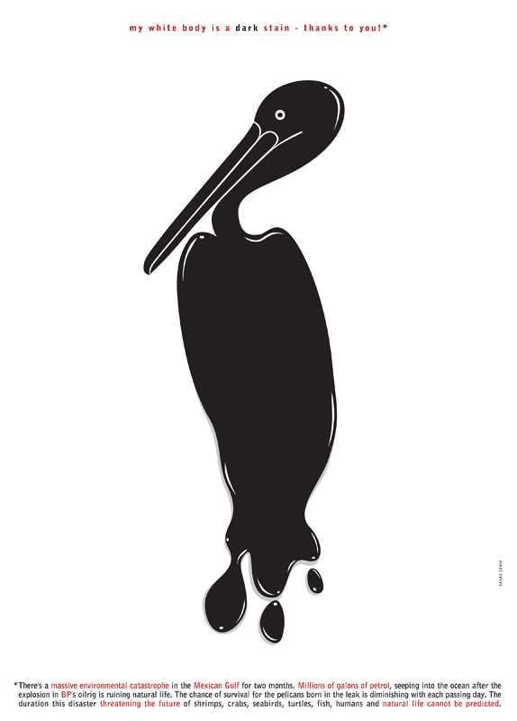
This piece is done by Savas Cekic. Cekic is a professional graphic designer and illustrator who works from their own studio. This piece is called “My White body is a Dark Stain – Thanks to you”.

In 2010, millions of gallons of petrol ran into the Gulf of Mexico following the British Petroleum oil rig explosion. Cekic stated that this piece is directed to put focus on the disaster and the negative health of animals such as the shrimp, crabs, seabirds, turtles, fish, humans, and every other living thing affected in the Gulf of Mexico.

Visit Savas Cekic’s website.

http://savascekicdesign.com/

Baylee Luttrell

Jolie Siegel

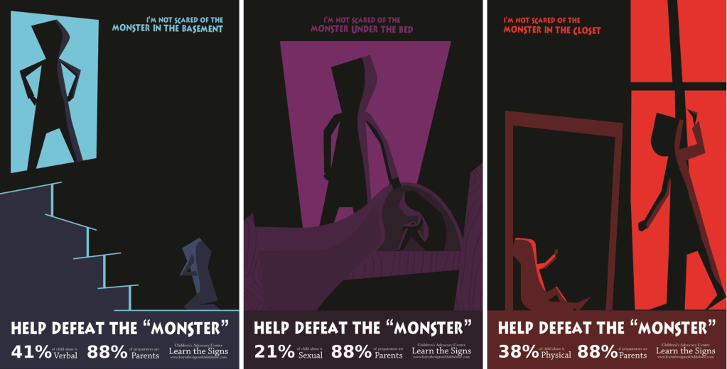
Luttrell is a graphic designer from Tullahoma, TN who has done work in editorial design, branding, and illustration. This poster design was inspired by their experience as a mandated reporter while working with children at a daycare facility. Their goal with this poster is to advocate for child abuse victims. Luttrell states that he used simple geometric shapes in this poster in order to prevent it from becoming “too dark”. I thought that is was an interesting choice as the message the poster is conveying is already a dark theme. Additionally, the use of geometric shapes in a way allows for the viewer to decide who the abuser is, creating a sense of relatability to those whose abuser may not be their parent. The non-gender specific illustration allows people to come to their own conclusions about who the abuser may be, as a parent is not always the abuser in a child abuse situation. Luttrell does a great job conveying the message with the geometric rigidity as sharp figures don’t often represent comfort and safety. In this piece Luttrell includes a tag line “help defeat the monster” as well as including a statistic along the bottom with a call to action


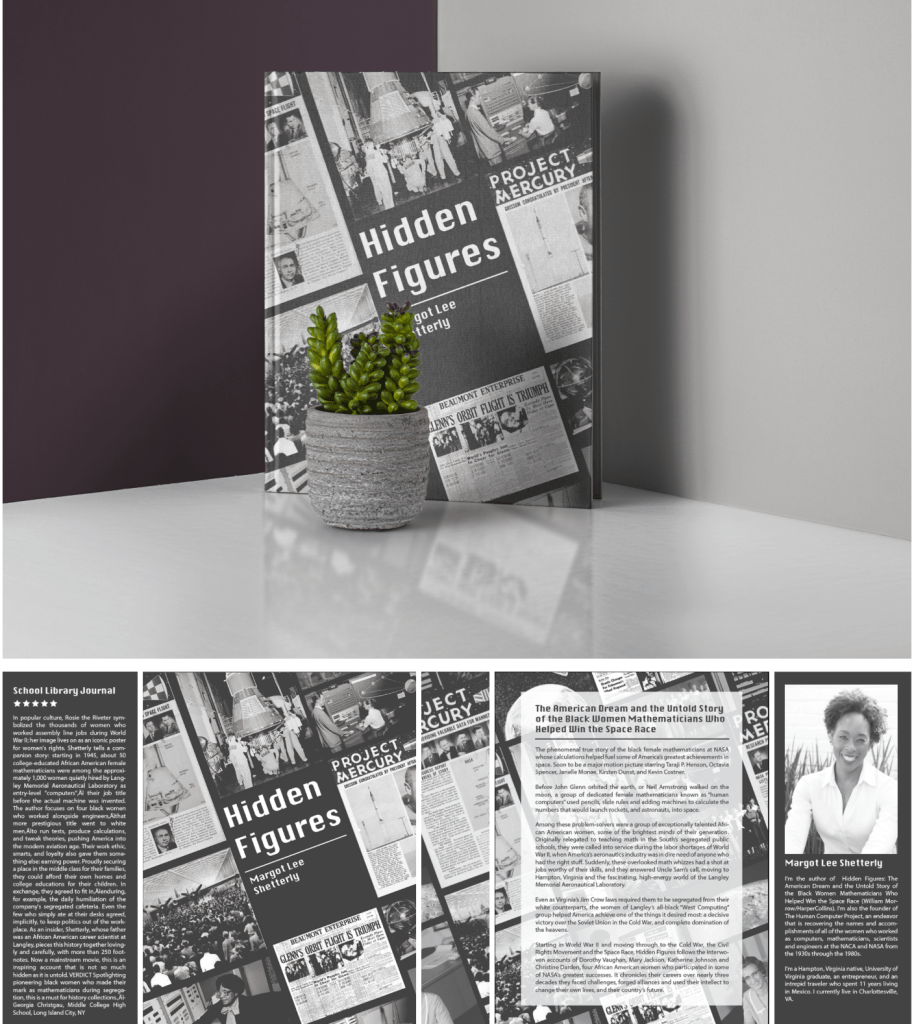
Luttrell has also done an editorial inspired by the movie “Hidden Figures”. This piece was created with age in mind and they chose to use a monochrome palette to convey this message. The photos in this piece were carefully edited keeping the theme of old age in mind.

More of Luttrell’s work can be found on their website portfolio at https://bayleeluttrell.design/work

Schneider Graphics For Change

Lorraine Schneider

Ivanah Alexandre
Primer (1966)

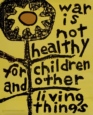
Lorraine Schneider (1925-1972) was an American Anti War Artist, a printmaker. She made her most iconic poster Primer for the Another Mother for Peace campaign. The poster states “war is not healthy for children and other living things” and it is in response to the Vietnam War that was happening in the 1960s. I think one of the brilliant things about this poster is how it childish it looks. It looks like a child grabbed a crayon and doodled a flower and their thoughts. I feel that makes the storytelling component more compelling because it makes it as if the POV is the child which appeals to Pathos and can make the viewer more empathetic. If it were super sophisticated and complex it wouldn’t tell the same story and it would be less powerful. It’s also nice how the stem of the flowers break up this visual text and the flower’s “head” follows the rule of thirds. The muted yellow is the perfect color to use. Yellow usually portrays brightness, happiness, positivity, and life. Yellow is childish almost in the way of how positive it is. The fact that it is muted adds the storytelling because it darkens all of those adjectives I listed before. The fact that the flower is black tells a story as well.

Lorraine unfortunately had a short career however her work still lives on. She had four children of her own so this piece in particular is really art from the heart. Primer is still receiving global recognition and is an iconic political activism piece of art.

Man will learn to resolve his inevitable difference through nonmilitary alternatives. But it is up to us, the artists. . . to prepare the emotional soil for the last step out of the cave.” -Lorraine Schneider

Image: Schneider, 1996, Primer, print. Created for the Another Mother for Peace campaign.