Identity Systems – Walt Disney

By: Jolie Siegel

The Walt Disney Company, more commonly known as Disney, was founded October 16, 1923. Since its founding Disney has released over 119 feature films as of June 25, 2021. Their empire encompasses animated films, TV shows, cartoons, short films, live-action movies etc. They are also huge producers of merchandise ranging from toys to backpacks to popcorn buckets. Many of their products are sold at franchise stores all over the world.A large contributor to their success is from the ever growing list of films they are set to release, along with the merchandise they will generate their money from. Disney has 6 Disney resorts and 12 theme parks, each that offer another method of Disney pushing their brand to consumers.

Locations include:
Walt Disney World Resort, Orlando FL
Disneyland Resort, Anaheim CA
Tokyo Disney Resort, Tokyo Japan
Disneyland Paris, Paris France
Hong Kong Disneyland Resort, Hong Kong
Shanghai Disney Resort, Shanghai China

Evolving Logos

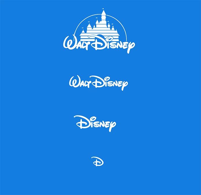
When people think of Disney, they immediately think about the castle and Mickey Mouse. These associations are key to their brand identity. Their original logo, while beautiful, needed to be recognized on various platforms where the large logo was not ideal. Over the last few years, they managed to easily transition their logo to a single letter that would still be easily recognized as Disney. This modernized logo was created by animator Mike Gabriel and producer Baker Bloodworth.

Mike Gabriel Website: http://www.mikegabrielart.com

Baker Bloodworth Website: https://mubi.com/cast/baker-bloodworth

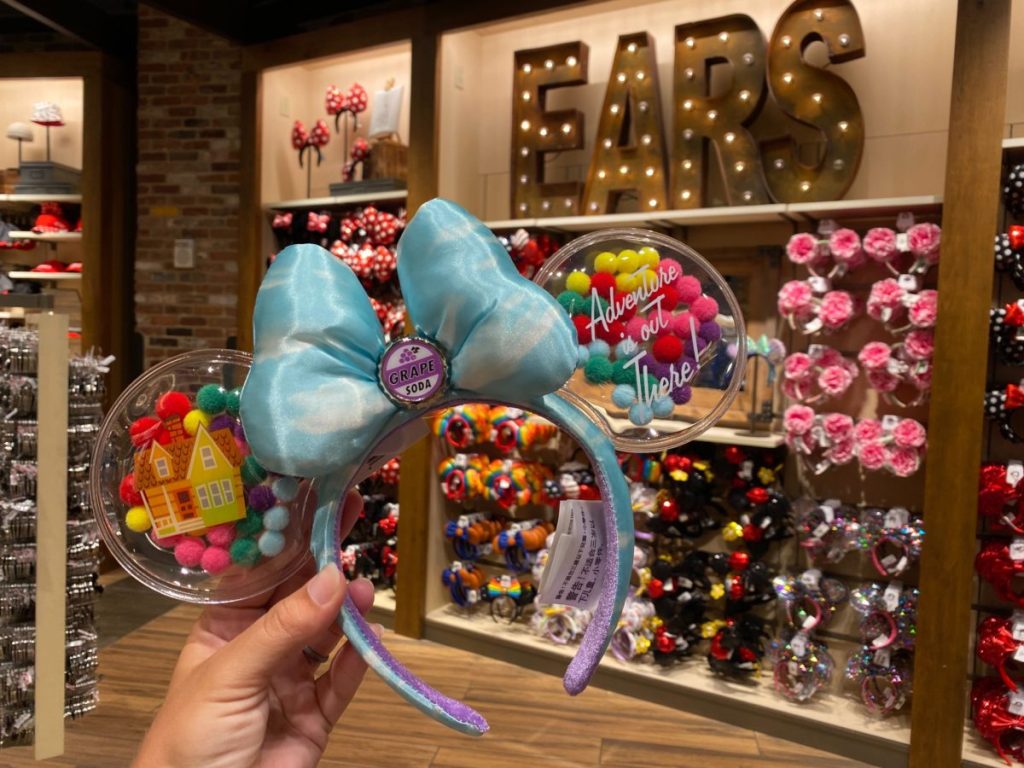
There is one other way Disney has managed to secure their foothold over their brand, and that is through the use of the character Mickey Mouse. Mickey Mouse is the original character designed by Walt Disney and many consumers resonate deeply with the character. The Disney company has found a way to exploit this feeling of nostalgia though their sales of Mickey Ears, sold exclusively at their Disney parks.

Original Website: https://www.disney.com

Disneyworld Website: https://disneyworld.disney.go.com

Identity Systems- Apple and Tiffany & Co.

Apple

The company Apple is a very well-know company. Founded in 1976, the popularity of Apple has flourished greatly. Apple now sells 27 different products. From phones, to televisions, iPads, computers, and watched, Apple has it all.

The iconic Apple logo is known by almost everyone. The simple apple shape holds so much power. I think this is an excellent example of a well-done identity system because it is such a simple design but is known and recognized when you see it. It is great because the name of the company is the same word as the logo. People hear “apple” and they can quickly know what you are talking about. People see an “apple” outline or shape and immediately know the brand.

This logo was designed by Rob Janoff. He designed this logo based on his examination of the physical real apple.

https://robjanoff.com/

Tiffany & Co.

Tiffany and Co. a jewelry brand founded in 1837 is known for the “Tiffany blue” they use. This blue became iconic and Tiffany’s signature color.

I wanted to touch on Tiffany and Co. as there logo to me isn’t their strongest identity system but the color theme is. Everyone knows this color is “Tiffany blue” and associated with this company. This definitely benefits Tiffany and Co. as they have made a new meaning for this color. Seeing this color makes you think of their company.

Ed Benguiat had designed the Tiffany and Co. logo in 1974. The distinctive color known as “Tiffany Blue” was selected by the founder Charles Lewis Tiffany. He used this color in publication for the company in 1845 and it has stayed since.

https://www.tiffany.com/world-of-tiffany/blue-box-story/#:~:text=The%20distinctive%20color%20known%20as,was%20first%20published%20in%201845.

https://www.tiffany.com/world-of-tiffany/charles-lewis-tiffany/

https://www.rit.edu/carycollection/ed-benguiat

Identity System, Goodiellow & CO 

Goodiellow & CO is a Men’s apparel and accessory line that was launched by target in 2017. In 2019 they launched a men’s grooming line to go along with the original apparel and accessory line. I’m going to display their men’s grooming line as it has become one of my favorites as late. 

What I really like about this brand is how it’s simply packing is the reason that it stands out on shelves. If you’ve ever walked through the men’s grooming isle before you would understand exactly why this product would stand out. Most men’s grooming products are very bright colors, have crazy names, over the top pictures and designs, and to me they all just scream “masculinity.” But Goodiellow is simple, straight forward, and to the point. It tells you what it is, the scent, the ingredients, and does not distract you with anything else.  

Identity System: Pandora

Pandora Jewelry is most known for having high qualitiy jewelry at an afforadable price. “Pandora designs, manufactures and markets hand-finished and contemporary jewelery made from high-quality materials at affordable prices.” – About Pandora

Pandora’s home page
Exploring Pandora’s page

Pandora’s website is minimalistic and uses three main colors: pink, white, and black. Pandora’s website is classy and clean. It is designed to help people easily navigate what they are looking for.

Pandora first started in 1982 as a jeweler’s shop in Copenhagen, Denmark by Danish goldsmith Per Enevoldsen and his wife Winnie. Over the years they became more successful as wholesalers. Today Pandora is about inspiring women to express their individuality.

In 2000, Pandora’s charm bracelet concept was first launched in the Danish market and has grown since then. Pandora is well known for their charms and being able to pick and choose which ones match a person’s personality. Their website allows for easy navigation to pick which specific charms a person would like that suits them best.

Pandora’s Charms & Braclets subtab allows for easy navigation.

Links Used:

PayPal

Identity System for brands includes all the visual elements that are associated with the brand like logos, product packaging designs web designs, and even the main colors that the brand uses. One of the identity systems that caught my attention was PayPal.

screenshot from PayPal’s official website.

PayPal acquired its brand identity in 2014 with the help of Fuseproject. To maintain its image and identity to “better express its innovative DNA and future as the leader in digital payments” PayPal is linked with a bolder wordmark, stronger monograms, more vibrant colors, and a dynamic angle graphic that increases user perceptions of trust and innovation. PayPal’s logo is also strategically placed on its credit card readers. I like its identity system because is simple but powerful, catches people’s attention and it gives this sense of security and power that they want to feel from a company that it’s handling their money.

Blog #5: Wildflower Cases

Ivanah Alexandre

I am OBSESSED with the creative direction and the branding of Wildflower cases. The perfect mix of generation Z edge and Y2K flare. Might I also add they have the best lineup of influencers to represent their brand!!

Wildflower was founded by sisters Devon Lee Carlson and Sydney Carlson. The two are socialites that are often seen by IT girls (Bella Hadid, Kylie Jenner, Stassie Baby, etc.). Being that the two are influencers themselves, their digital presence is highly associated with the brand.

Y2K is back and Wildflower is onboard! Y2k is essential the style and fashion trends associated with the late 90s to early-mid 2000s. The creative direction of their campaigns and the designs of cases are highly influenced by that time period. I think they are so genius because they pay attention close attention to trend forecasts not only for their designs but also for the influencers they collaborate with. My favorite collaboration was with the mega popular YouTuber Emma Chamberlain. Emma Chamberlain’s audience and Wildflower’s audience are basically the same so that’s brilliant. I can predict with the popularity of the show Euphoria that their next collaboration will be with one of the Euphoria cast members (Alexa Demie, Sydney Sweeney, Hunter Schafer, Maude Apatow, etc.).

One of my favorite elements of the identity of Wildflower cases is how playful they are. Some of their designs are borderline childish! It’s cute and fun, it’s not intricate or complicated or complex. Their identity exudes an energy that I feel the average girl is striving for.

Monster Drink Identity System

There are many energy drinks such as redbull, bang, rockstar and more. However, the packaging for the monster drink catches a customers attention more than the other brands. Monster has designed its cans with a variety of vibrant colors for each flavor. The monster logo on each can remains the same but the silver pattern and color changes with each can. Monster is a huge company and a huge product that is very well known today. I think its design has something to do with the huge compel to choose monster over the other branded drinks. The bright colors are meant to catch your attention and draw you to their product. On their website, they have many different options of energy drinks such as Monster Energy, Monster Energy Ultra, Java Monster Coffee+Energy, Hydro, Rehab Monster. All of these different categories make monster more compelling to buy. On the website they say “Sweet and salty- It tastes like Monster!” The advertising with this product and the logo has made monster a very popular drink.
https://www.monsterenergy.com/https://www.monsterenergy.com/us/en/products/monster-energy?utm_source=google&utm_medium=cpc&utm_campaign=green_brand_exact&utm_adgroup=general&utm_objective=traffic&gclid=Cj0KCQiAmpyRBhC-ARIsABs2EAoL9NjK_aHqQkuHD_uG8xe3P9LwrQHkgrj3Gfr1rAPDDwTCxzyh5sIaApoiEALw_wcB

Mrs. Meyer’s Identity System

I think Mrs. Meyer’s design and branding are very strong amongst other cleaning supplies. Walking down the cleaning aisle at Target, there’s a lot of bold and loud packaging coming from big brands such as Lysol, Windex, or Fabuloso. Not only does Mrs. Meyers’ branding match their non-toxic products, but the packaging and design also set them apart from the other cleaning products on the market.

Monica Nassif, the founder of Caldrea Company, came to Werner Design Werks asking them to help her essentially “rip=off” her successful high-end cleaning supply brand. She wanted to take aromatherapeutic cleaning and make it much more accessible and affordable.

Together, they were able to come up with a brand concept that tells a timeless story with amazing graphics and packaging!

See more: http://wdw.com/case-studies/mrs-meyers-clean-day/

Carla Dadulla

The NBC Logo

Gestalt Theory for Logo Designers
The NBC (National Broadcasting Company) logo is a good example of positive and negative space and ambiguity. It was designed by Graham and Herb Lublin. The main part of the logo shapes a peacock through the white space around the colors. NBC adopted this logo due to the bright colors, hues and overall richness in color. It was also chosen to catch the viewers attention because color TVs and Programs were on the rise. The six feathers of the peacock represent the network’s six divisions including yellow for news, red for entertainment, blue for network, orange for sports, green for productions, and purple for stations.

https://blog.logomyway.com/nbc-logo-history-behind/