Apple’s page design is undoubtedly beautifully designed. It’s webpage showcases all of the devices that they are currently selling in a stunning display. A white background makes the text easy to read, and by scrolling down, each of the products shift effortlessly in a mesmerizing way while delivering promotional information about their products. The home page features backgrounds that are mostly white, but their most special products may have a colored background, making them stand out to the viewer. Even if a user has no intentions to actually buy a product, they would still likely enjoy the experience of scrolling through these beautiful designs.
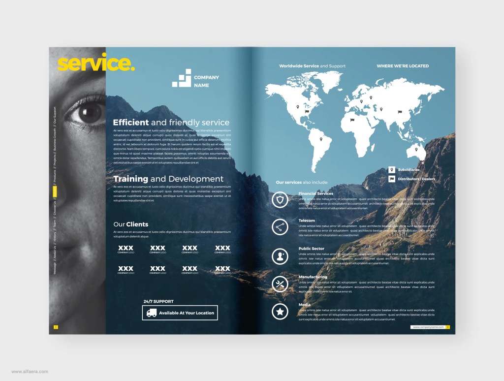
I really enjoyed the design on this page. I feel like the colors and the pictures work well together; I really like how there are no white spaces on these pages but it is still eye-catching whiteout being overwhelming to the reader. It has a lot of negative space but this one is active thanks to the picture acting as background and the text layout. I feel that the text also works well with the background, the white really stand out from the colors of the background and it makes it looks easy to read. The text is not extremely long and is organized neatly, the icons through the pages also help the organization of the design and it also helps to separate the text to make it more eye-catching to the readers as well as easier to interpret.
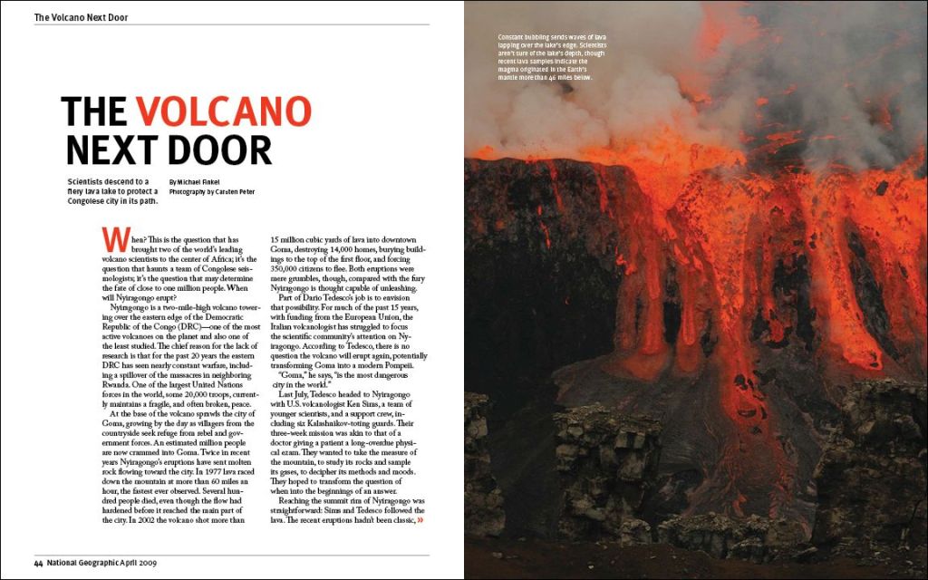
Many readers will look at a photo first as it can be eye catching to the reader like this first spread from national geographic. For many National Geographic readers, they are interested in the natural beauty that is our world. The spread above as you can see shows lava overflowing and spilling over the edge. What is amazing about photos like this one, it is considered a dangerous task as you travel to these locations to capture the best photo to share with others who do not have that experience of seeing it in person. Although the photo is fascinating, a text must include facts about this location and what it took to travel there. The writers did a good job with the title of the spread, along with the location, and dates included in the text. They also changed the boldness, color, and font of certain words or letters within the text.
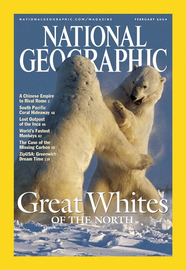
National Geographic has been a company that is well known for their journeys to places that are hard to reach for the normal photographer or human. Their journeys take days, weeks, or years to prepare and accomplish. NAT GEO is known for their front cover which includes their yellow outline around the page as it is a color that stands out when looking through magazines. Next they have their name in the cover with an incredible image of either nature, people, or certain locations.
I really enjoy looking at natural magazines like National Geographic as I have an interest in traveling to a few national parks after I graduate. They do an amazing job at keeping the reader interested and engaged in their spreads as they are images that are taken in real locations, with a camera, and at times in terrible conditions.
Searching through magazine spreads this one stood out to me. Its beauty and simplicity allows me to easily and happily read the loose and spaced out text. The paragraphs are spread out well which allows my eyes to go through the text at ease. The use of white space also helps guide my eyes through the spread. The images, text, and white space have a perfect balance. The images are fairly simple and have a blue theme to them. The designer has included a blue shape in the background to tie together the two sides, allowing them to feel as one. The margins create a beautiful structure to the work which leaves a crisp and clear look to the page. On the first side, an image comes out from the margin in a charming way. This allows for a feeling of asymmetry even though the magazine spread is fairly symmetrical, the use of shapes and the large image creates an interesting, asymmetrical look. The image on the margin also pulls your eye in while creating motion through the spread. The title of the page “Praise the Sea, on the Shore Remain”, stands out by using a bold, capitalized font. Although their aren’t other sub-headings, the paragraphs have clear spaces between them making it easy to view.
There are certainly things in this magazine spread that could be improved. Things such as more use of asymmetry and use of fonts, if their were sub-titles, but overall this spread is a beautiful sight to see. Its simple but interesting layout gives the reader a refreshing page. I was really attracted to the use of margins. How the image and shape were pushed beyond the white margin creating a different and beautiful set-up. The use of images, margins, and white space have really opened my eyes to the beauty of simplicity and ease.
While searching for layout inspirations, I found this beautiful e-book/workbook template. This caught my attention because of its mellow and neutral color palette. I find that neutral color palettes are very easy on the eye and I’m able to absorb the information better against these colors. There is also a healthy balance between empty space, text, and images on most pages. Some of these spreads have way less text and more empty space. This makes it much easier to digest the information on the page. There is something so elegant and clean about the design that makes me want to keep flipping through the pages. I think the arches add an interesting element that frames both the images and text nicely.
I decided to take a look at April Greiman. She was born in 1948 in New York city where she grew up. She went to the Kansas City art institute and then went to Switzerland where she learned under Armin Hofmann and Wolfgang Weingart. After her time in Switzerland learning she moved to Los Angeles and started Made in Space. “Currently, April Greiman is appointed at the Woodbury University, School of Architecture as an art instructor. She also teaches at the Southern California Institute of Architecture” Her impact on graphic design has won her awards including the Gold Medal for lifetime achievement from the American Institute of Graphic Arts. If you would like to read more about this site, you should check out this article.
John Maeda is a contemporary graphic designer. He is also an author, scholar, and computer scientist. His work mainly focuses on exploring the point where design, technology, and business come together. Maeda serves as a pioneer in interactive motion graphics. His work is considered groundbreaking in a way that it explores and alters the fundamentals of design. Maeda has written a number of books about design, however his book The Laws of Simplicity, is considered to be a landmark in the graphic design world. The book explores how to ‘need less but get more’ using ten laws for balancing both the complexity and simplicity within design, business, and technology. A portion of his work, including the above design, is stored in the permanent collection of the San Francisco Museum of Modern Art.
Stefan Sagmeister is a known for his graphic design, performance art, and typography work based in New York City. In 1933, he founded his company Sagmeister Inc., specifically to create designs for the music Industry. Pictured above are two examples of album covers done by Sagmeister. He is known for his wide variety of tools, materials, and techniques, his typography, and his controversial imagery that shapes his artistic identity. He has done movies such as The Happy Film and has designed album covers for Lou Reed, OK Go, The Rolling Stones, David Byrne, Aerosmith, and Pat Metheny.
The images above Sagmeister makes the words come alive. Not only does he out type onto people but he makes the type apart of the person. The type is the focal point. He uses such bold and strong structure to his work that it really stands out.
Sagmeister’s website is truly brilliant. I would recommend checking it out! https://sagmeister.com/
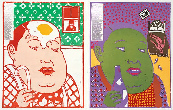
Seymour defined what graphic design and being a graphic designer meant in the twentieth century, creating graphics that not only looked amazing, but also communicated a message that might be anything from a light-hearted remark on design to an anti-smoking billboard. As seen by a terrific new online resource, the Seymour Chwast archive, his much-imitated graphic and illustration style still stands up well today. Chwast chose Roscoe Conkling “Fatty” Arbuckle, a silent cinema actor and comic who was allegedly accused of rapping and killing actress Virginia Rape, for “The Dark Side Of Good People” issue. this art shows two sides of the poster where in the first page the man has a nice pleasant interface and then the second poster has a darker side to it.
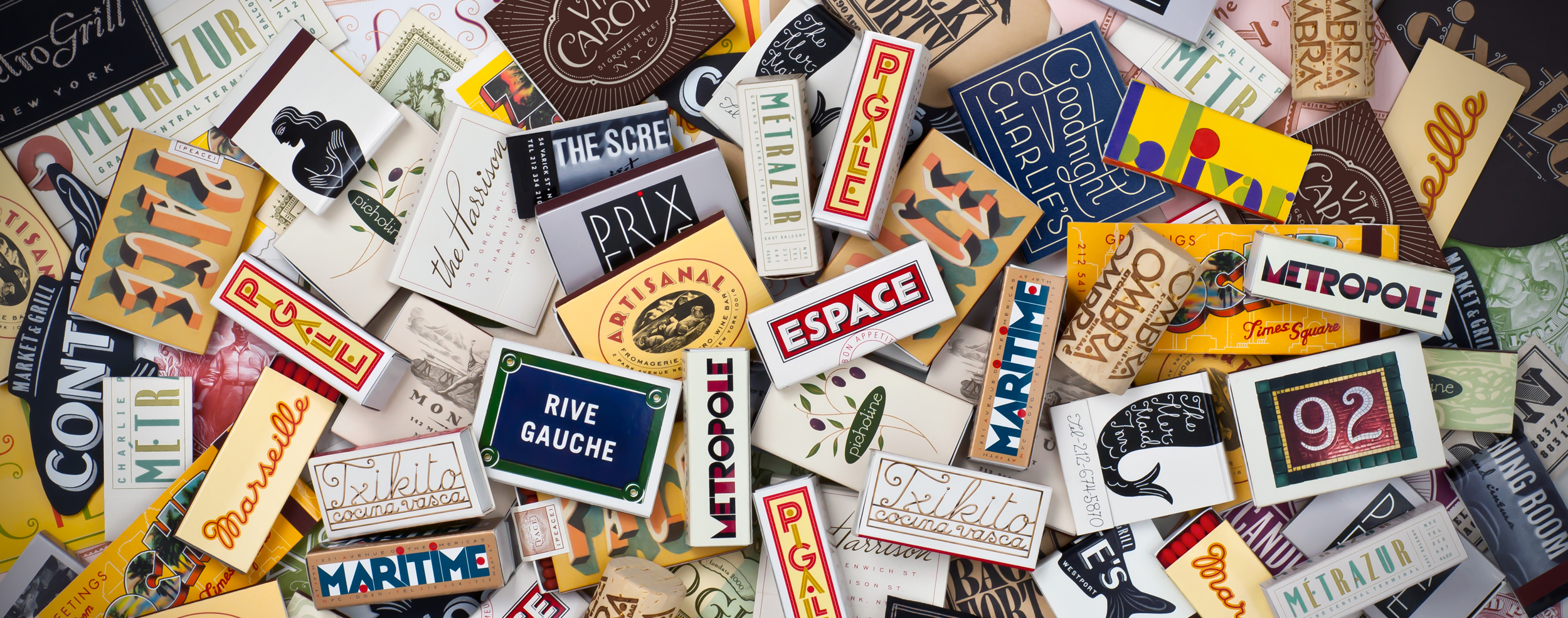
Louise Fili is an American graphic designer who draws heavy inspiration from her love of Italy, Modernism, and styles the of European art deco. She is based in New York and her work is mostly based around her work with typography. Her work is practically timeless in the way that it draws from the 1930s art deco style while still maintaining a modern and fresh feel. Fili taught herself how to do typography and she attended Skidmore College to study art after. Louise Fili opened up her own studio in the late 1980s. Her studio usually works with restaurant and food based marketing, packaging and branding. Along with this Fili also has made covers for over 2,000 books and has even co-written books with her husband Steven Heller, who is an author himself.