Boba Yaga Menu

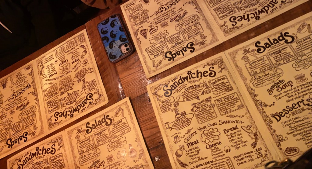
I was standing idle at work when I realized I had a blog post due tomorrow, luckily Boba Yaga has a really well designed menu that’s perfect to write about. 

I think this design is very clean and consistent. The designer made really great use of spacing and margins. There’s nothing out of place and it’s all even, which makes it very readable to customers. Each section has some visual aid, which is great because it makes customers more likely to add to their order because visuals are much more intriguing than just words. 

I also enjoy the small design aspects, such as the witch character who’s actions match the food options on each panel. A lot of the decor around the cafe is Studio Ghibli themed, so I also like that there’s a reference to the studio on each panel as well! 

Seen In The Real World- Petco

When looking for real world examples of graphic design, typography, and illustration in Oneonta, I came across Petco’s logo. I found this interesting because of the illustration in the photograph above. The illustration of the blue cat and red dog hooking ears gives a cute and playful feeling to this logo. Both animals are simple, heavy black lined, and color filled shapes. Having the dogs floppy ear hang/hook between the cats ears, creates one unified image. I think this image is cute, simple, and a nice addition. I also think this friendly interaction between the animals creates a welcoming and caring feel.

Besides the feeling and cleaver interaction between the animals, I don’t love this logo. It feels big and bulky. But, I think Petco achieved its goal that the logo is very often recognized as their store.

Bang Energy Logo and Packaging

The packaging for the Bang energy drinks caught my attention because of the color choices and the design to it. The flavor of this drink is cotton candy so using the bright colors pink and blue helps contribute to the feeling that it is a happy and sweet flavor. Also, the colors pink and blue are commonly associated with cotton candy. This is an energy drink so the design should symbolize being energetic, upbeat and strong and I think this design portrays that perfectly. The vibrant colors, font size and illustration make this drink seem more aesthetic and appetizing to the customers. I also believe that the “b” is made to look like either a speaker, a wave of sound or to catch your attention to also portray that being loud is apart of being energetic from the item. Already, the flavor being cotton candy makes it stand out over other energy drinks but the logo design with the splashes of color behind it make it much more appealing to people looking for this type of drink. I think this design works well because it is a simple logo that it is not too busy but also is not boring where the person looking at it is not uninterested.

Seen in Real World: Carhartt

I find the Carhartt logo interesting because of how easily it is recognized on clothing, materials, stickers, etc… The name Carhartt came from the combination of train car + heart. Their original logo represented this visually. Though nowadays, the new and improved design evokes a sense of innovation and moving as a company. The yellow swirl is so simple yet so recognizable in todays society. To me, you know a company/brand did a successful job on their design when a symbol such as Carhartts logo is identifiable with little to no correlation to the actual brand. This yellow swirl everybody knows but it doesn’t directly say what it means, that is what I find so fascinating.

Seen in Real World: Yellow Deli Menu

Ivanah Alexandre

I find the typography in Yellow Deli’s menu to be very interesting. Here is a photo I took of the Yellow Deli’s menus while I went to grab dinner with some friends. I feel the typography is almost mimicking handwriting but because it is digitally done it is virtually “perfect” and doesn’t have the imperfections or irregularities that regular handwriting has. The graphic design of the whole menu looks as if someone just sat down with a pencil and doodled some doodles. I think it’s very cute and childish. Especially how they chose to dot their i’s with flowers. Flowers in a common theme throughout most of their in-store graphics and their collateral. The menu’s graphic design matches the overall vibe of the yellow deli; which is very warm, cozy, and “wholesome”.

Blog Assignment 5 : Identity System

One of the most well-known restaurants in the world is McDonald’s, because of its consistency and convenience. It is globally recognized as the Golden Arches, and it is loved by many. This company as a whole has a good identity system because it’s logos and products are red and yellow, which psychologically induces hunger on the viewer. It is also easily recognized. Their mascot, Ronald McDonald, is a friendly clown who admires children and there are charity systems that run in his name. Both children and adults feel comfortable and happy when they walk into a McDonald’s. As well as their jingle, “I’m lovin’ it”, and the scent of their fried oil that can be detected from a mile away, this fast food chain is distinctive from its competitors. Designer Jim Schindler created the iconic M for the McDonald’s logo back in 1962, and it is still used to this day.

https://blog.logomyway.com/mcdonalds-logo-history/

Identity Systems – YETI

https://www.yeti.com/en_US/accessories

Yeti is an American company known for their products that include drinkware, coolers, bags, gear, apparel and much more. The YETI was founded in 2006 with their headquarters is located in Austin,TX.

What I enjoy about this company is the creativity behind some of their designs and colors chosen for their products. In the image above, people can see the idea of having a bronze-like secondary color with the a design of the American worked in with the YETI logo. YETI does a great job of keeping the company logo focused around the environment, hunting, wildlife, and nature as a whole. I like how simple the brand name is with a variety of colors for the product itself, while creating different designs that work into the brand name. A few examples of this are below:

Red Bull Identity System

A brand that I believe has a great identity system is Red Bull. Everyone knows the energy drink advertised around the world with its bright and vibrate colors and distinct logo, along with their well known slogan from countless commercials, “Red Bull gives you wings.” It was created to draw viewers in through advertising that their drink gives you so much energy that you’ll have the wings to get things done. The iconic “gold and red” color scheme is what makes the logo recognizable. All of the Red Bull cans have this logo slapped on, front and center, to make them recognizable, no matter the color of the can. The logo also features two bulls about to collide with their horns against the backdrop of the sun. The thin and tall shape of a Red Bull can is also a feature more unique to them. The logo and slogan were made by the company owner Dietrich Mateschitz in 1987. He is the co-founder and owns about half of the company. The vibrant colors and recognizable logo is what makes Red Bull a strong identity system.

https://www.redbull.com/us-en/energydrink/company-profile

Identity Systems – Nike Swoosh

Nike was founded on January 25, 1964 in Eugene OR. Their infamous logo can be spotted and recognized almost immediately by most. At first, their logo design wasn’t the same as we know it today. The original design was bought for $35 from Carolyn Davidson, she later created the swoosh that we all know today.

The original Nike Logo bought for $35

In Greek mythology, Nike is the Winged Goddess of Victory. The logo is derived from goddess’ wing, ‘swoosh’, which symbolizes the sound of speed, movement, power and motivation.

The reason why I feel this logo is an excellent example of a well-done identity system is because of its simplicity. Nowadays, almost everybody in the sports community and everyday people can recognize the swoosh. Its jet black design creates for a perfectly executed, unique, stand out logo.

Read more on the designer and history here: https://en.wikipedia.org/wiki/Carolyn_Davidson_(graphic_designer)

Identity Systems: Headspace

Headspace is a meditation app that uses science to help its users calm down from stressful days, lull users to sleep or boost their mood for a brighter day. The brand implements cute and colorful graphics to help push the calm and happy vibes. The color palettes used in most of their branding are calming blues popping yellows and serene purples bringing in the elements of stress relief, inviting joy and peaceful rest. They make great use of the cute characters within their branding as well making them flexible and fun shapes to bring home the message that anyone can use their app. These graphics are also very simplistic and fun to look at making their website and social media very easy to scroll through. I also like the name of this brand because this app is pushing to help users make their headspace a better place to be. So its a very straightforward name for this brand.