Havaianas

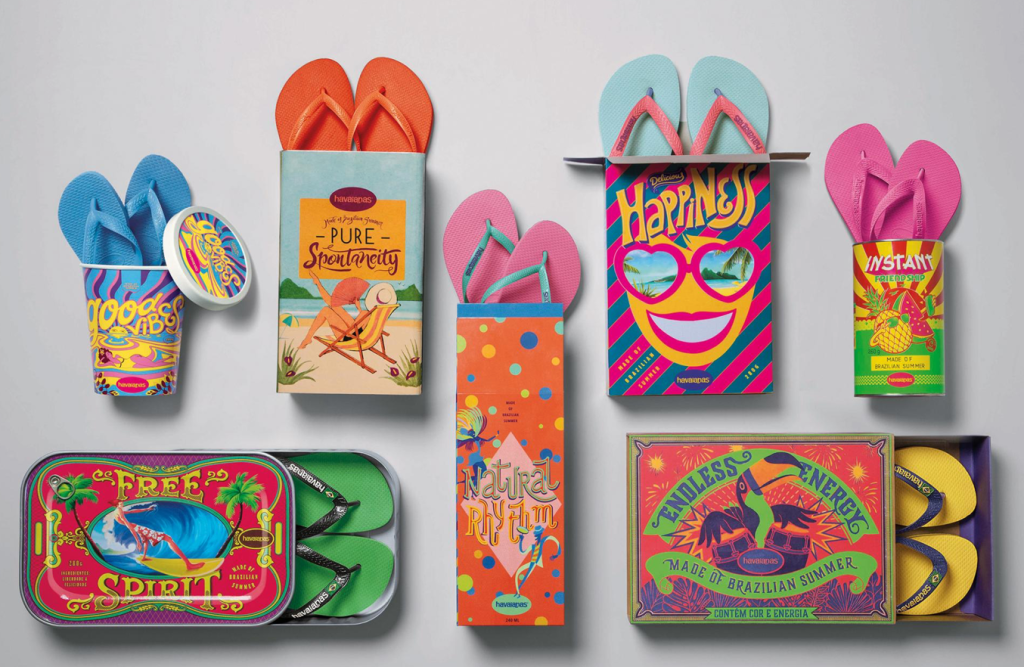
I found this designer to have created an eye-catching form of self promotion. The use of bright colors with varying designs is super attention grabbing and this makes people question what exactly is inside of these packages. People may question what “made of Brazilian summer” is and these packaging helps customers begin to associate the bright colorful designs with their brand. Additionally, the product of flip-flops are not usually what you would associate with these colors, however when you take into consideration that the bright colors are reflected in the color of the flip-flops that are being sold it makes total sense. This is just a super creative way to include the bright colors of the brand.

To see more of the designs click the link below!

https://www.adsoftheworld.com/media/integrated/havaianas_made_of_brazilian_summer

Self Promo: Reese Cooper

The first time I saw Reese Cooper was through Youtube. The video was about how his clothing and fashion got denied from fashion week. So, he rented a room in the same city as the current fashion week and put on a runway show with his clothing for free. He promoted his personal show and set everything up himself. I found it fascinating how he chose to make the venue look outdoors, especially in pictures, when they are actually in an all white room. This was the first encounter I had with Reese Coopers work.

The second time I saw Reeses work was through Instagram. I saw he put on another runway show, but this time with more exposure and recognition from the first. The models walked on top of this rounded tower in the middle of nowhere. The scenery was beautiful but this looked so bizarre. The way he promoted his work seemed absolutely crazy and out of the box, I liked it.

Most recently, I saw Reeses newest project, a runway on a bridge. The way he thinks of these absurd scenes to promote himself blows my mind. I think that’s the reason why he is so successful. After all that’s what attracts me to his work.

Self-Promotion piece: Jessica Walsh

For this blog post I found Jessica Walsh’s website eye catching. After looking at her website and her work I was very intrigued with the colors she used and how her pieces are all clean but catch the viewers attention to make them more interested and invested. The point of putting your work on a website is to be more known and discovered by more potential clients. The first image I added to this blog is a really good image to catch peoples attention and promote her work. First, because the bright colors tend to catch viewers attention more. Secondly, It is made with the women wearing colors of the rainbow and posing in many different ways with different backgrounds and colors to show inclusiveness. The second image I included in this blog post is more simple however, Jessica Walsh uses her symbol a lot in her work. This symbol is simple yet bold since it is in majority of her work in a very large size. Jessica Walsh is promoting her use of design as well as photography and direction in her work. The pieces she has on her website are made to show clients what she can offer to them for any project they need. I really enjoyed looking through Jessica Walsh’s website and looking at the work she has created and what she is able to create. I recommend looking at her website and looking at her work.

https://andwalsh.com/

Self Promo: Tia Adeola

I found this self promotion of fashion designer Tia Adeola to be very interesting and creative. Tia Adeola is one of my favorite fashion designers. She inspires me so much! She’s about my age -maybe a couple years older- and she is also first generation American. She is so gifted and has developed an amazing brand. Here she is promoting the face masks that she started selling admist the pandemic. She essentially dressed up K-95s in beautiful fabric and ruffles. Many celebrities saw these promotions on Instagram and bought her masks! I think it is so cool that she made the model look like she is a statue head. The whole thing reminds me of a museum of course. Which is onboard for her because she is a big fan of Art History. I also love how simple it is. It just shows the mask, and her name. No unnecessary text. If you are interested in buying a mask all you would need is her name and that’s the only piece of text on this promotion.

Self-promotion: Wanda Priem

For this post, I decided to show Wanda Priem’s self-promotion portfolio. I think this portfolio looks very efficient and it works pretty well together. The colors and the negative space really activate the work and give it a professional look. It’s also nicely put together and brings up the artist personality a lot.

she decided to focus on the concept of “Prime” and use its different meanings to give life to the design. prime numbers are a constant idea here. the non-prime numbers are eliminated and only prime numbers are used. Trough this elimination, a pattern is formed, this pattern becomes a design element.The photographs also contribute to the concept. Through showing how prime numbers can onlybe divided through itself and one. Not only is this design very cohesive, but it has a complex message behind it. its meaningful its simple and very organized. I personally really like it.

Bernstein & Andriulli

This interesting company promotion printed their illustrations onto matchbooks. Bernstein & Andriulli a company that showcases creative artists is a management agency and media consultant. They represent all types of artists such as “photographers, illustrators, stylists, hair and makeup artists, directors, production companies, animators, interactive and experiential producers (Bernstein & Andriulli). I found this self-promotion graphic and thought it was so interesting and nothing like I’ve seen before. This is the main reason it intrigued me, it was nothing I’ve seen before. I think that is a major part in self-promotion. To make yourself stand out from other designers is what will make you succeed. Thinking outside the box and taking risks. I also think it is very incredible that since this company represents many artists, that the matchbook campaign incorporated many illustrations to see/promote, not just one.
These matchbooks have the artists illustration and name. To me this is such a unique and memorable promotion piece.

The Bernstein & Andriulli website is so fascinating and incredible to look through. I really recommend visiting their site, so many cool and unique things to view. I think many of you would enjoy it.

https://www.ba-reps.com/

Personal Branding: Caitlin Choo

I found this project on Behance and thought it was a really strong design. The designer was inspired by clouds and how colors represent different moods and emotion. Not only is this design very cohesive, but it has a beautiful message behind it. Choo is putting forth that she is not perfect just like the clouds and her moods are frequently changing. Employers are always looking for the perfect candidate for a job, but the inspiration behind the design makes Choo all that more compelling. I love that this design is very simple and there is really strong use of white space.

Click here to scroll through the full project!

Information Design: Suicide in the United States.

I chose to do an information graphic on suicide because I feel that not everyone really knows how often it happens and the information behind it other than just the surface. In this information design the creator uses their images to show the information they are trying to show other people. The percentage of depression is represented in a ring by different colors to show how many adults have depression in a year. The design also uses symbols of men to show how many deaths are caused by suicide. Each drawing of a man represents 1,000 lives. The grey men show how many lives in total are taken and the black ones represent the 5,500 people that are age 15-24. On the left hand side, there is a list of the top 10 causes of deaths in the United States and each section of it is drawn to length of how many deaths are calculated by that cause. All of these design factors such as color, symbols, size, shape and more all help portray the information that is meant to be heard.

Information Design How We use Social Media

How Adults and Teens Use Social Media Infographic - e-Learning Infographics

This Infographic was one that I thought was well done. There is lots of visual graphics instead of just stating facts, which gives information to readers quickly. I enjoy the way they broke down the facts into different visuals, instead of just repeating the same visual over and over. The charts are easy to understand when looking at comparisons because you can easily tell which group had used that form of social media most. The color scheme is also something to note. The infographic contains mostly orange and blue, which are complementary colors. The background is a tan color, so it doesn’t take away from the information given. I think this infographic is successful in the way the information is presented.

Source: Pew Research Center studies from August 2013, May 2013 and February 2013

https://elearninginfographics.com/how-adults-and-teens-use-social-media-infographic/

40 Little Things You Can Do To Break Your Creative Block

Ayannah Newton

This infographic really caught my attention! It, as the title suggests, lists 40 things an artist can do to break a creative block. Although it uses a lot of colors, it is well organized, easy to read, and pleasing to the eye. I found it to be inspirational as an artist myself. Not only does it convey the information well, but it also reminds me of something a young artist may hang in their studio for motivation.

Designed by the team at Creative Market!