Barbara Kruger

Ivanah Alexandre

Untitled (Look and listen), 1996

Bio

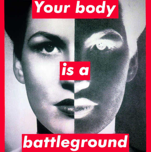
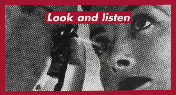
Barbara Kruger (b. January 26, 1945) is an American artist who is most known for her collage art. Her artwork tends to combine black and white photography with bold statements in white boxed in a bold red rectangle. She is said to use Futura Bold Oblique or Helvetica Ultra Condensed as her font. She attended Syracuse University then Parsons School of Design in New York City. Kruger spent some time working for Conde Nast Publications as a graphic designer for their Mademoiselle magazine. She was even promoted to being the head designer at Mademoiselle magazine when she was only 22 years old.

Supreme

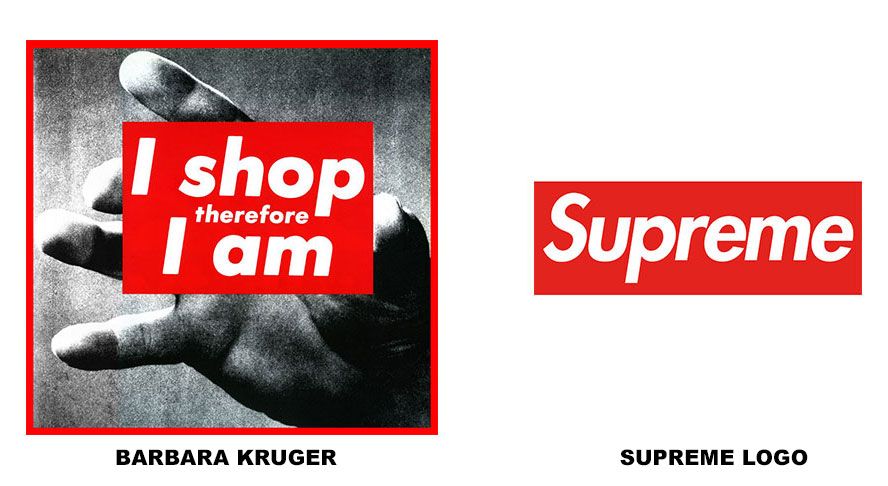
I’m sure a lot of us familiar with the super popular fashion brand Supreme. The brand has become iconic through there box logo (they call “logo”). It works because it is so simple and it’s easy to read and it’s bright. Kruger has confronted the fashion streetwear brand for appropriating her style for it’s logo. I suppose “imitation is the a form of flattery”.

Work

Untitled (We Don’t Need Another Hero), 1987

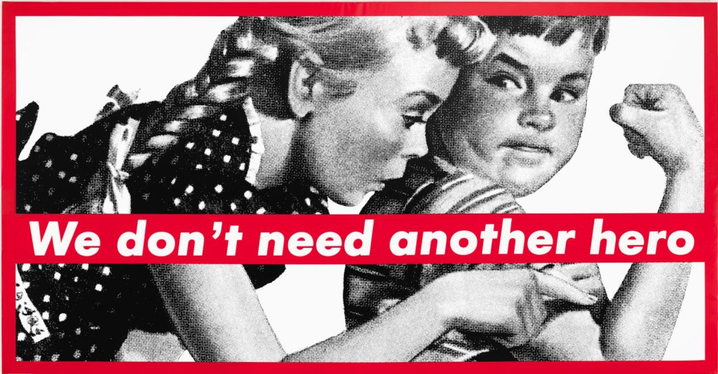
A lot of Kruger’s work focuses on media and politics. She tells a story in a simple and direct statement. Kruger says she likes to use personal pronouns such as “you”, “I”, “we” because they “cut through the grease”. She recognizes that we are the change. If we want the system to change the action begins with us. She is still alive at 72 years old and she lives and works in New York and California. A lot of her artwork lives at the Museum of Modern Art and the Los Angelos County Museum of Art.

Visit this Barbara Kruger tribute website to view the rest of her notable works.

Susan Kare

The Woman Who Gave the Macintosh a Smile | The New Yorker

Susan Kare is a graphic designer based on San Francisco, California. If you’ve ever used a computer before, you have most likely seen software icons designed by her. She graduated from New York University with a Ph.D. in fine arts. She began to work at a museum, and although creative, it wasn’t her thing. She then decided to work for Apple in 1982 and was the only one in charge of graphics. When working for Apple, she designed the Macintosh with a face, as seen above. About a decade later, she decided to create her own graphics studio called Susan Kare Design. She recently worked as the Creative Director at Pinterest, a well known website and app about creativity and inspiration. In the past she has also worked for Microsoft, IBM, Sony Pictures, Facebook, and now Niantic Labs.

Susan Kare has a ton of involvement in all things technology, symbolically. She has created icons for software for hundreds of different companies and was the creator of the command symbol. She is known as the “woman who gave the Macintosh a smile.” She also designed a bunch of fonts for Apple. Overall, Kare is one of the most significant technologists of the modern world.

To find out more about Susan Kare and see more of her work, you can visit: https://kareprints.com

History of Graphic Design: Saul Bass

Saul Bass most notable graphic design works which include film posters and brand logos.

Both a filmmaker and graphic designer, Saul Bass is most known for his design of movie posters as well as logos for many famous corporations.

Born in 1920 in New York City, Saul Bass as a child had always been creative. In college he took classes at the Art Students League where he studied under Gyorgy Kepes.

After college, he left New York to go to California where he would work for advertising, until he gained popularity from working on the poster to Carmen Jones (1954). Through this poster, many filmmakers took notice of Bass and invited him to work with them, which lead to the making of Bass’ poster designs of The Man with the Golden Arm (1955) and Vertigo (1958) and many more.

He later also went on to design many famous logos for brands such as Quaker Oats, Girl Scouts, AT&T, Kleenex, and Warner Communications.

Cipe Pineles

Picture this: It’s the year 1927 and you’ve been granted the Tiffany Foundation Scholarship to attend Pratt Institute. Fast forward to 1931, after your skills flourish, you finally graduate, and you are ready to enter the workplace. But here’s the issue – you’re a woman.

Despite being a talented hopeful, Cipe Pineles faced many challenges finding work and a creative safe space after graduating from Pratt Institute. She would eventually find comfort in a group of European immigrant designers who were also trying to make a name for themselves. The company became Contempora Ltd. and there Pineles’ skills only grew by designing advertisements and pattern updates.

At a Gala event put on by Contempora Ltd., Pineles met the wife of Conde Nast who was fully impressed by her work. Shortly after Pineles became an assistant to M.F. Agha, then art director of Condé Nast publications. After about 10 years working under Agha, Pineles was titled the art director of Glamour magazine in 1942. Her art direction and design were also brought to publications such as Seventeen, Charm, Vogue, and Vanity Fair. 

Pineles was so innovative for her time, not only because she was a successful woman working in a male-dominated industry, but because she blurred the lines between fine art and publication design. Before Pineles, hiring and commissioning fine artists for publications was unheard of.

Images (Left to Right):

Cipe Pineles, Vouge cover, 1950, photograph: Irving Penn

Cipe Pineles, Charm cover, November 1953

Cipe Pineles, Vouge cover, 1939

Carla Dadulla

Paula Scher

By: Jolie Siegel

Paula Scher is a well known graphic designer who has done work for companies such as Adobe, Microsoft, Coco-Cola, Walt Disney Company, and many more notable companies. She is known for her unique approach to typography, developing a new style based off of Art Deco and Russian Constructivism. She utilizes typography in a way that is unusual and new, yet instantly recognizable. This is why some consider her to be the most influential graphic designers in the world. Her work even has a permanent home in exhibitions such as the Museum of Modern Art, the Library of Congress and other various institutions.

Some notable achievements include; Art Director Hall of Fame (1998), Chrysler Award for Innovation in Design (2000), American Institute of Graphic Arts Medal (2001), and was the first woman awarded the Type Directors Club Medal (2006)

Some of her work that can be found in MOMA

Some more commonly recognized work of hers

“The things that make work interesting, and create invention, are accidents. You want to be in a position where you’re capable of making accidents”

Check out this link if you’re interested in learning more about “A Life in Her Work”

https://www.madamearchitect.org/interviews/2020/7/16/paula-scher

Check out this link if you’re interested in seeing more of her work

https://www.behance.net/PaulaScher

Blog Assignment 2: History of Graphic Design

The very first graphic design agency dates back to 1903, and it was called the Wiener Werksätte (Vienna Workshop). This workshop consisted of architects, artists, and designers who put their heads together to create designs to grab the attention of its viewers. Koloman Moser, a painter, Josef Hoffman, an architect, and patron Fritz Waerndorfer established this workshop and created a promotional banner for this new agency.

https://uxdesign.cc/a-brief-history-of-graphic-design-90eb5e1b5632

Paul Rand

Paul Rand Modernist Master (1914 - 1996)

In the story of graphic design, there are millions of people who now call themselves graphic designers but there are some that have left a remarkable mark in the industry. One of them is Paul Rand (1914-1996) many say that he is considered the father of graphic design. Paul Rand was an American art director and graphic designer that was well known for his corporate logo designs for major firms like Morningstar, Inc., NeXT Computer, Yale University, and Enron. He also was one of the first American commercial artists to embrace and practice the Swiss Style of graphic design. since the late 1930s, Rand adopted both European modernism and American spirit and functionalism in his graphic style and was highly rated for it. In 1947, Rand published his book titled Thoughts on Design which contained theories and beliefs that shaped the entire future of graphic design he introduces many ideas to the world of design, one of them being the ideology that graphic design should be a “functional-aesthetic perfection”. The balance between beauty and practicality was the major factor to make something look good while getting the message across in an effective manner to the public.

Design can be art. Design can be aesthetics. Design is so simple, that's why it is so complicated.”

― Paul Rand

Graphics For Design Poster 1 Alvin

I chose the poster by the artist Barbara Kruger rose. The art is titled “Your body is a battleground,”. This art was made in 1989. Kruger’s art, which has appeared on billboards, bus cards, posters, and railway station platforms, as well as in parks and other public areas, is infused with a strong sense of social involvement. “Your body is a battleground” emphasizes how the fight for freedom of choice differs from political conflicts. Mostly the battleground which is our body gets the results rather than how society perceives it. So when women are being told to do stuff with their body, for example, abortions, people have their own opinions but the real fact is that no matter what happens, people are not ones experiencing the results but rather the women going through it.

“Explore Safely” by Yuko Shimizu, 2008 

Yuko Shimizu is a Japanese illustrator who works out of New York city. Her work is a combination of Japanese heritage and contemporary reference. She grew up both here in the US and in Japan. She also has two college degrees, one in both countries.  

She has worked as an illustrator for many prominent companies including The New Yorker, Rolling Stone, GQ, Apple, Adobe, Microsoft, MTV, Target, National Public Radio, Time, The New York Times, And The Library of congress. Also, in 2018 she won the Hamilton King award. Now She teaches Illustration at The school of visual arts.

“Explore safely” was created in 2008 to ‘better educate teenage girls in Europe about safe sex and AIDS prevention”(paperink). I think this work speaks to me so much because at first glance you could completely miss how provocative it is, only once you’ve taken a closer look at it do you see how provocative it is. I also really enjoy the look of the poster, even though the main focus is right in the middle there is still enough going on in the background to keep it very visually interesting.  

If you would like to see more of her work you can look at her web site https://yukoart.com/

Boris Aleksandrovich Alexandrov

Aleksandrovich, 1941, Defend our Beloved Moscow

Boris Aleksandrovich Alexandrov (1905-1994) was a Soviet-era composer, artist, and Major-General in the Soviet military. During the second world war, Aleksandrovich broadcasted Russian folk songs to soldiers on the frontlines, and in a similar way, provided patriotic media in the form of propaganda posters part of a larger art movement called “Socialist Realism”, an art style typically used for the purposes of propaganda and spreading patriotism, prevalent in the Soviet Union and other communist or socialist countries in the mid to late 20th century.

Socialist Realism was especially employed in WWII for these purposes, a period where propaganda art was nearly universally seen across every major nation regardless of their position in the war, intended to bolster the industrial workforce as well as the fighting forces of all countries. The Soviet Union in particular enjoyed this boom of propaganda art, and Socialist Realism can be seen all the way up until the collapse of the USSR. Its style is best defined as bold, idealistic, and simple to digest, often being very literal and hiding shallow deeper meaning. In this sense, they were a highly efficient utilization of graphic design to spread messages to the masses, ensuring their call to action could be easily understood while still representing the ideals of the USSR and attempting to inspire its people.


In 1958, Aleksandrovich was granted the title of “People’s Artist of the USSR” to commemorate both his visual and performing arts.

More information on Aleksandrovich is available here: https://en.wikipedia.org/wiki/Boris_Alexandrovich_Alexandrov