
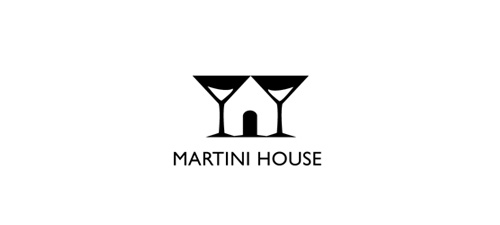
Martini House Logo
When browsing online to find a logo that uses positive and negative space, I came across the Martini House logo. I think this is a very straightforward design that represents exactly what the business is. I like how the designer used two martini glasses right next to each other then made a house out of it by adding the front door. I also liked how he has the white in the glasses to show that they are somewhat full with alcohol. The designer of the logo is Eddie Brown, unfortunately I don’t think this logo ended up being chosen but it’s still a great logo. You can find this logo along with many of his other designs at https://logopond.com/EBrown/profile/13914/?gallery=&filter=N.
Ambiguity of Positive & Negative Space: USA Network
This simple, yet effective logo uses negative & positive space perfectly. The designer, Sean Serio, creates an ‘s’ between the ‘u’ and ‘a’ using negative space that connects all the letters within the word. This logo is clear and easy to understand and doesn’t overcomplicate the logo. USA Network changed their logo to this one in 2005 and have been using it since then.
Websites Used:
Positive/Negative Space logos
This is the American Institute of Architects Center Logo by Pentagram. I think this logo shows good use of positive and negative space. This logo is simple but at the same time, it has a lot going on. The overall active space works really well, it creates the shape of a key and it’s easy to locate for the viewer, I also like how the artist incorporates the city skyline within the key, it’s a great and creative way to active the negative space of the logo. Although this is a very simple design, overall I think this logo uses the white space well.
Apple Logo
The Apple Logo was created by Rob Janoff in 1977. It’s easily one of the most recognizable logos today. The use of black and white makes the positive and negative space pop. At first glance most wouldn’t realize the technicality of such a simple logo, but when looked at deeper the design becomes genius. The bite out of the apple is perfectly placed and blended into the background with negative space. Rob Janoff has create a ton of other famous logos to date, here is a link to his site: https://robjanoff.com
Toblerone Logo
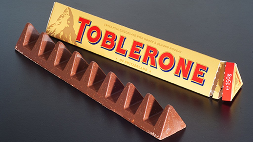
The Toblerone logo dates back to the year 1908 and was created by two men, Theodor Tobler and Emil Baumann. When creating the logo, their goal was to create the shape of a mountain to emulate the shape of their chocolate bar, as their chocolate bars are known for their triangular shape. In addition to echoing the bar shape, they wanted buyers to recognize the mountain icon as the Matterhorn in the Swiss Alps. Within the Matterhorn, Tobler and Baumann chose to incorporate the symbol of a bear in their logo due to the chocolate bars origins. Toblerone was created in Bern, Switzerland which is also known as the “City of Bears”. The bear is featured on the city’s coat of arms and by including the bear, they are paying homage to the treat’s birthplace. At first glance, the bear is hardly noticeable and many may dismiss it at the snow on the alps. If the viewer takes a moment to look at the logo more closely, they will notice the bear standing on its hind legs. This ambiguity is what I believe makes this logo a great example of using positive and negative space.
For more information on the development of Toblerone check out the link below: https://www.mondelezinternational.com/Our-Brands/Toblerone
Check out their brand website here: https://www.toblerone.co.uk/en
Beautiful Pages


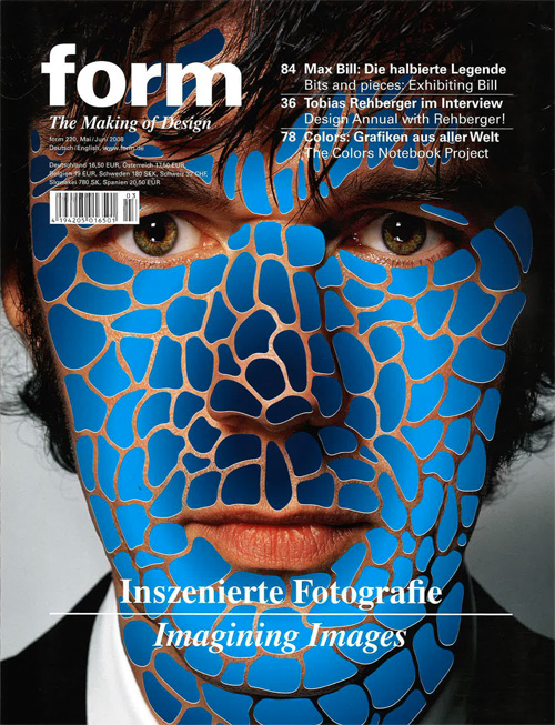
These magazine pages made by Form caught my attention with how they altered the normal use of these materials to create their own creative images. The first image has piano keys coming out of a pair of lips. Even with that to catch your attention there are more random objects and colors behind it to draw your eye over to it as well. The color use in this page is very well done and how some of the patterns and colors overlap shows depth to it. The second image is a mans coat and body and where his head is supposed to be is just clouds of smoke instead. These ideas take any object and alter it to however they want it to which is just beautiful itself. The third image, is a mans face and over his skin are these blue scales that range from light to dark blues. These three magazine pages are extremely creative and very well done. The text is simple since the background is so busy the text is centered in white to draw attention to it against the darker background.
http://www.formmagazine.com/en/
Aries Moross


The Guild of Food Writers
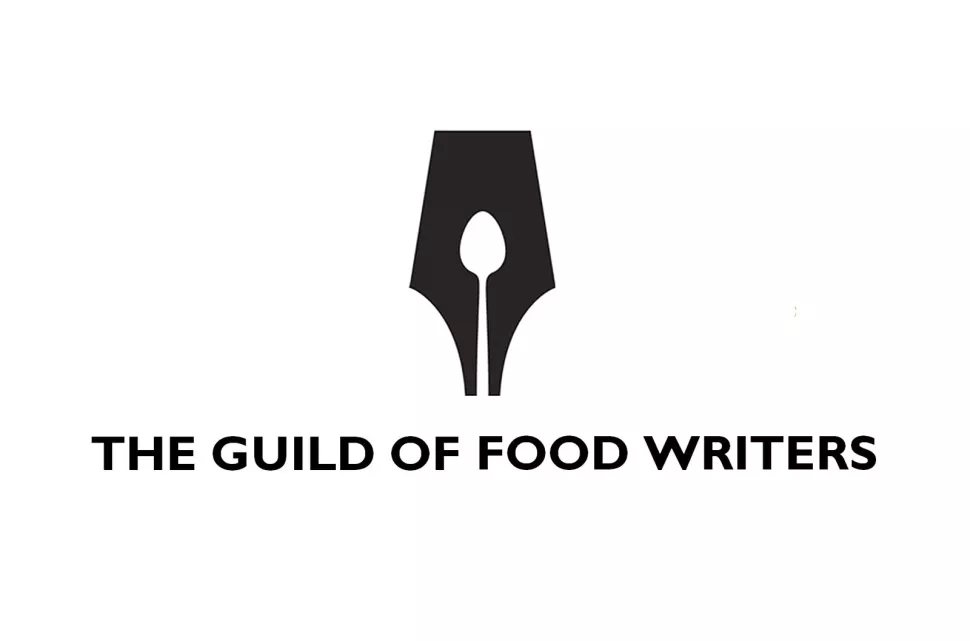
Founded in 1984, The Guild of Food Writers is a professional association of the UK’s top food writers, broadcasters, and critics. This organization is dedicated to creating networks and communities within food journalism and culinary education.
This logo makes great use of both positive and negative space. 300Million took two concepts, writing and food, and created a logo that perfectly combined the two. The designers used the negative space from a fountain pen nib and designed it to look like a spoon.
300Million was founded in 2004 and gained a lot of recognition and praise for their work, but fell into administration in 2012.
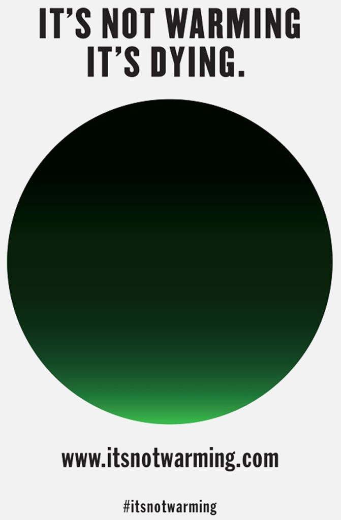
Milton Glaser
Climate change is an issue we face everyday and this campaign was created to raise awareness and support to the issue. This campaign aims to create a greater sense of urgency to the issue of climate change and to show how serious it really is. His design looks like a simple green and black circle however, the black part that is majority of the circle is symbolizing the smoke and pollution on Earth and the small bright green part at the bottom is symbolizing the little life remaining on Earth. There were buttons created of the green and black circle that are available to buy on the campaign website for $5 for five of them.
https://www.dezeen.com/2014/08/04/milton-glaser-its-not-warming-its-dying-climate-change-campaign/
