Blog #4: Spartan Golf Logo

Ivanah Alexandre

Spartan Golf Logo designed by Richard Fonteneau

I noticed another classmate did the other logo I did so I am posting another one.

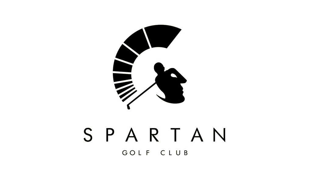
This is a absolutely BEAUTIFUL use of positive and negative space! This use of positive and negative and space is interesting because you can see both images almost immediately. You don’t have to “work” to understand it. Also the concept illustrates or articulates the brand perfectly; it is extremely relevant. The positive space is made to resemble a golfer following through on a powerful swing. The negative space is made to resemble a greek spartan warrior. The energy of the golf club doubles as the arc of the spartan helmet as the body of golfer doubles as the face of the spartan. This logo could not be more perfect!!

Negative Space Logo: American Institute of Architects Center

Ivanah Alexandre

American Institute of Architects Center, by Pentagram.

This logo used positive and negative space very nicely. The viewer can recognize that the positive space is made to resemble a key and the negative space is meant to resemble a city skyline. The company that uses this logo is called American Institute of Architects Center. So the logo is relevant to the business as both a key and buildings have to do with architecture. I have however seen more creative uses of positive and negative space that better illustrate the purpose of a company. Like I could easily mistake this logo for a city based real estate company logo. However, architecture may be a harder concept to illustrate.

Blog Assignment 2: History of Graphic Design

The very first graphic design agency dates back to 1903, and it was called the Wiener Werksätte (Vienna Workshop). This workshop consisted of architects, artists, and designers who put their heads together to create designs to grab the attention of its viewers. Koloman Moser, a painter, Josef Hoffman, an architect, and patron Fritz Waerndorfer established this workshop and created a promotional banner for this new agency.

Blog Assignment 1: Graphics for Change

Throughout history, many artists have used their visual communication skills to convey topics that they felt needed dire attention or to be protested against. This is usually achieved by showing something to provoke shock value to the viewer or to make them think harder about something that they otherwise would not. Keith Haring, a famous artist from the 1980s, was no different. He is known for depicting his figures in joyous scenes, such as his easily distinctable but unnamed print of five dancing men in front of a yellow background. In a particular print of his titled Silence = Death, his usually peppy figures are drawn to be distressed by the silence against AIDS. Seeing brightly colored figures expressing negative emotions with X’s marked on their chests feels out of character for Harring’s designs, but this further emphasizes the importance of how necessary it is to fight against AIDS. Art historian, critic, and writer Ruth Millingon posted an article describing Harring’s picture amongst others made by different artists that also promote change or activism.

https://ruthmillington.co.uk/11-famous-protest-art-examples/

Blog Assignment 4: Logos: Ambiguity of Pos/Neg Space

An example of a logo that utilizes ambiguity of positive and negative space to convey a meaning is the classic Girl Scouts logo. At first glance, one could see three side profiles of girls’ faces. Then, one may notice that the three faces are layered in a design that resembles a clover, a symbol that is commonly associated with luck and nature. The logo was created by a graphic designer named Saul Bass in 1978.

https://www.famouslogos.us/girl-scout-logo/

Toblerone Chocolate

This logo for Toblerone Chocolate uses the technique of ambiguity of positive and negative space to create an interesting hidden image. The first image above is the normal logo of Toblerone chocolate. The second image is enhancing the hidden message so it is clear.

Toblerone chocolate is a Swiss brand. The Swiss Alps (mountain) in the logo is very easy to notice. However, if you look closed with how the negative and positive space play with one another you discover something more. A bear in the negative space! The chocolate brand was established in Berne, Switzerland which is known as the “city of the bears”. Once you notice this cleaver image within the mountain it is hard to unsee it. This was such a good use of space and very thoughtful to relate it back to the region it is from. I really enjoy this graphic design logo.

https://1000logos.net/toblerone-logo/amp/

https://www.worldwidechocolate.com/shop-by-brand/toblerone/

WWF Logo

I chose the WWF logo because it is such a simple but good example of ambiguity of positive and negative space. The Logo was created in 1961 by co-founder Sir Peter Scott and the negative positive space version was made in 1986 at the San Francisco office of Landor. The logo was based on Chi- Chi, a giant panda for The London Zoo. I feel like this is a fairly know Logo, as I can Remember seeing it often in commercials growing up. What I think is really well down about it is that it is almost hard to see that it uses positive negative space. The white space blends so well with the black to create the shape that you miss the use of the pos/neg space and just see it as a panda. I also like how simple it is, it’s highly effective at grabbing your attention quickly and then with the use of pos/neg space can hold your attention. 

https://www.creativebloq.com/design/10-logos-make-clever-use-negative-space-61621038

Logos: Girl Scouts

The girl scouts logo is a design that uses its negative and positive space design to create the faces of three girls. Saul Bass is the man who created this logo in 1978. Aiming for simplicity and a sense of unity. The women’s heads are shaped to form a four leaf clover to further push the ideas of looking toward the future, unity in the face of differences and female friendship. The green color palette also helps to push the Girl Scouts love for nature, with a few tint changes over the years its always been green. With its unique but simplistic design it is very recognizable even when slightly changed to modernize it.

Heres the Girl Scouts website where you can find out more on their history: https://www.girlscouts.org/en/discover/about-us/history.html

LG Logo

Ayannah Newton

The LG logo was designed to represent the values of the brand. Their main value is humanity, followed by global (outreach), technology, tomorrow (the future), and energy. The logo is comprised of a red circle, to represent friendliness, as well as a design of the human face using the letters “L” and “G.” Rather than using additional colors for the face, the designer of the logo utilized negative space to create a more futuristic look. According to the LG website, they believe their logo represents the brands’ values so well that it is important that it never changes.

See more info on the LG logo and values here:

https://www.lg.com/global/about-lg-brand-identity

SOUNDCLOUD LOGO

Soundcloud is a online platform where the public is allowed to upload, share, and stream music. This platform is where artist can begin their careers by promoting their own music to others, creating an audience for themselves. Many well-known artist have had successful careers by being discovered within this platform. The Soundcloud logo can be seen as a cloud at first with what seems to mimic audio equalizer lines as it is a platform for music, as mentioned before. The creators of the logo were both Alexander Ljung and Eric Wahlforss, in 2007.

https://www.businessinsider.com/life-of-soundcloud-founder-ceo-alexander-ljung-2015-8