Incredible Types

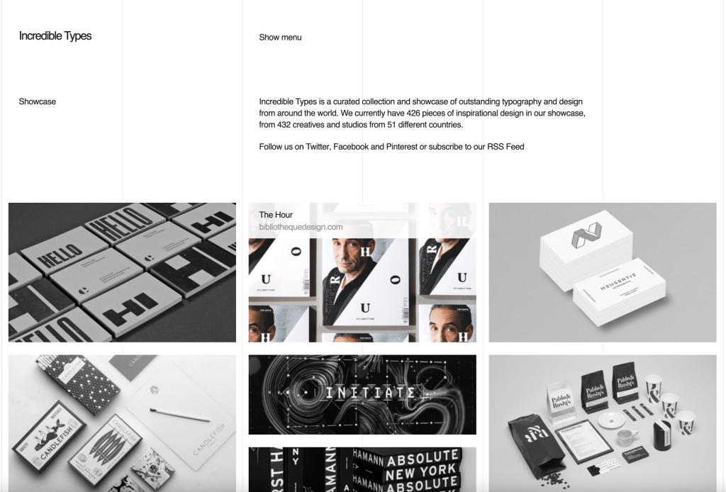
I think http://incredibletypes.com/ is a great example of a nicely done design blog. This page is very simple and clean. I love that you can see the columns on the webpage, at first I thought that it could be a programming error, but I like that from a designers perspective, you know exactly what the columns were used for.

This blog is a curation of many different graphic designers and I like that it’s in black and white when you first open the page. When you scroll over an image, it turns to color and includes the title and page that the design originates from. This makes the design stand out against the rest without clicking to a new page.

Creative Boom

https://www.creativeboom.com/

Creativeboom.com is website that welcomes artists, designers, illustrators, photographers, digital animation, and filmmakers to share their work and help educate one another. Creativeboom.com assists and supports artists at every stage in their career. From leaving college, freelance, or being part of a team Creative Boom supports your work.

Creativeboom.com has many resources on their site. Including news, inspiration, featured work, resources, tips, podcasts, shopping, newsletters, and many blogs. Looking through this website I felt such a strong community of artists and their want to grow and to help others. I really enjoyed scrolling through and reading the featured work. You don’t only learn about the work but you learn about the artist. What challenges they have faced, what they think makes them successful, and their creative process. It is a very interesting, fun, inspiring, and pleasing website.

I would highly recommend looking through Creativeboom.com. I have felt very inspired, moved, hopeful, and excited after viewing this and hearing words from so many artists.

https://www.creativeboom.com/

Blog Assignment 6: Seen in the Real World

One of my most favorite places to visit on campus is the Argo Tea in Milne Library. At Argo, students can get a refreshing drink to help them study, as well as coffee and other foods. The typography of Argo tea is relaxed, being that it is all in lowercase letters, and the logo is simple but distinguishable. The light green that they use on their walls and banners is natural, calm, and serene, just like their tea and environment.

Green Toad Bookstore

I chose to look at the Green Toad Bookstore’s logo and typography for this assignment. I thought the font that they chose was really interesting since it’s not a super common font that you’d see in the world typically such as serif. I also thought it was interesting that the little bullseye on either side of the toad are the inverse colors of the other. What I also found intriguing is the fact that the image the frog and the word bookstore are placed on top of two shapes that appear to look like books stacked on top of one another. It is such a simple shape but convey’s the store’s identity of being a bookstore. I also love that the tracking is fairly spread apart and makes it even more interesting to look at. This font style is also carried over on their open sign and window.

As seen in the real world

I chose to look at some student work by Isabella Greco from the digital illustration class. I really like here work because of how simple it looks on the surface but how truly detailed it is when you take a closer look. I like the simple the walk way in the middle is, but how well its able to lead your eye through the poster. then, I really like all of the fine details in the building. the closer you look the more you see when looking at the building, I especially like the top part of the roof. the pattern there is very well done. I also really like the color through. m favorite part is the contrast between the sunset and the green trees. the contrast between the two is very nice to look at.

If you wanna see this for yourself its on the third floor in FA.

Acuvue Contact Lenses

Ayannah Newton

I chose a box of contact lenses for this blog post because they are something I use almost everyday and never actually sat and looked at the design of the packaging. The graphics as well as the typography actually provides the viewer with an understanding of what they are getting out of the product. Behind “1-DAY” there is a graphic of the contact lenses themselves. What I found to be even more intriguing, however, was the typography of the word moist. Not only are the letters made to look like bodies of water, but the center of the “o” is shaped like a droplet of water, or contact solution. It tells the viewer that the contact lenses will not make your eyes dry, which is pretty important for contact wearers. Looking at this with a graphic design eye inspired me to take a look at and appreciate the designs and typography on other products that I use on a daily basis.

Seen in the Real World: Snickers

When looking for a brand to do this post I saw my roommate open a snicker and I just had to use it. I feel like the identity of this brand is famous and recognizable. Even when the logo is very simple and straightforward, its cachets people’s eyes and it creates an impact. Witch I feel is important if we consider how competitive the chocolate market can be. the logo is framed by a thin red line and features all-capital letters to one height. The lines of the typeface are refined giving a modernized look besides this the letters have a small white background, which adds volume and dynamics to the logo it also makes the letters more visible against the dark brown background. As I mentioned before it is a simple logo, but I feel it has so much personality. It really reflects the idea of sincerity that the brand is always trying to sell to its customer.

Seen in the Real World: Nerds

I chose Nerds for a design seen in the real world because of the bright colors. There is a large variety of vibrant colors to demonstrate that it is the rainbow version of Nerds. This is a candy that is supposed to be appealing to children (and me), so there are lots of fun shapes and characters. It has a playful composition to draw in children who see this sugary candy in the candy aisle. The Nerds mascots, which look like frogs, have very positive facial expressions. They are seen around the title and provide the character sense that children are easily drawn in by. Behind the title, Nerds, there are fun shapes that highlight the name of the candy. These are dark colors, which make the white words pop.

Seen in the Real World: Tops Reusable Bag Illustration

This fun little graphic is on one of the reusable bags I take shopping with me. I really enjoy this design, although I’m not too sure why its shaped like a buffalo, but that animals shape comes across very clearly and I love that the shape is made up of other tiny graphics all in the shapes of grocery items. The food within the buffalo shape have all different types of line weights and I think that adds some visual breaks within the shape so it all doesn’t just get all lost because the line weight is the same throughout. There is a cutout heart in the middle of the buffalo shape and it was made not by cutting out the details of the smaller items that make up the shape but formed by the items making the edge clean and not splitting any of the small graphics in half and I think that was a very smart choice. There is one design element that I think is very cute and its that the horn on the buffalo is made with a croissant.

Seen in the Real World: O-Factor poster

I knew I wanted to do some sort of poster for graphic design in the real world and this poster for O-Factor is perfect to talk about. I found it in the Wills’ dining hall lobby on the bulletin board.

For the design on the poster I would say it’s basic, but it gets the point across. The graphic shows music sound waves, which lets people know off the bat someone is going to be listening to something and it is going to be music related. The surrounding text lets viewers know what the poster is for (to vote) and when and where voting is going to be taking place.

Personally for me I don’t think the title of the poster works well in its favor. The first time I saw it, I thought it just said Factor and then I realized it was actually saying O-Factor instead. I did appreciate them trying to be creative and include the Activities Council symbol within the O, however I don’t think it easy to read at first glance, at least for me.