Information Design

In the winter I love to spend time snowboarding with my friends in the terrain park. For the past 5 years it’s been a big part of my life in the winter months. When entering parks, there is usually a sign to signify the upcoming terrain. Most resorts have the universal color as orange, but some signs vary. Another example is shown below.

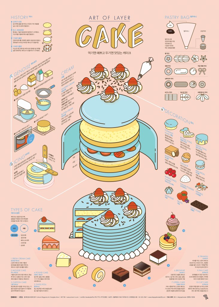
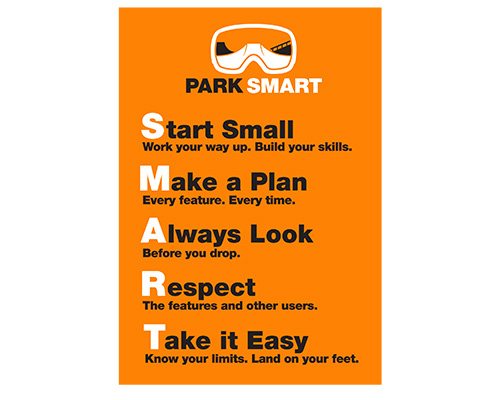
The reason I find these intriguing, especially the design above is how simple they are. While snowboarding/skiing past you can read and understand the whole sign very quickly. Some riders are faster than others and urgent readability is a must in order to understand what’s ahead.

Designers are unknown.

Read more about terrain park etiquette here.

Covid Information Design

I choose this covid info graphic because it relates to recent cases and occurrences that is happening in our lives. here we see the countries and the amount of cases that has happened in it. it very graphic and still very readable. we see drawings of what looks like covid virus in an animated form in the background.

this is the link to the site.

https://dribbble.com/shots/10855309-COVID-19-Coronavirus-Disease-2019-Infographic-Design

Environmental Impacts of The Clothing Industry Infographic

I found this infographic interesting to look at because it uses a fairly consistent color palette using the green to highlight the most important areas the clothing industry impacts. There is a visual hierarchy on the page as the larger words and green boxes creates a sense of importance. The use of bold fonts they chose for this does a great job separating the information and highlighting which parts of the text are the most urgent. I also really enjoy how this designer chose to make the waste section pop off the page with the color red since it is the color complement of green. Additionally, this artist added a call to action at the bottom of the infographic which is a nice touch to balance out the dark and heavy feeling the top part of the infographic conveys.

Created by Jane Chow & Julian Chow and published by Ju Ju at the website https://visual.ly/community/Infographics/environment/environmental-impacts-clothing-industry

Information Design: Gender Pay Gap

When looking at different infographics this one stuck out to me. I really enjoyed the color palette used for the design. They also didn’t use black instead they used a navy blue and they use a light beiges instead of white which I think give the design a light and less harsh feel than it would have with straight black and white. The titles to each categories really helps me as the reader find out what information can be found and where. It interesting to see the wage gap and how it effects different parts of the world.

This infographic was made by a woman named Heather Griffin, I unfortunately could find its origin.

Information Design

I chose this info graphic because it did a good job of catching my eye out of all the others. Firstly I like how simple it is, it is very neatly broke up into four sections and each one gives you data. Secondly I like the use of color, I like that the Ukraine cites are in color and the equivalent cities are in gray. lastly I like how much information you get from it, but it doesn’t make you feel overwhelmed with to much information. This is definitely due to the nice and neat organization.

Information Design: Art of Layer – Cake

I think the infographic is so cute and effective! The designer of this infographic is Sung Hwan Jang. I love the use of pastel yet still bright a color palette. I love how the graphic includes general information such as the ingredients for the cake and the process of baking a cake. I also love that there is extra information about cake, such as different styles of the pastry bags, types of decoration, and the types of cake.

Unfortunately this graphic is mainly in Korean. It’s an obstacle to fully understand the graphic, however the titles of each section are in English which is helpful. It is also extremely helpful that the graphics can speak for themselves and one doesn’t necessarily need text to comprehend what the graphic is saying.

Cake Infographic Poster Link: https://www.behance.net/gallery/56458085/1708-Cake-Infographic-Poster?tracking_source=search%7Ccake

Information Design: History of Communication

ThinkingPhones.com

I find this infographic to be really effective for many different reasons. I like that the designer used images and text to communicate and illustrate the data. If I didn’t know how to read I feel like I would still be able to comprehend the history of communication because of the photos. The photos are super simple too which make the whole thing less complicated and easier to read. I also like the way the page is broken up by the timeline. Our eye naturally follows the swirl of the timeline from top to bottom. I also appreciate the use of color. Here color is breaking up “The Visual Era” (blue) with “The Wired Era” (orange). I noticed how the timeline goes off the page which shows that there is a future to communication and the videophone isn’t the last stop. This detail can have the viewer imagine what other communication inventions the future holds. Perhaps holographic communication or virtual reality communication that makes it feel like the person(s) you are communicating with are actually there! I also like how there is not that many words used, the designer only used necessary words!

The Cost of an Average British Wardrobe

This infographic is done by Surgery Redcow for a series called Nutmeg. Click here to see more, but I really enjoyed this one specifically. I didn’t need to do much reading to understand the information, which is key to a strong design. They made use of color to compare both men’s and women’s spending habits when it comes to clothing. The design is very clean and the information is easy to navigate.

The designer also used size as a defining element to visualize the information. The more money spent or the larger the number of items owned impacts the size of the graphic paired with the information. For example, women spend more than men overall and the coin graphic for women is larger. This is used all throughout the infographic making it easier to digest the information while not having to read all too much.

Information Design- World’s Deadliest Animals

Bill Gates has helped fight malaria, a disease that kills over one million children a year. In 2014 he published the above infographic to his blog. This really caught my attention. It has minimal words and bold lines and colors. The bold lines and colors are the main image and information. It is very clear that the mosquitos are a much higher threat than sharks. This information is very shocking, surprising, and awakening to those who don’t know much about mosquitos and malaria. The simple illustrations are very straight forward. You immediately know the message of the infographic and you know exactly what it means. This is very well-done.

https://www.gatesnotes.com/Health/Most-Lethal-Animal-Mosquito-Week

https://www.webdesignerdepot.com/

I choses to look at web designer depot. the fist thing that caught my eye was the colors and the logo. both are very well deigned and thought out and are a warm welcome to the web page. This web page is well designed and easy to find what you are looking for. there also seems to be a ton of resources to help you along in your graphic design career. I also really like the sub headlines that break up the first page, they help to organize and look visually pleasing. They also have a whole section just for free graphics design types/ Fonts. they also have a quiz section where you can test your knowledge on graphic design elements. this could be very helpful to someone teaching themselves and is a nice addition.